
CBC’s Beijing animations blend new elements with a familiar concept
Weekly insights on the technology, production and business decisions shaping media and broadcast. Free to access. Independent coverage. Unsubscribe anytime.
Canada’s CBC has developed another take on the Olympics look it started using over two-decade agos.
The designs center on cutouts of athletes set against bold backgrounds and a design motif that’s swapped or tweaked out each time, often incorporating nods to the host city and country.
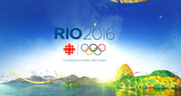
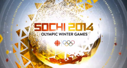
For Rio, it was flowing ribbons and organic shapes. In Sochi, triangular and diamond patterns with an emphasis on gold were used, while PyeongChang in 2018 used a flower pattern and “blossoming” animations.
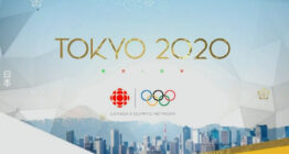
Most recently, in the delayed 2020 Summer Olympics in Tokyo, a triangular pattern and angled borders blended with a different take on a flower were used.
Combinations of design elements pop up in more than one year’s design, though the designers at the network appear to be determined to maintain an overall “feel” while also not being afraid to “break the mold” to make each Olympics look unique enough to stand on its own.
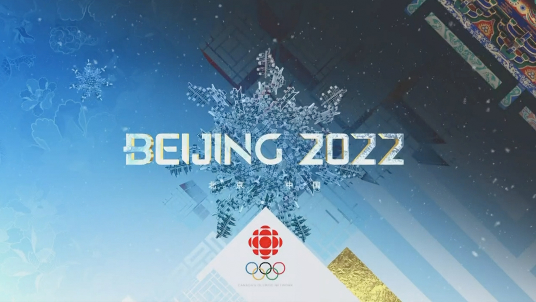
For Beijing 2022, one of the most prominent elements is a diamond and diagonal design language that incorporates linear elements and rectangular boxes with straight edges and 90-degree turns.
Many of these appear to draw inspiration from traditional and modern lattice patterns that are found in Chinese art, decor and architecture.
The design frequently features Chinese characters in the background, and there appears to be a visual connection between the bold, straight strokes in these and the patterns used throughout the look. In some instances, the diamond orientation of elements serves as a way to suggest the shape of a snowflake.

In other applications, intricate maze-like patterns, set on a diagonal, are used.
Contrasting this are circular elements that coordinate with the large, on set video panel and furnishings the network is using. It’s also nice nod to the network’s logo, which features a circle surrounded by a series of circular segments.
Additional elements include imagery of flowers and dragons, the latter of which feature “scales” formed from diagonal segments.
The thick strokes of the pattern are also incorporated through the use of horizontal bars in other animated elements.
Diamonds and triangles are a common element used by many networks for Winter Olympics designs, typically a reference to the icy mountainscapes and “frozen fractal” motifs that aim to link the looks with the concepts of cold weather, snow and ice.
NBC, for example, typically incorporates mountains into its Winter Games looks, while its looks for Summer Olympics often feature more dynamic designs that have evolved from geographic and architectural references to more typographic-driven looks in Rio and Tokyo.
PyeongChang 2018
Tokyo 2020

tags
2022 Winter Olympics, CBC, CBC Sports, Olympics
categories
Broadcast Design, Featured, Graphics, Olympics, Sports Broadcasting & Production