
ABC Chicago airing promos that appear to slant more toward upcoming new look
Weekly insights on the technology, production and business decisions shaping media and broadcast. Free to access. Independent coverage. Unsubscribe anytime.
ABC 7 in Chicago has started airing local promos that, while not all that noteworthy in the normal sense, do feature what appear to be elements from the upcoming graphics package redesign first reported by NewscastStudio exclusively.
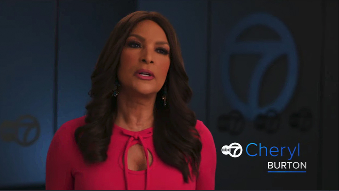
The promos focus on various talent, with other members of the Eyewitness News team sharing, in interview-style shots, what they think of the subject of the promo, in this example main co-anchor Alan Krashesky.
The comments in the promo are typical of this type of campaign and about what you’d expect.
However, what’s noteworthy is that the typography has switched over to Proxima, instead of the normal Helvetica-style typeface the station has used for several years.
Most of the glossy, glassy, highly 3-D elements are also gone, in favor of the flatter and darker look that has already been sampled in the station’s weather graphics redo.
Another nod to the new look is the full-width bar that appears toward the end of the spot, which, while still having a slight bevel and light burst effect, appears to tilt more toward the look used in weather graphics.
Since no graphics have been widely seen on air outside of weather, it’s not clear how the design might extend beyond those applications. While the weather look is mostly devoid of light bursts and beveled edges, the look still appears as if could harmonize a bit between the two — or it’s an attempt to sort of bridge the two looks, though the smaller bar with Krashesky’s name above it is decidedly more in line with the weather look.
A look at the full-width bars WLS often uses for promos — with the glossy gray-silver segments and black background with thick glass edge accents, all of which are part of the primary news graphics package. That said, like most stations, WLS also creates looks for campaigns that extend beyond the look of its news graphics package.
So far, WLS and ABC stations leadership have declined to comment on the redesign, but multiple NewscastStudio sources have confirmed it is coming in the fall of 2022 and has been in the works, in partnership with Smith Geiger and its creative division Vivid Zero, for years, and has been heavily driven by research and data.

The new promos notably also do not appear (although at times it’s hard to tell) the new ABC logo, another story first reported by NewscastStudio in May 2021.
WLS, like many ABC-owned stations, has been somewhat inconsistent in rolling out the new version of the ABC globe logo that accompanies its Circle 7 logo and was first announced in May 2021. It’s popped up in some cases but not others and station vehicle livery and mic flags have yet to be updated, enough the ABC the network has made the switch almost everywhere.
Back in Chicago, the on-set logo dimensional that emblazons the front of the anchor desk also has not been updated in the shots shown in the promo.
In fact, it appears that the animated logos used in the spot next to talents’ names, which follow a similar visual foundation as the new weather graphics, also use the old version. That said, replacing all of these elements would be relatively simple.
The promo’s interview segments with Krashesky’s co-anchor Cheryl Burton, meteorologist Cheryl Scott and sports anchor Jim Rose were shot in front of a background that features multiple station logos, but the ABC part is typically cloaked in darkness, perhaps on purpose.
Sources say that come fall 2022, most ABC-owned stations will transition to a new graphics package inspired by the look seen in WLS’s graphics packages.

tags
Chicago, Circle 7, News Promos, promos, TV Promos, wls
categories
Branding, Broadcast Design, Broadcast Industry News, Featured, Local News, News Promos and Sports Promos