
WGN promo sets the stage for 75th anniversary
Weekly insights on the technology, production and business decisions shaping media and broadcast. Free to access. Independent coverage. Unsubscribe anytime.
Iconic Chicago TV station WGN is preparing to mark its 75th anniversary by showcasing its rich history and the memories that likely still exist in the minds of many Chicagoans and, thanks its onetime superstation status — viewers across the country.
The station officially turns 75 on April 5, 2023, having signed on in 1948 and building a name for itself by producing large amounts of popular local programming including “The Bozo Show.”
Its contribution to the history of Chicagoland is preserved in its longtime tagline “Chicago’s Very Own.”
While locally-produced entertainment programming has faded from the station’s airwaves, it still provides a significant amount of local news which, despite its current independent status, often outperforms network programming such as “Today” in the market.
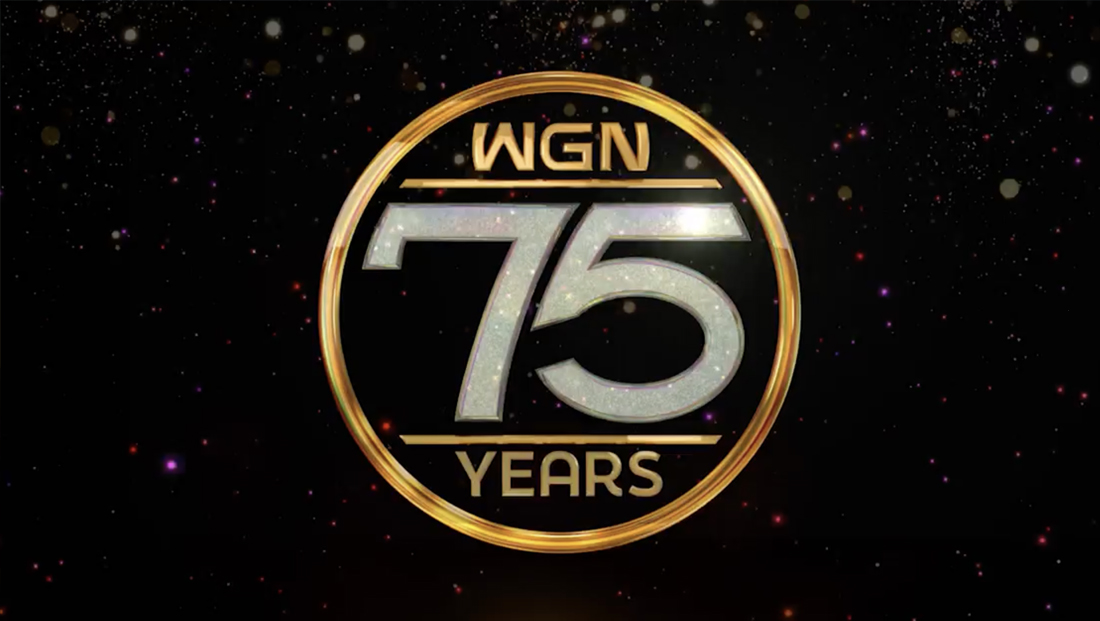
To mark its upcoming birthday, the station created a circular emblem reminiscent of a 1977 globe station logo design that combines gold and diamond-esque elements with some unique typography.
“WGN” is placed along the top of the circle with a unique “W” that looks more like an upside-down “M,” while the “W” and “N” appear to have been modified slightly to have curved sides.
![]()
Below this is a large “75” set in dramatic numerals that includes a “5” that has its upper left stroke modified to follow the curve of the “7” next to it. The tips of both numbers sport curved ends that follow the circular border around the design.

The “75” appears to use a diamond texture with sparkles added, a nod to 75 years often being referred to as a “diamond anniversary.”
The style of the entire logo, including the “75,” appears to be designed to create feelings of nostalgia with ties to the 1977 logo and shares some characteristics of jewelry and other decorative items of the time of the station’s founding. It has hints of the art deco and other design movements, though not all of them were in vogue at the time of the station’s founding.
Either way, the design still feels appropriately celebratory and glamorous — and perhaps, thanks to its morphed numbers, just a bit like the Superman shield.
Meanwhile, the Nexstar-owned station has also created a promo that showcases a line of framed photographs of its long history. These pictures are lined up in a row and the promo features the camera moving slowly by.
Audio from programming and events shown in the photos is artfully blended in along with brief typographic screens serving as separators.
The first one reads “We’ve been ‘very’ there for news,” which chunkily incorporates the “very own” element. The word “very” appears in a diamond pattern with gold border in a larger, sans serif typeface amidst thinner, gold-toned serif letters.
That screen is followed by “for laughs,” “for history…” and “for you…,” all of which are meant to finish the sentence starter “We’ve been very there…” The first in the series of screens, “laughs,” doesn’t include the ellipsis and the final one stylizes “you” in all caps.
In keeping with WGN’s rich history in Chicago-area sports, some of the on-camera picture frames also include a ball or puck placed nearby, along with matching commentator audio.
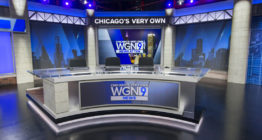
The spot ends with a wide beauty shot of the station’s current news set as the camera center video wall showcases a flyover of the station’s longtime studios on West Bradley Place north of downtown Chicago.
This shot also showcases two appearances of the “Chicago’s very own” tagline on the set itself, including the one emblazoned on the permanently-installed header above the center of the home base.
Finally, the spot ends with the “very own” tagline read out loud as the 75th-anniversary logo animates in with a burst of sparkles.

tags
Anniversary Logos, Chicago, logo design, News Promos, promos, TV Promos, WGN
categories
Broadcast Design, Broadcast Industry News, Heroes, Local News, News Promos and Sports Promos