
S.D. station prepares to mark 70 years by adding more unique elements to its logo
Weekly insights on the technology, production and business decisions shaping media and broadcast. Free to access. Independent coverage. Unsubscribe anytime.
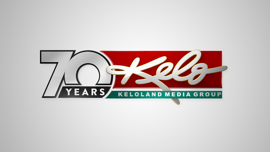
KELO, Nexstar’s CBS affiliate in Sioux Falls, South Dakota, is preparing to celebrate its 70th year on the air.
The station signed on May 19, 1953.

KELO is one of a slate of stations that typically pronounces its call letters as a word, in this case as the non-existent word “kello,” which rhymes with “hello.”
It is further notable for using its call letters to create a new word for its overall branding — “Keloland.”
KELO also has a distinctive logo that has, for years, used a handwritten-style typeface, a rarity with U.S. call letters.
The call letters are currently placed on top of a red background with a teal-green bar below used to house the branding of “Keloland Media Group.”
Over the years, the call letters have gotten slightly bolder and more fluid and currently take on a 3D form with glossy effect. There are various flourishes that extend beyond the red field behind.
The letters are also unique in that they appear as lowercase, with the exception of the starting “K,” which emphasizes that its name is said as a word, while the gentle curves create a friendly feel that blends with the notion of saying “hello.”

To say the logo is unique — and perhaps even a bit outside the box — is probably an understatement, though it also highly recognizable in the region.
For the 70th anniversary, the station added a bold, geometric interpretation of “70” to the left of the normal lockup, with the curve of the right side of the “0” bumping against the blue and teal, making its left right curved as well.
It’s fairly stark contract to the rest of the design, especially with its thick border, but also does borrow some typographic hints from the “Keloland Media Group.”
The “7” and “0” are spaced closely together and merge at one point in the center. Meanwhile, the bottom of the “0” is chopped off for a black block with angled and curved sides for the word “years,” which could benefit from a bit more spacing on the right side.
The overall result is an eclectic look that appears to blend a nod to the 1950s while also complementing the station’s unique look.

tags
Anniversary Logos, KELO, Nexstar Media Group, sioux falls
categories
Branding, Broadcast Industry News, Featured, Local News