Channel 4 goes ‘altogether different’ in updated brand rollout
Weekly insights on the technology, production and business decisions shaping media and broadcast. Free to access. Independent coverage. Unsubscribe anytime.
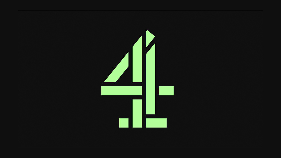
Britain’s Channel 4 has put the finishing touches on a company-wide rebranding that began in 2022 and brings its iconic “blocks” back together while also adding a new dimension to that concept.
Led by the in-house 4creative and agency Pentagram, the rebrand still centers around the blocks that comprise the Channel 4 number and have been part of the network’s identity since its launch in 1982.

Over the years, the logo has been redrawn, repositioned and reimagined multiple times, as well as broken up into individual blocks as part of on-screen idents and other visuals.
The identity that 4creative and Pentagram developed instead focuses on the “4” as a whole.
To be clear, Channel 4 never abandoned its logo — it still appeared in its non-disassembled form across its various properties, but it did sometimes feel as though it took a backseat to the alternative interpretation of the icon as blocks.
In this composite, created by NewscastStudio, the old logo is in green and the newest version in red, showing slight changes in thickness and diagonals.
The updates also include a tweaked iteration of the logo meant to pay homage to the original design created by Martin Lambie-Nairn.
This latest update includes some tweaks to the number, mainly in the form of slight changes to spacing and thickness. The tip of the “4” is more significantly changed.
Overall, the “4′” icon feels slightly bolder and more prominent.

Changes started to roll out in conjunction with the network’s 40th anniversary in 2022 and also drive the unification of the entire Channel 4 portfolio, notably its on-demand streaming service All4, which now shares its name and branding with Channel 4 in an effort to have consumers think of all of the broadcaster’s offerings as a single entity.
Prior to the new look, the individual segments of the “4” were often represented more as if they were individual blocks placed in seemingly random or haphazard ways, including moving around in animated 3D spaces.
Another take that had become popular was imaging the blocks as being assembled into a chunky metallic figure (that felt a bit like TARS in “Interstellar”) that would walk around, play sports and perform other actions).
Taking a cue from the blockiness and angles in the pieces, Brody Associates also created a bespoke font at the time of the last makeover that features unique glyphs with “dynamic, unusual shapes,” “cut-into strokes,” additional slab serifs, angled terminals and “angular, graphic character forms.”
The updated version of bespoke font Horseferry, originally created by Brody Associates with updates by NaN.xyz.
Known as Horseferry, after the street Channel 4’s headquarters sits on, the font is a quirky and fun way to make the network stand out.
Type studio NaN.xyz worked with Pentagram to remaster and update Horseferry.
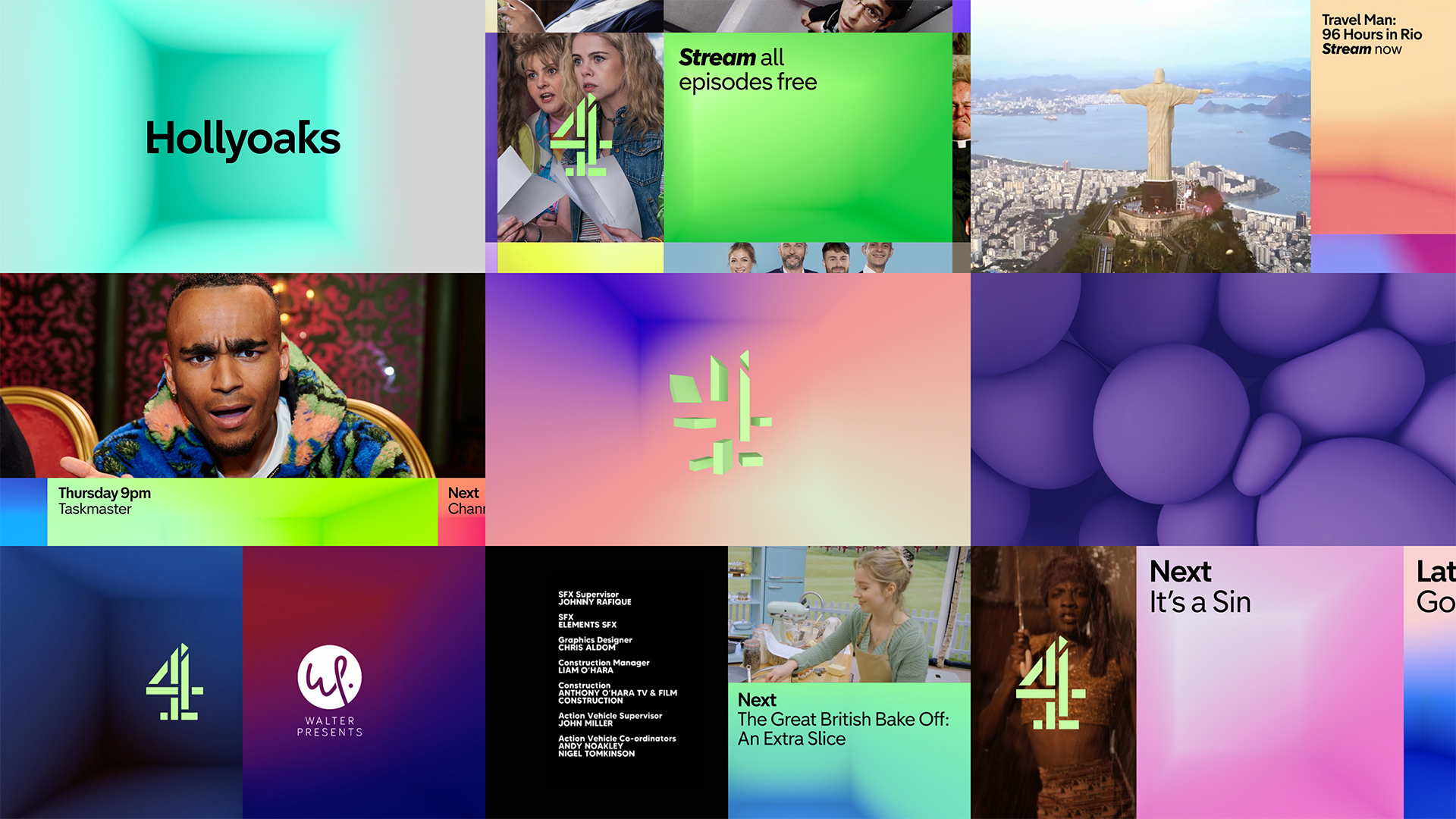
A new color palette has been introduced, with the “4” typically appearing in a bright green, meant to present the uniqueness of the brand its programming, along with its “Altogether different” tagline.
The logo’s color is complemented by a similarly fresh color palette that is also used to form over 60 backgrounds, including ones centered around the idea of soft 3D “rooms.” Other background options, including more organic forms, are also available.
The color system throughout the rebrand feels light and airy and often combines hues in unexpected ways, another decision meant to help Channel 4 stand out from its rivals.
Meanwhile, Pentagram and 4creative worked with studio Found to create a dynamic and flexible animation language that can be extended for future uses.
In promo animations, for example, the soft gradients used to create the rooms are complemented with clearly segmented parts of the screen used to showcase video and still imagery.

Found’s animation uses smooth, fluid motions that places the viewer in the center of what could be imagined as a mosaic of rectangular and square spaces. There are options for both “twisting” and “sliding” style animations.
The concept of “rooms” and the patchwork look could be seen as a nod to the blocks used in the previous branding.
That blocky look is also still used with the Channel 4 numeral when it breaks out of the flat feel to become 3D blocks that twist and slide apart or into place.

This example from Channel 4’s new branding showcases the updated version of Horseferry along with the gradient ‘rooms’ concept and ‘4moji’ icon system with the bucket of popcorn used to cheekily suggest a snack during the season finale.
Adding to this is an iconographic language that offers “4mojis” designed to bring a bit of personality and attitude to the identity system.
Project credits
Agency: 4creative
- Executive Creative Director: Lynsey Atkin
- Deputy Executive Creative Director: Chris Wood
- Deputy Executive Creative Director: Lambros Charalambous
- Head of Design: Rob Boon
- Managing Director: Katie Jackson
- Executive Producer: Louise Oliver
- Senior Project Manager: John Trevor
- Senior Producer: Lauren Holden
- Junior Producer: Jazz Stradling
- Junior Project Manager: Lucy Newbold
- Production Assistant: Emily Jacob
Client: Channel 4
- Chief Marketing Officer: Zaid Al-Qassab
- Marketing Director: Amber Kirby
- Head of Brand Transformation: Matt Berry
- Rebrand Director: Mat Heinl
- Programme Director: Ying Miller
- Experience Design Lead: Matt Wade
- Marketing Lead, Brand Transformation: Simi Murthy
- Marketing Executive, Brand Transformation: Lana Camp
Design System: Pentagram and 4creative
- Design Team Partner and Creative Director: Luke Powell
- Design Team Partner and Creative Director: Jody Hudson-Powell
- Design Team Associate Partner and Designer: Jack Llewellyn
- Designer: Alice Sherwin
- Design Team Technical Director and 3D/Motion Designer: Luis Gutierrez
- Design Team Associate Partner and Producer: Nav Bhatia
- Strategy Team Partner and Creative Director: Naresh Ramchandani
- Strategy Team Associate Partner, Brand Narrative: Ashley Johnson
- Strategy Team Project Manager: Isla Wickham
- Strategy Team Project Manager: Kate Heller
- Strategy Team Strategist: Zoë Gibson Quirk
- Strategy Team Writer: Robyn Cusworth
Channel 4 Typeface re-Mastered and Extended: NaN.xyz
Onscreen Presentation: Created by Found in Collaboration with 4creative and Pentagram
- Creative Direction: Jack Seymour and Clayton Welham
- Production: Sophia Georgiou
- Designers: Kiril Trashliey, Nicole Peterson, Andrea Marshall, Ambro Bergamaschi and João Lucas
- 4creative Senior Producer: Chloe Roberts
Pitch and Opticals: Time Based Arts
- Ian Baird
- Mike Battcock
- Nick Smalley
- Ria Shroff
- Stephen Ross
- Tom Johnson
- Tom Robinson
- Sean Ewins
- Mike Skrgatic
Social: Created by STINK in Collaboration with 4creative and Pentagram
- 4creative Digital Creative Director: Christos Savvides
- 4creative Digital Creative: Chris Rice and Greg Carter
- 4creative Director: James Henry
- 4creative: Senior Producer: Paul Gleeson
Sonic: Created by Factory and SIREN in collaboration with 4creative and Pentagram
- Factory Composer and Creative Director: Anthony Moore
- Factory Producer: Beth Massey
- SIREN Music Supervisor & Creative Director: Sian Rogers
Out of Home: Created by Pentagram in collaboration with 4creative

tags
4creative, Channel 4, Pentagram
categories
Branding, Broadcast Design, Broadcast Industry News, Heroes, Network Branding