
‘The Source’ debuts with oddball look
Weekly insights on the technology, production and business decisions shaping media and broadcast. Free to access. Independent coverage. Unsubscribe anytime.
CNN debuted its latest entry into the 9 p.m. hour of cable news with another clunky design that attempts to combine dated textures with virtual extensions and cityscapes.
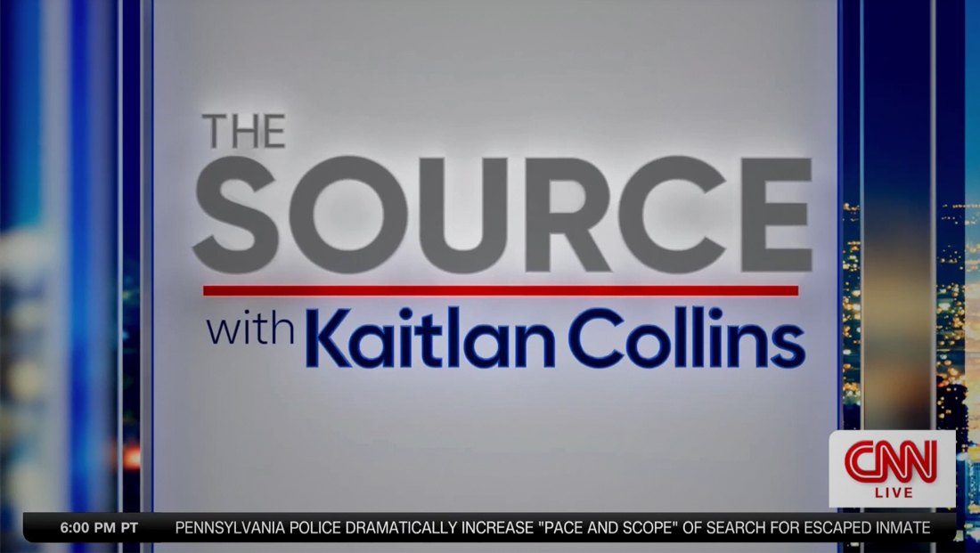
“The Source with Kaitlan Collins” premiered July 10, 2023, helmed by the network’s former White House correspondent and “CNN This Morning” co-anchor Kaitlan Collins.
The show’s name is actually recycled from a Kasie Hunt show that aired for less than a month on streamer CNN+.
Though this version is a separate show with an entirely new look, it’s not exactly fresh, given its use of largely outdated layer effects throughout.
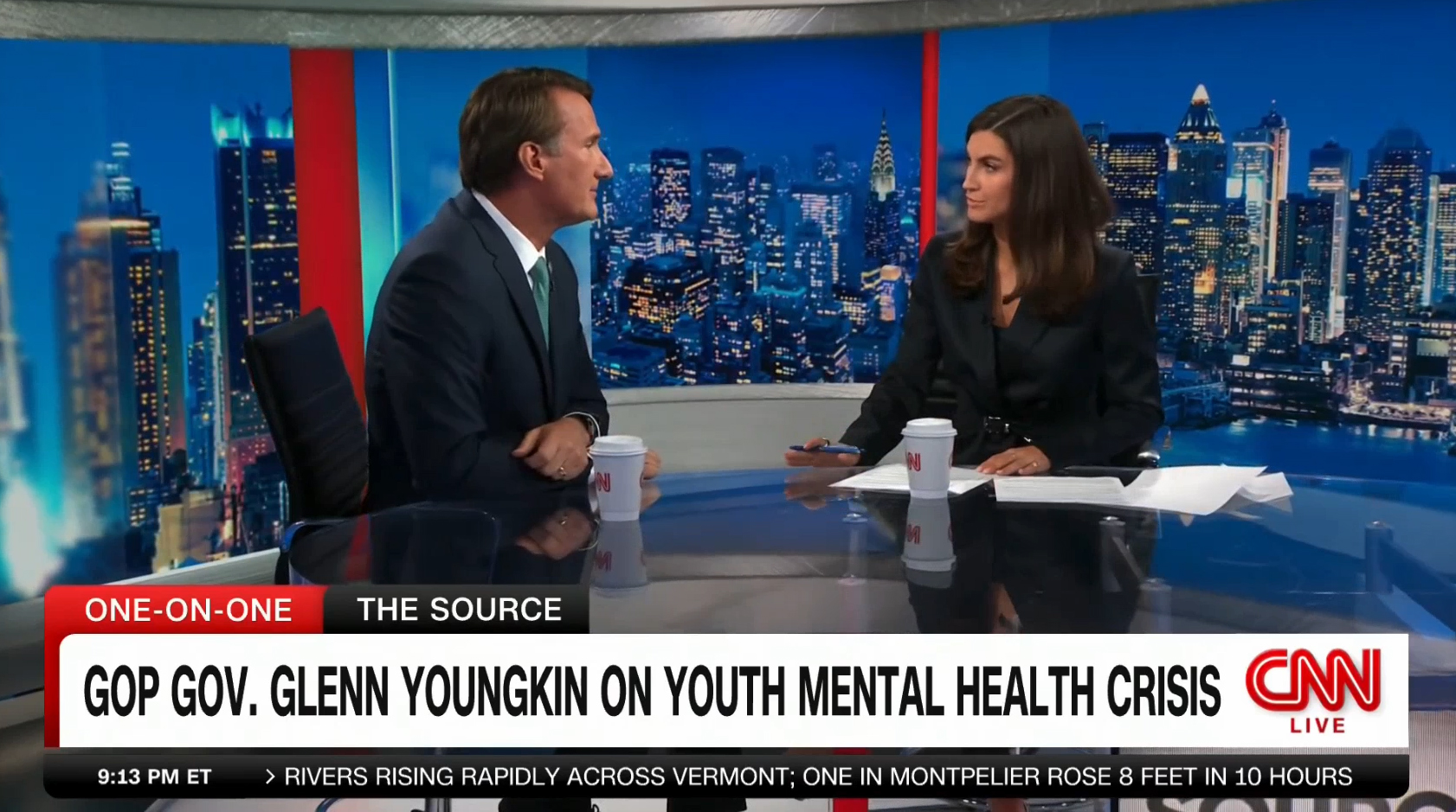
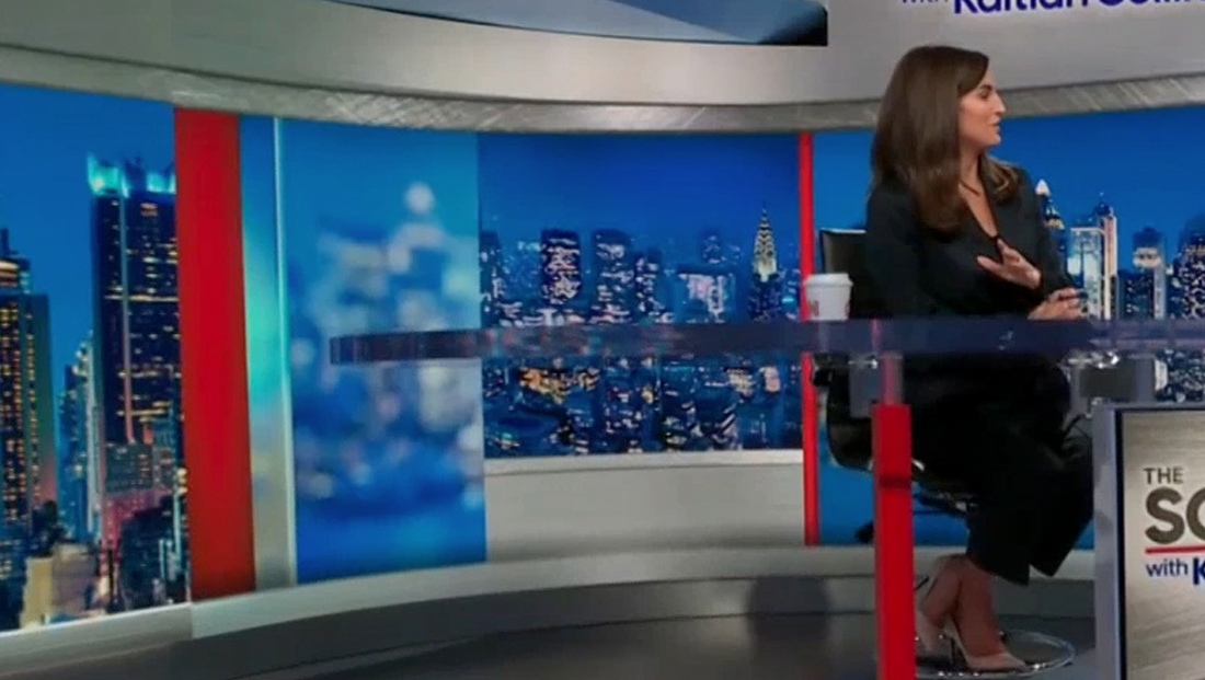
For the top of the show, Collins stands in front of one of the larger video walls in Studio 19Z at the network’s Hudson Yards facility.
‘The Source with Kaitlan Collins’ video wall graphics include a large headline that nicely reflects on the glossy white riser that leads to the set’s functional staircase on the left.
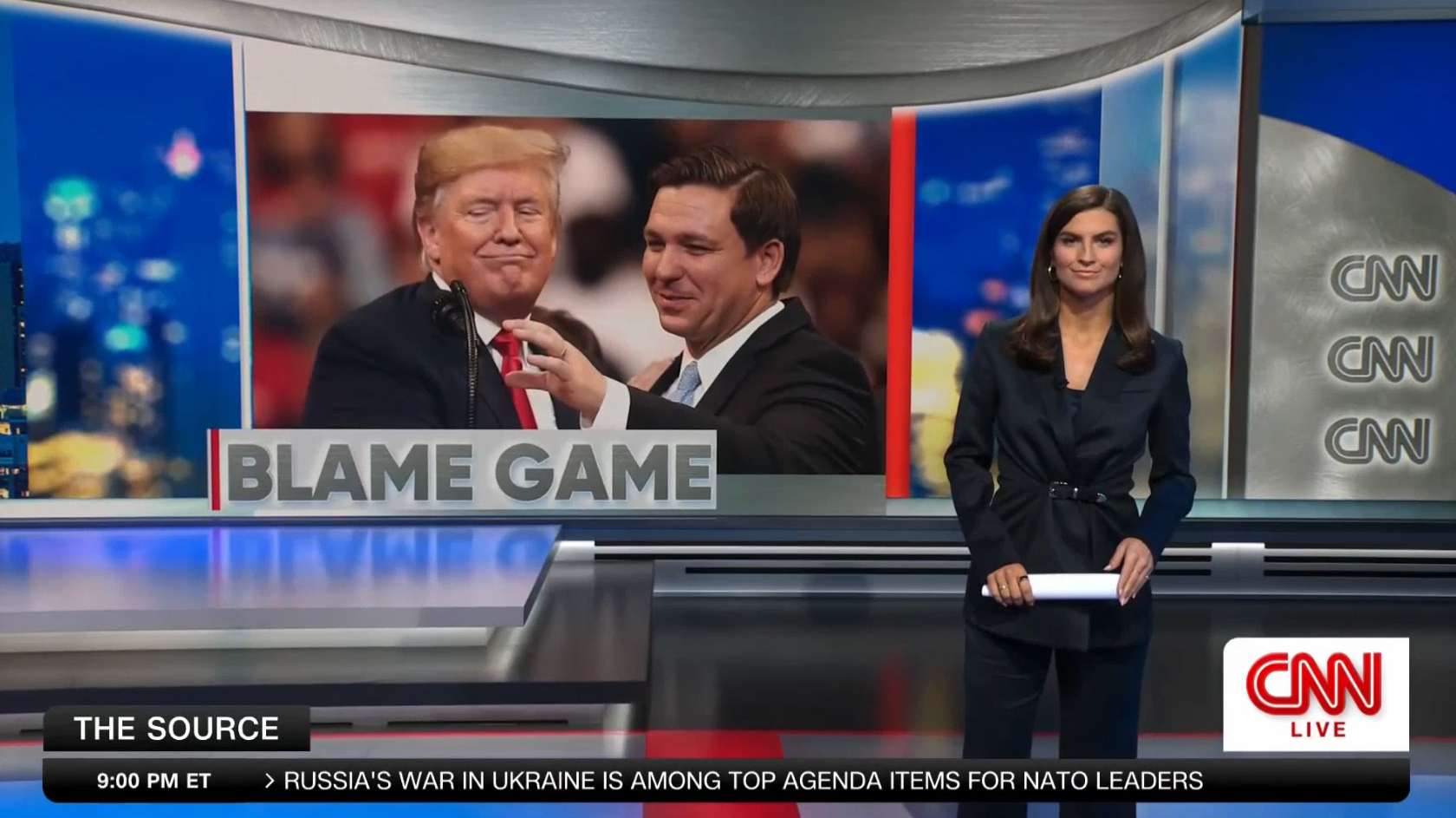
Behind her is a graphic that combines a virtual set extension theme with large space for each tease’s topical image and headline, which has a brushed metal texture applied to its face.
The look also relies heavily on similar metal textures in several variations, including on the curved panel with stacked CNN logos on the far right and structural footer and header elements, all of which create the sense of a quasi-structural space. Most notably, the texture was used to create a curved header piece above the image frame. The effect serves as both a nod to some of the curved elements on the set as well as a visual cue that draws the eye to graphic and anchor.
Behind these parts of the video wall graphic is a blue-tinted cityscape with varying degrees of blurriness, including some parts that are obscured by semi-transparent beveled components.

Setting off the look are bold vertical red bars, which help the look tie into the red decals on the floor and a particular frame that supports one of the studio’s desks.
Overall, the video wall graphics follow the trend other CNN shows use, including going back to the days when the space was used for “CNN Tonight with Don Lemon” as well as the current “CNN News Central” New York-based editions. Both of these broadcasts have attempted to suggest structural scenery on video walls, though they perhaps are not as successful as they could be.
Many of the virtual set elements used on both “The Source” and “News Central” don’t quite pass the realism test for a variety of reasons, including elements that are a bit too sharp considering they are supposed to be varying distances from the camera, oversized texture patterns that don’t match the scale of real studio elements and architectural details that are a bit too uniform and don’t have the subtle natural variations one would expect of real scenery.
The show open, meanwhile, combines many of these designs with prominent glassy panels and light bursts, 3D effects on the show logo and a blue cityscape background. Much of the open uses fluid animation, though there is a slight stutter effect toward the end.
During the sequence, a distinctive, heavy beat that feels both serious and uplifting plays — and similar cuts of the catchy track are used throughout the show, particularly when going to and coming out of breaks. Stephen Arnold Music composed custom new theme music for the show.
At the top of the broadcast, Collins stands in front of this same video wall as the camera pushes in, briefly showing that she is standing next to a circular anchor desk with red frame and glass top and equipped with an L-shaped band of LED panels that intersect the structure before running down into the riser.
The camera then adjusts to accommodate an OTS graphic that combines similar headline text styling as used on the video wall teases along with simulated textured metal surfaces and glassy elements.
The rest of the broadcast takes place at the desk set up in front of the video wall array that sits under the balcony that wraps around part of the space, which includes a curved segment.
These video wall graphics also attempt to simulate physical elements, though to a bit lesser extent.
Even though only the corner of the actual LED is curved, the background graphics feature a simulated metallic header that warps subtly. These curves only appear in the header and it’s not entirely clear if this effect is intended to create the illusion that the virtual walls are bowed or change height slightly along the curve.

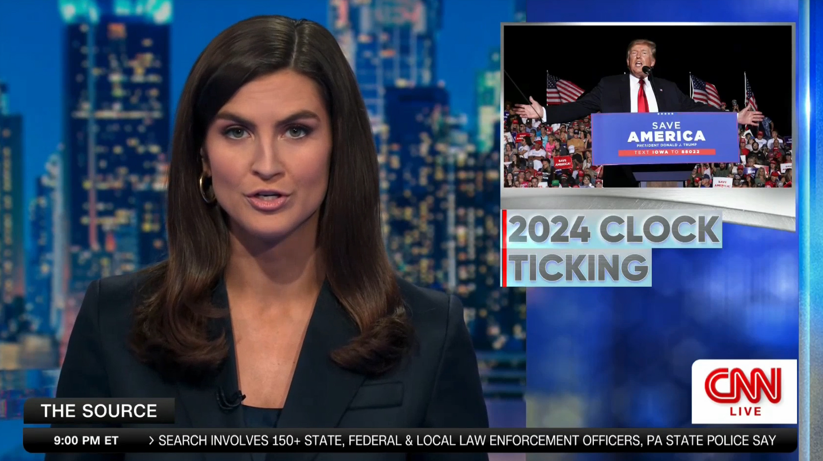
Strategically placed vertical solid red and simulated glass panels are also used, with the show logo shown to the small segment of LED that peeks up in front of the mezzanine.
Placement is one of the show’s design strongpoints — Collins’ head ends up just to one side of the iconic Chrysler Building and in some boxed one-shots, a red vertical appears just to the right of her box, though this latter part varies slightly when the camera’s fairly tight framing adjusts as she moves.
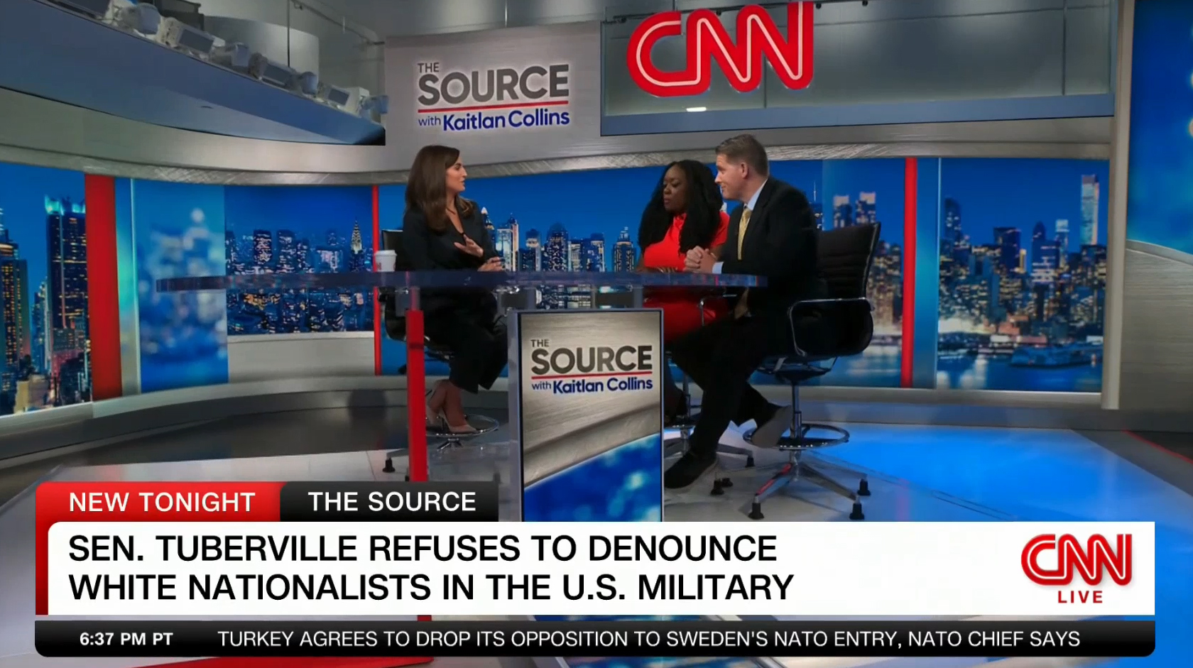
The set can be configured for both single and multi-guest setups, with the option for a solo one to be seated camera left of Collins and two on the opposite side.
This video wall graphic attempts to create the look that there is a video panel or screen of some sort inside of the space left by the metallic elements and red bar. However, some of the details, such as where the thin left border meets the footer near the bottom of the design have simulated 3D effects that don’t quite match up. It’s also fairly evident that the white glow along the top of the faux header was created using a single semi-transparent gradient instead of actual integrated lighting because of how it interacts with various surfaces.
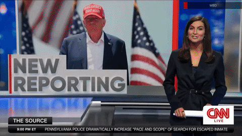
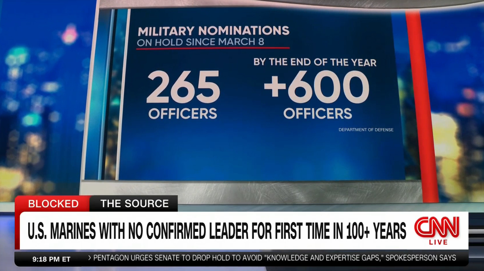
Apart from the OTS and video wall graphics used near the top of the show, “The Source” doesn’t rely heavily on topical graphics, though it did briefly use a “video on video” floating camera “walk and wander” shot to showcase key facts about military nominations on the July 10 broadcast.
While this approach is a stark contrast to the graphics-heavy look CNN uses during other broadcasts, including both “This Morning” and “News Central,” this approach does put more focus on the anchor and guests.
Unfortunately, this approach could be much more successful if the background graphics were a bit more subtle — their current bright look carries significant visual weight and the addition of glass panels, simulated metallic surfaces and red bars adds additional clutter.
All told, “The Source” continues CNN’s tired approach of creating graphics that attempt to replicate real surfaces (such as “This Morning” and its wood effects and the “News Central” metallics and glass) and ends up looking more amateurish than sleek and polished.
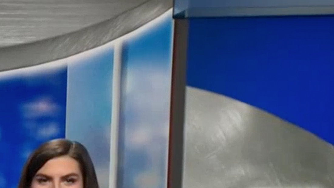
In this image, enlarged to show detail, there’s an odd effect where the dark gray vertical in the middle of the image meets the header. It appears the horizontal element on the right side of the screen may be attempting to replicate a semi-transparent element, but there are some odd offsets that don’t quite match up where the simulated white light fade and various gray parts intersect. It is possible the look is an attempt to replicate a material that shifts the perspective of anything behind it, though the overall design could have been refined a bit.
CNN is certainly not alone in using video walls to attempt to create the look of physical elements — and other networks are certainly guilty of graphics that don’t read well on screen.
In this enlarged screen capture, there’s a noticeable ‘seam’ to the left of the thick red bar on the left side of the image. There’s a slight change in the simulated metallic header at the very top, while the second, thinner header element and footer that sits just above the real metallic banding install in the studio features an even odder seam. If this were actual scenery, one would likely expect there to be either a seamless flow for these textures or have some kind of separator or, at the least, shadow to indicate a slight shift in materials. Instead, it feels like two images were simply digitally placed side-by-side. Likewise, if the effect is trying to simulate a slight change in depth of the ‘wall,’ it’s a bit inconsistent.
Virtual set extensions can be fairly hard to pull off well, especially for more discerning viewers, though oddities can often trigger others’ brains to think there’s something a bit off between what the eyes are actually seeing and what they should be seeing if the backgrounds were structural.

A fairly successful way to avoid this is to create virtual backgrounds that blur the line between what could be real and what couldn’t — such as creating spaces that have an element of the fantastical. CNN has done this, at least to some degree, with “The Source,” given that at least some of the backdrops attempt to simulate physical looks but add in elements, such as large, seemingly floating video panels and designs with questionable stability that wouldn’t normally be possible in the real world.
However, the look flails a bit because it crosses into the area of trying to create elements such as vertical glass panels, red columns and structural frames that could be real — and those issues with scale, lighting, sharpness and discrepancies where parts meet add to those issues.
Of course, designs like these aren’t always necessarily meant to be read as being real structural parts of the set. However, it seems somewhat counterintuitive not to obey some basic principles of how real environments interact with light, depth and different materials since the designs such as these are, almost by definition, at an attempt to at least somewhat simulate something real.

tags
CNN, Stephen Arnold Music, The Source with Kaitlan Collins, Video on Video, Video Walls, virtual set extensions
categories
Broadcast Design, Broadcast Industry News, Cable News, Graphics, Heroes, Set Design, Video Walls