
TNT Sports focuses on viewfinder, ‘this n that’ language device for European rebrand
Weekly insights on the technology, production and business decisions shaping media and broadcast. Free to access. Independent coverage. Unsubscribe anytime.
U.K. and Irish BT Sport unveiled its new branding under the TNT Sports name, leveraging its namesake network’s name and logotype to form a “viewfinder” graphical element and “mix n match” language patterns.
As announced earlier in 2023, BT Sport, which is a joint venture of America’s Warner Bros. Discovery and Britain’s BT Group, took on the TNT Sports name. Eurosport, which WBD controls through its international division, is also slated to take on the TNT name at some point in select European markets.
The TNT Sports name was previously used in the U.S. for sports broadcasts on the U.S. network of the same name and is also used on three South American-based networks, with WBD noting the brand represents premium sports programming around the globe.
However, the TNT Sports name is essentially new to most U.K. and Irish viewers, so the venture had the ability to create a new standard from the ground up.
For a logo, the international networks use the same logo that the U.S. network introduced in 2016 along with the word “Sports” spelled out in a typeface that mimics the logo’s slightly rounded corners.
The TNT Sports name started appearing on the former BT Sport signal on July 18, 2023.
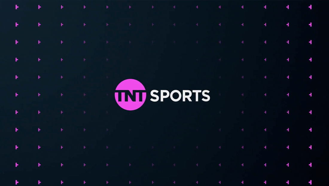
Brand agency DixonBaxi looked toward the letterforms of the “TNT” and extracted a shape it calls the “viewfinder.” The element looks roughly like a “T” turned on its side, though with the lengths of each of the three arms adjusted.
The shape can be flipped 180 degrees to form a mirror image, with the end result being a camera-inspired element framing element.

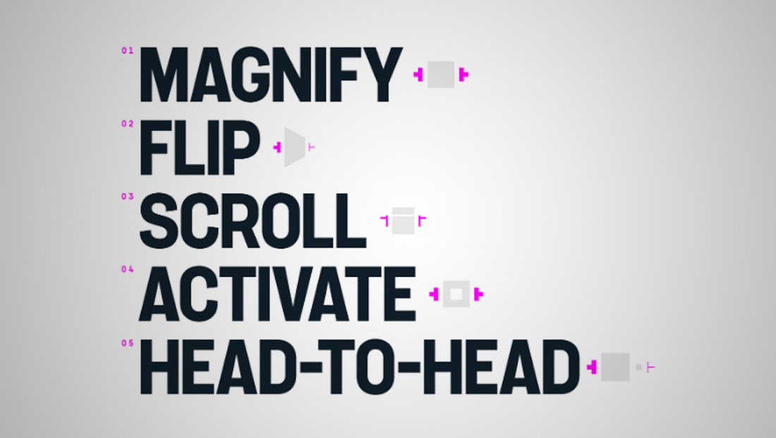
DixonBaxi, in turn, applied a series of animations to the shapes using five key concepts that create interplay with other on-screen elements: Magnify, flip, scroll, activate and head-to-head. Each of these uses a slightly different take on the viewfinder element, with the scroll option tweaking the glyph slightly.
These animations are decidedly slick and smooth — flowing naturally to reveal various other on-screen elements. In some applications, the connection between the two “T”s is made obvious with sequences that appear to grab the two letters in the logo and morph them into the viewfinder elements.
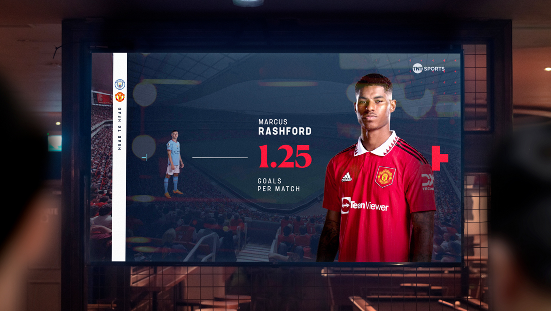
The viewfinder has also been incorporated into conceptual layouts that notably use a combination of horizontal and vertical elements in various thicknesses to frame-out information while also serving as a visual cue to how to read what’s being presented.
In some ways, the flow of these elements mirrors the movement in the fully animated elements in a sort of subtle way.
In addition to serving, quite literally, as a framework for animations, the viewfinder also lends itself well to be leveraged as a patterned background or texture.
The branding is meant to “stand against today’s commercial sporting standard and hero fan culture in a uniquely emotive and empathetic way. The result is a fiercely tactile brand that reveals the multifaceted nature of sport — an attitude-filled disruptor with a fan-first perspective,” according to DixonBaxi.
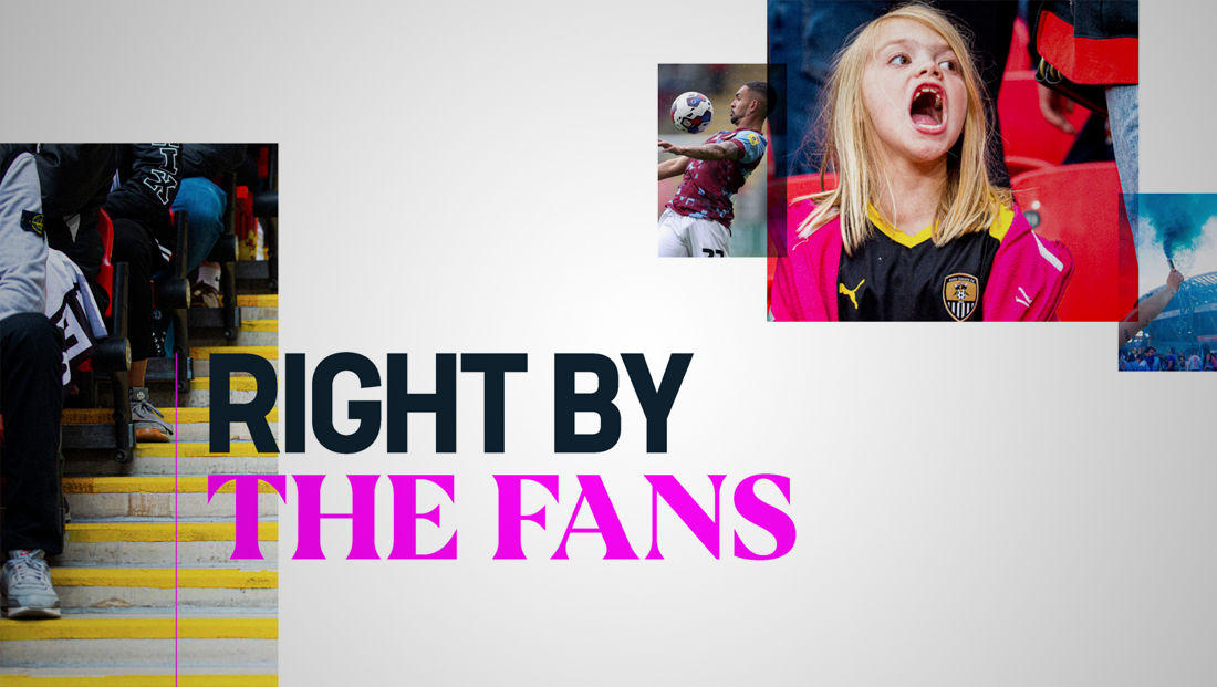
To leverage the power of fandom, the brand adopted a primary tagline of “Right by the fans,” a play on words that are meant as a nod to the phrase “do right by” and the concept of being close to (or, in this case, on the same field or court as the fans).
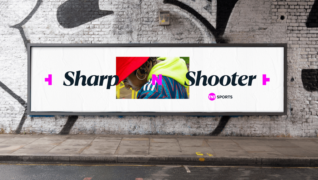
DixonBaxi also developed as “this N that” language device that’s used in many on-screen elements.

Derived from the “T-N-T” letter pattern, the device “acts as a ligature to join two unexpected things together. A colloquial play on the ‘and’ conjunction, the N connects polarities within fanbases and sports, and heroes moments both big and small.”
Examples include “Here N Now,” “Pride N Joy” and “Clubs N Hearts.” The device is also used to showcase competing teams as an alternative to the more traditional “versus,” though “V” is also used when a more literal approach is needed.
All of these text elements are set in two customer typefaces created by type design studio F37 Foundry; one serif and one sans serif. The serif manages to be both bold and clean, while the sans serif display features distinctive flared serifs that are a nice nod to the slightly curved corners in the TNT Sports logotype.
From the start of the project, the ambition was to redefine the sporting landscape and hero fan culture uniquely, emotively and empathetically, noted DixonBaxi.
“Sport is often reduced to the big epic moment. The goal of the season. The trophy lift. The opinion of a pundit. We wanted to create a brand that has space for a collective view of sports, putting fans in the experience. Something that breaks the traditional ‘big moment’ and feels street-level, rich, tactical and spontaneous,” said Harry Ead, creative director at DixonBaxi.
“It was important to approach this project in an instinctive way. The fanzine (we created) signifies the raw spontaneity of sport which makes it so captivating. We tapped into the rich subcultures of sports that are forged by the uniqueness of fans,” said DixonBaxi designer Tassia Swulinska.
DixonBaxi was also responsible for the 2022 rebranding of Eurosport.

tags
BT Sport, DixonBaxi, eurosport, F37 Foundry, TNT Sports, TNT Sports Europe, Warner Bros. Discovery, WBD
categories
Branding, Broadcast Design, Graphics, Heroes, Network Branding, Sports Broadcasting & Production