CNN continues to tweak insert graphics package
Weekly insights on the technology, production and business decisions shaping media and broadcast. Free to access. Independent coverage. Unsubscribe anytime.
CNN rolled out another graphics update on Monday, Aug. 14, 2023, that continued dismantling a graphics overhaul that debuted in June 2023.
These changes largely center around the bug and results in a layout that is more in line with the pre-June design. The curved edges and cleaner look are maintained with the latest update, introduced in June under then-CEO Chris Licht.
Less than a month later, Licht was gone and on June 27, 2023, the network began updating some of the typographic elements introduced in the redesign.
The original June redesign featured lighter versions of CNN Sans, which some viewers reportedly criticized as being hard to read.

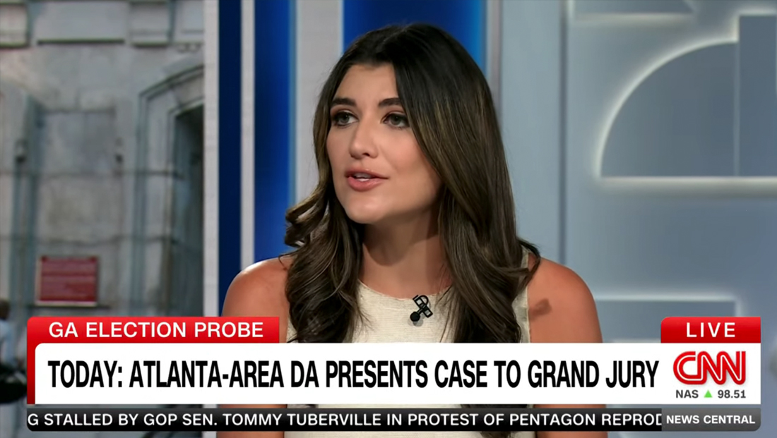
In the updates rolled out on Aug. 14, the CNN logo remains within the white space on the lower right of the screen that merges with the primary banner when it is displayed.
The pulsating “live” indicator under the logo is gone, replaced with a more prominent red flag above the logo, similar to how it was before the redesign.
In the space under the logo, the network can insert the current time and stock market conditions, while a medium-gray box on the right of the ticker holds the current show’s name.
Again, these changes essentially restore the basic layout of the bug to how it was before, with the exception of the time and stock market data no longer being in a black box and the fact that the bug box previously was completely separate from the primary banner.

How the CNN lower third insert graphics looked well before the June 2023 redesign — in this case back in January 2023.
These changes notably eliminate having to have the show name appear in a dark gray flag to the right of the primary red flag above the primary white tier.
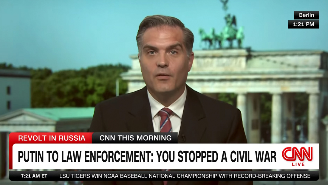
After the late June 2023 update, fonts became bolder again, but show names, such as ‘CNN This Morning’ here, still appeared above the primary white bar to the right of a topical or franchise flag.
As NewscastStudio noted when the original redesign debuted, this could create an odd issue of visual hierarchy because, somehow, the red and dark gray elements managed to compete with each other at times.
While this change did make show branding more prominent, it added competing visual weight to that top tier typically occupied by a “flag” describing the current segment.
All told, reuniting the logo bug, current time, stock market information and live flag along with the show name to the same corner of screen real estate is likely a wise move. Also, as NewscastStudio noted in early June, having the time and stock data to the far left of the ticker created a bit of a disconnect for viewers accustomed to having this information grouped together.

tags
CNN, CNN Sans, insert graphics, lower thirds
categories
Broadcast Industry News, Graphics, Heroes