
Charlotte station debuts new logo, switches to group graphics package
Weekly insights on the technology, production and business decisions shaping media and broadcast. Free to access. Independent coverage. Unsubscribe anytime.
Charlotte’s Gray-owned WBTV has debuted a new logo along with a switch to the group’s GrayONE graphics package.
The station had used its previous logo, which combined a partially-obscured “3” and CBS eye, since 2001.
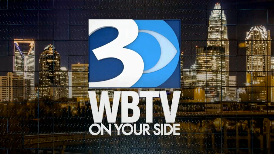
The old WBTV logo used from 2001 to 2023.
The new design retains a similar color palette as the old one, but uses more straight and diagonal lines. The blues found in the old logo are hinted at in the three horizontal segments created on the left side of the new lockup thanks to a diagonal line.
The numeral “3” has been switched from the more casual one in the old logo to a sturdier one that still manages to have some distinctive flair with particularly close spacing between the “hooks” and horizontal bar in the middle.
![]()
In some ways, these are so close the logo borders on starting to look a bit like an “8,” especially with the upper left part of the numeral obscured by the diagonal.
The station calls, meanwhile, are now spelled out below the logo, typically placed inside the white area that forms, collectively, the “3” and various linear elements.
While much of the new logo is flat, as opposed to the slight 3D effects used in the old design, there are slight reflections applied to the trio of colored bars.

A distinct part of the new logo is that it drops the CBS eye.
The previous version of the WBTV logo technically ran afoul with CBS brand standards by partially obscuring part of the logo behind the numeral.
The issue was reportedly a small point of contention between the station and network at times (as it was with other affiliates who would cover up part of the iconic logo).
By removing the CBS eye from its primary lockup, WBTV negates those potential issues with brand standards as well as placing the focus squarely on its local branding.
It’s not uncommon for stations to add and remove network logos as part of their own logos over time in response to changing tastes and the fate of network ratings, though it’s not clear why WBTV dropped it from this version. Most stations also have different versions of their logo with and without the network logo.
The CBS eye does still appear in select applications on the station.
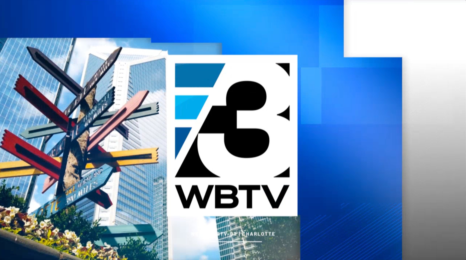
The new logo’s cleaner angles also melds better with the GrayONE look, which relies heavily on blocky segments.
Like its sister Gray stations, the package has been customized with logo imagery and branding, including adding in the “On Your Side” tagline where applicable.

tags
Charlotte, Gray Design Group, Gray Television, GrayONE, wbtv
categories
Branding, Broadcast Design, Broadcast Industry News, Graphics, Heroes, Local News, TV News Graphics Package