
LinkedIn studio blends brand standards with new takes on the company’s look
Weekly insights on the technology, production and business decisions shaping media and broadcast. Free to access. Independent coverage. Unsubscribe anytime.
When it came time to start designing studio environments for LinkedIn’s video content, production designer James Pearse Connelly was able to the site’s brand standards as a jumping-off point for reference and inspiration that ultimately led to a flexible production space that leverages the corporate look without feeling overly “corporate.”
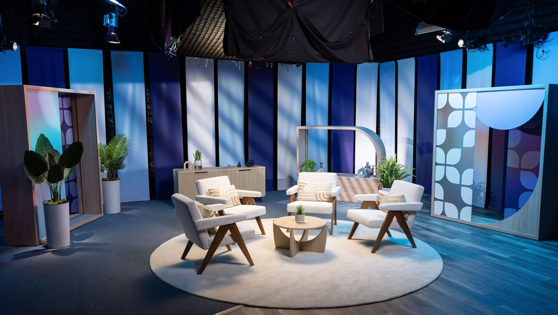
Connelly worked with the business networking site to create a new multipurpose studio at the company’s San Fransisco headquarters.
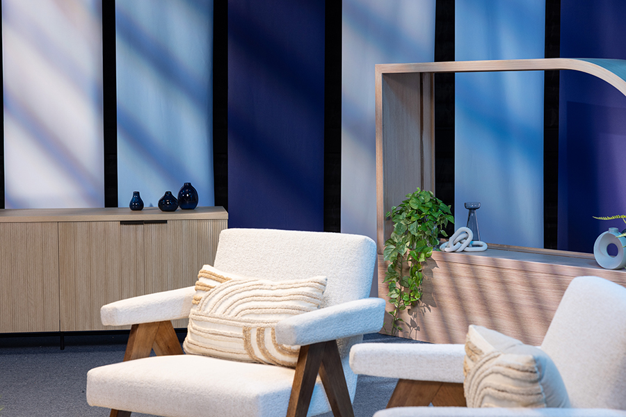
Used for both internal and public-facing video productions, the space echoes the familiar LinkedIn blue with a healthy dose of beiges mixed in, another color the site has started using more.
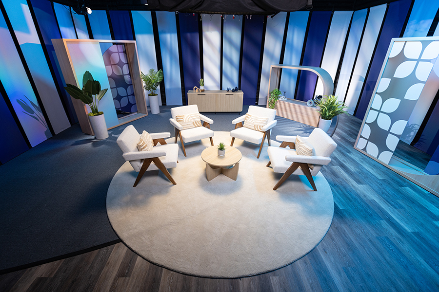
The studio is wrapped with long, vertical graphical panels.
Initially, these are provided in various shades of blue, but LinkedIn has the option to swap them out with any other design in the future by unclipping the current ones, rolling them up for storage and replacing them with printed canvas in whatever new look the company wants.
“We gave them a flexible system and a whole lot of toys to play with,” explained Connelly, noting that the entire space can be easily reconfigured by not only changing out the background graphics by moving around scenic pieces and its curated furnishings as needed.
Scenery-wise, Connelly’s team built several open cabinet-like units that can slide around the space thanks to “skis” installed under the bases.

Each segment features open space with a blend of translucent and solid panels mixed in.
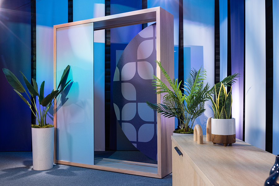
A driving theme in the design is the use of a petal-like shape, which appears prominently in the frosted panels in two of the wild scenic units — as well as part of one corner of one of the scenic pieces and even in accessories such as throw pillows.
“The colors are exactly their colors but for television conversational purposes, they branched out a little bit to choose a new pattern to weave in,” said Connelly. “I think it’s working really well. The scale of it is definitely working well in the closeups and in the wide shots.”
That petal isn’t officially part of the LinkedIn brand style guide, though it has close ties to the circles in LinkedIn’s dotted “i”s and the rectangle inspired by the box surrounding the word “In,” both of which are called out as signature shapes in the brand standards.
The shape, however, was ultimately landed on through a collaborative design process.
“It was great that they were willing to go forward with the shape without being so restricted by brand guidelines. That’s the best part about set design — sometimes just seeing people play in your sandbox,” said Connelly.
The shape can be grouped and arranged in several ways, a visual hint at the “linking” behind the site’s entire business model — but still remaining friendly and approachable.
“To me, it also captures the essence of what an app is. It’s a little square with rounded corners,” noted Connelly.
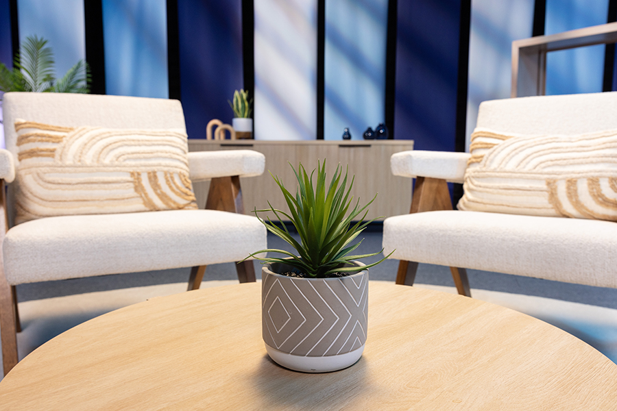
Connelly selected a gray-beige for the modular set pieces while incorporating warmer woods that skew more toward the beige end of the spectrum with the stylish chairs.
As it happens, adding in a smattering of warmer shades and hues is a key part of LinkedIn’s color system, which has evolved to become less reliant on blue, according to the company’s brand site.

The space’s first batch of printed canvases does rely heavily on blue, but uses a mix of shades that go from a very rich and deep selection to an almost-white tint.
These were installed in a purposefully non-patterned arrangement, a strategy that allows them to blend into the background and not feel overly structured.
The strong vertical lines created in the empty space between panels not only helps define the space’s scale, but it’s also carefully carried through with the lighting thanks to vertical-slat gobos that cast over the printed panels and scenery.
Connelly also paid close attention to the floor.
“We added some new flooring to not only ground their home base area, but to allow four different shots to have interesting flooring and not be monotonous,” he explained.
The permanent flooring materials can bisect a circular area rug in off-white, which serves as another nod to the mixed of circular shapes and right angles found in the brand’s look.
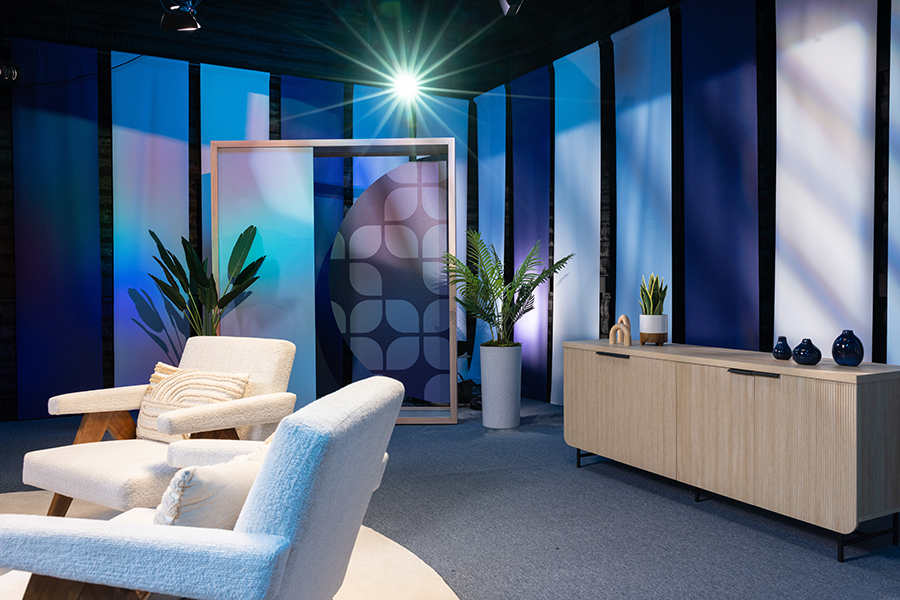
The space is, like most of Connelly’s projects, accessorized with a very close attention to detail. Potted plants in a variety of options bring in a touch of nature and help break up the blue, gray and beige tones.
Small decorative items, including the aforementioned beige and white throw pillows, all include nods to the mix of straight and curved lines, the space’s color palette or, in the case of an oversized decorative chain piece and converging chevron pattern on a planter, the idea of connection and networking.
Connelly is currently working on some additional studio spaces for LinkedIn, having already collaborated with the company on one other previous project.
“This has really taught me this flexible asset building approach to repurpose these assets and be very efficient with their programming,” said Connelly.
“LinkedIn taught me a lot along the way on how to design and engineer these elements for the onsite team — then repurpose,” he explained, noting that this concept is likely to find its way into designs for other brands he works with as well.
Photos courtesy of J.P. Connelly and LinkedIn.

tags
Corporate Production, J.P. Connelly, James Pearse Connelly, LinkedIn
categories
Branding, Broadcast Design, Broadcast Industry News, Corporate and Enterprise Video Production, Heroes, Set Design