Ft. Myers station debuts new graphics designed around concept of connection
Weekly insights on the technology, production and business decisions shaping media and broadcast. Free to access. Independent coverage. Unsubscribe anytime.
Ft. Myers, Florida, station WINK has unveiled an updated logo, brand design and new motion graphics designed to capture the notion of connection and navigating through the stories it tells.
Vivid Zero, the creative arm of SmithGeiger, handled the redesign.
Another one of the agency’s big projects, a group graphics package for ABC-owned stations, started rolling out in June 2023, with more stations debuting the design into 2024.
Much of that work was said to be driven by research, though SmithGeiger and ABC declined to provide further details in June when NewscastStudio requested comment.
The WINK package, meanwhile, appears to share at least some creative threads with the ABC design but with a slightly cleaner and more refined feel.
WINK logo redesign
At first glance, WINK’s new logo doesn’t look all that different from the old one — it’s still a wide, fairly thick sans-serif with a red underline.
One version of the old WINK logo. Various color schemes have been used and sometimes the underline does not appear.
WINK is one of a handful of TV stations in the U.S. that treat their call letters as a word for the purpose of on-air branding. In the past, there was some speculation that the calls were picked as a nod to the CBS eye logo, but the letters’ origins in radio actually predate that design.
The station wisely opted to keep the “WINK News” name and pronunciation.

However, Vivid Zero made some subtle but key tweaks to the station logo. First, the typography is slightly bolder, which helps make the overall look feel stronger.
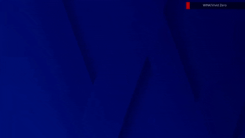
WINK’s K-point
The design also modifies the “K” into two separate strokes — the traditional vertical one and a separate chevron to form the arm and leg of the letter. Dubbed the “K-point” in the brand case study, the element has obvious visual connections to an arrow.
![]()
The design allows for the point to be placed inside of a backplate box and rotated to face each of the four cardinal directions as a visual cue to draw the viewers’ eyes toward important information.
This includes the option to have it appear as a sort of “loading” indicator for the logo — with the K-point popping up on screen and shifting into a “W” through an expanding box and then filling in the remaining three letters as the entire lockup slides left.
The WINK name can also appear with shadow accents added to create a sort of ribbon-like look that also emphasizes the logo’s angles and endpoints.
‘W’ icon option
In addition to the full WINK call, there is also the option to use the “W” alone.
The single-letter layout works well for app icons and social media avatars.
![]()
That said, the “W” by itself doesn’t immediately conjure any relation to TV or the station, though WINK is the only one of the big four TV stations in the Ft. Myers market to brand using any word that starts with a “W,” so in that context, it’s a clever move.
It’s worth noting that, aside from app icons and some accents throughout the graphics, the “W” is mostly used as a jumping-off point for the rest of the letters to appear on the screen, which makes the relationship between the standalone letter and full station name more evident.
In this article:
- Logo, icon and K-point
- Visual language, animation and opens
- Lower thirds, insert graphics, tickers and bugs
- Weather graphics
- Fullscreen graphics, wipes and video wall graphics


tags
Ft. Myers, logo design, SmithGeiger, Vivid Zero, wink
categories
Branding, Broadcast Design, Broadcast Industry News, Graphics, Heroes, Local News, TV News Graphics Package