
ABC owned stations’ graphics package leverages purposeful motion, 3D

Subscribe to NCS for the latest news, project case studies and product announcements in broadcast technology, creative design and engineering delivered to your inbox.
After a multi-year design and rollout process, viewers in two markets can now see variations of the ABC-owned station’s group graphics package, that is a blend of carefully crafted 3D elements, purposeful animation and sweeping movement.
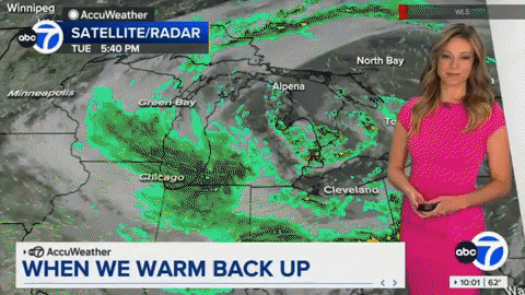
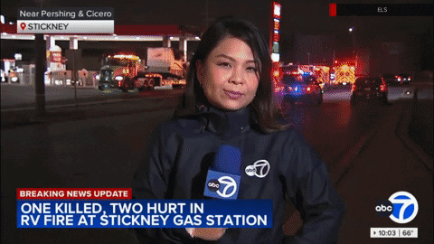
Hints of the new look first started appearing on Chicago airwaves in 2022 when WLS switched its weather graphics to a design that ditched its glassy, lens-flare heavy design in favor of a simplified, flatter look.
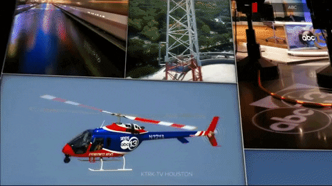
Almost a year later, WLS would introduce matching graphics across its newscasts. KTRK in Houston would follow in the following months.
Created by Vivid Zero, the creative services division of research firm SmithGeiger, the new look is said to be heavily research-focused. However, ABC, SmithGeiger nor Vivid Zero would discuss the new look or the research that guided the process with NewscastStudio after making repeated promises to the contrary.
The redesign process was also intertwined with an extensive multi-million dollar upgrade of production control rooms at the stations, working alongside Ross Video and its creative services division, Rocket Surgery.
Across the eight stations, Ross XPression is now standard for graphics with Rocket Surgery handling the implementation. This includes deep integration in Overdrive for automation. Other control room upgrades include Acuity and Graphite switchers and connections with Datalinq and DashBoard.
Opens and stingers
Overall, it is easy to see how current design trends drove the new look, given its flatter yet still 3D-driven look that draws from isometric style with motion that feels influenced by the swiping and flicking that dominate our mobile-first world.
A core part of the new design is based on a series of shifting views of the 3D elements.

Conceptually, this is realized as if the graphics are taking place inside an imaginary 3D space made of large, modular segments. Some feel like a giant wall of framed blocky pictures, while others conjure the feel of wandering by a large, curved video wall.
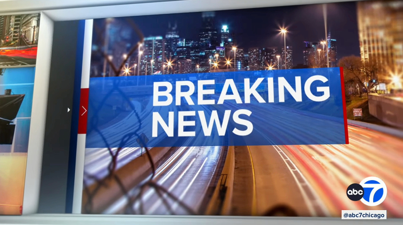
The 3D feel is most evident in the news opens, which showcase a strong vertical image taking up most of the screen before shifting sideways and wider as a 3D block with the newscast logo rotates into place.
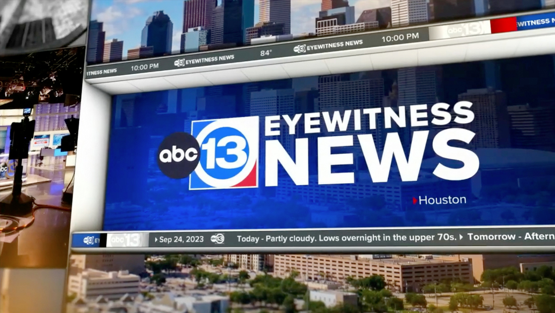
This logo panel sits inside of what appears to be an alcove in the 3D wall of “bento box”-style imagery as real-time tickers scroll by above and below the edge of a ledge-like space near the bottom and above the lip of the alcove’s imaginary ceiling just above.
Once the logo panel rotates into place, the viewport hangs out here briefly with only subtle movement before the far right of the logo block is revealed as an opening that is used to reveal live video, whether it be fullscreen footage or a camera shot — or even another animation.
When a station opts to put two animated elements back-to-back, they match up and feel like a continuous sequence.
For example, a breaking news stinger can run immediately after the open, giving the feel that the viewport whipped around to view another part of a 3D space.
All of these stinger sequences, meanwhile, can fall under one of several distinct looks that both WLS and KTRK have used.
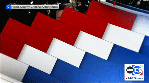
The first is a blocky look with rectangular colored segments with a text field in the middle. This is typically used without any topical imagery for “now” and “next” stingers.
Another look boasts a more 3D feel and features another closer view of an imaginary alcove with multiple frames for imagery that varies based on use.
Finally, there are also two versions with curved ribbon designs that conjure visual connections to the Times Square home of “Good Morning America.”
Some of these are designed to accommodate multiple graphical elements, including the station logo and topical images that dominate the viewport before shifting to a franchise logo or text on what would be the far right of the space if it were a real environment.
The other variation features a shorter curved portion preceded by a fullscreen collage of imagery.
Many of these fullscreen elements are a collection of other elements, including rotating column-like 3D blocks, colored vertical bands in solid or alternating color patterns with the option for arrow accents, accent text or circular elements.
Some stingers also include “live” elements such as the current time, which appears to be updated dynamically so it reflect the true time.
Subscribe to NCS for the latest news, project case studies and product announcements in broadcast technology, creative design and engineering delivered to your inbox.

tags
ABC Owned Television Stations, Acuity, ktrk, Rocket Surgery, Ross Acuity Production Switcher, Ross DashBoard, Ross Graphite, Ross Overdrive, Ross Video, Ross Video Datalinq, Ross Xpression, Vivid Zero, wls, XPression
categories
Broadcast Design, Graphics, Graphics Systems, Heroes, TV News Graphics Package, TV News Motion Graphics Design