
South Dakota Public Broadcasting unveils brand refresh
Weekly insights on the technology, production and business decisions shaping media and broadcast. Free to access. Independent coverage. Unsubscribe anytime.
South Dakota Public Broadcasting has unveiled an updated logo and branding.
The organization, which runs a network of radio and TV stations across the state, dropped its longtime logo with a bird icon and serif typography.
The logo, while not groundbreaking, does a fair job of streamlining the brand’s primary identifier.
Old logo.
SDPB worked with Sioux Falls, South Dakota, branding agency Fresh Produce to create its new look, which centers around a boxed “SDPB” wordmark set inside of a box.
Typography switches over to a slab serif that’s been smoothed out; the only straight 90-degree angles are found in the series themselves.
While all four letters get this treatment, it’s perhaps most notable in the “S,” with its two curved notches at the top and bottom of the glyph that completely the curvy nature of the character, as well as in the “P” where the lower portion of the letter’s loop tucks up to the left vertical bar with a slight upward curve.
The new logo’s typography actually triggers reminders of the old PBS logotype, which was set in a slab serif next to its iconic profile emblem.
Various PBS member stations and the organizations that operate them have taken different approaches to rebranding over the year; some embrace the blue-centric PBS look and its custom PBS Sans font, while others go completely in a different direction.

That’s not surprisingly given that many of these organizations, like SDPB, carry programming from PBS while also running radio properties fueled by NPR, Public Radio Exchange and American Public Media. These various organizations do not share a common branding strategy or look, which adds a layer of complications when trying to design a logo or brand for a media outlet that operates in both radio and TV.
SDPB and Fresh Produce conducted a survey of 581 people and interviewed over 60 people across the state when researching the new brand.
“As with any design research, it tells you exactly what to do. We listened to people who care about and associate with SDPB, and those conversations told us exactly what kind of colors we needed to look for, what kind of energy to incorporate, how it needed to sound, how it needed to be written, and what it needed to evoke. It was almost seamless and a complete joy to work on. From a design standpoint, it fell onto the page perfectly,” said Fresh Produce senior graphic designer Tom Bates.
During Fresh Produce’s research ahead of the redesign, the words “curious” and “affectionate” stood out, according to an SDPB article about the update.
A particular quote from a survey response ended up being a stand-out example of how Fresh Produce made creative decisions: “Eager and articulate person, excited about living.”
“That seemed to capture an audience who loves SDPB and wants to be a part of it. The audience is also active, resilient, and courageous. My favorite is the teacher, questioner, and trickster,” said Heidi Marsh, the account executive for the project.
True to that image, the design still manages to be bold and more memorable than the old look with the rounded corners serving as a subtle nod to being approachable and friendly.
Fresh Produce wisely opted to not use the outline of the state of South Dakota in its design, but it’s still worth noting the final logo’s footprint is roughly the same as the state’s boundaries.
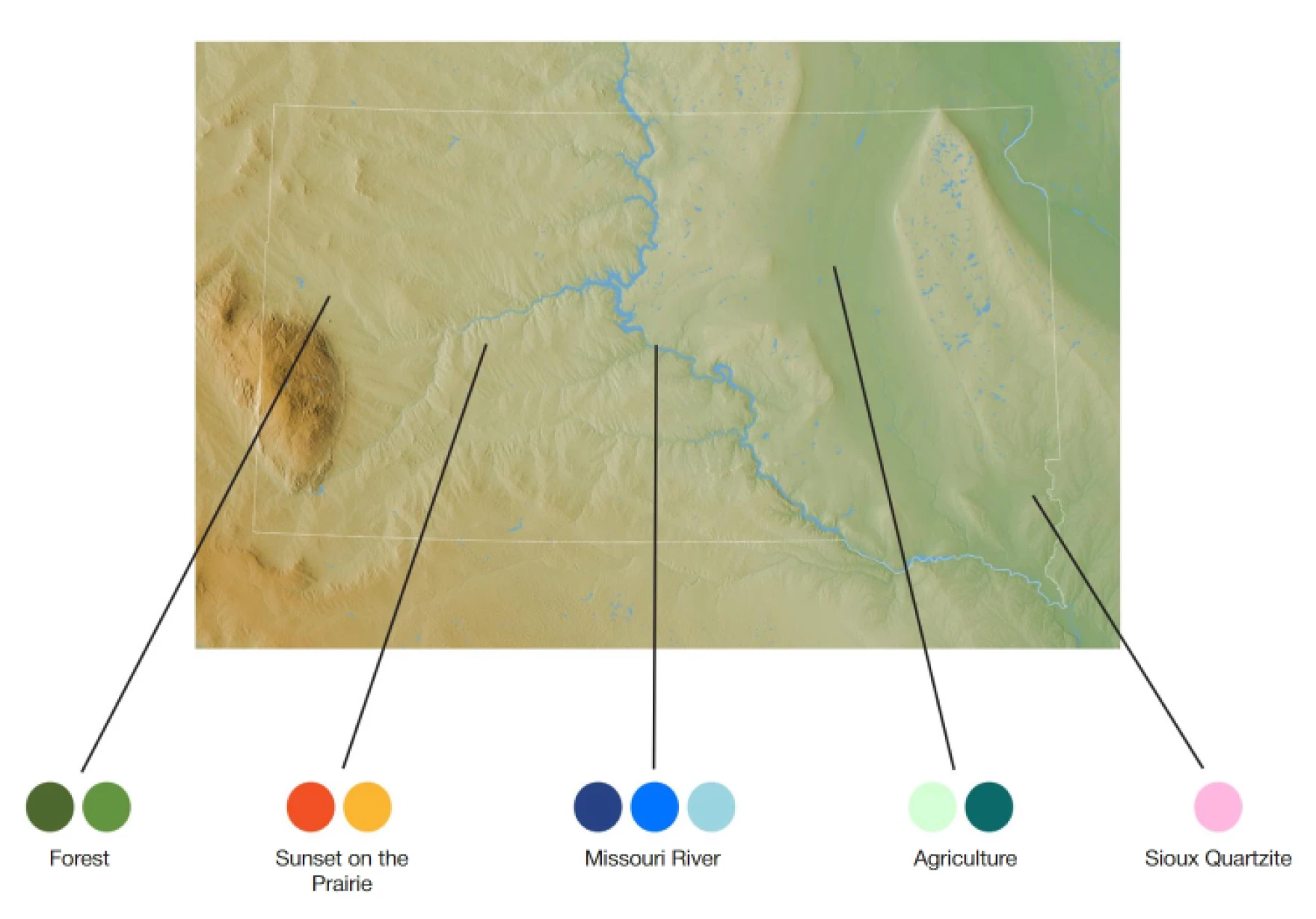
Beyond the logo, SDPB has also been provided with a color palette that it says is inspired by various geographical and geological features of the state.
The official palette has colors taken from almost every major part of the spectrum, with the possible exception of a true red.
Instead, there’s “Sioux Quartzite,” a friendly pink shade that, largely thanks to its uniqueness, stands out in full-color applications.
Colors from across the palette are used in various ways in on-screen visuals, which are defined by a series of horizontal bars that shift across the vertical axis, creating a nod the “slab”-like look found in the logo.
Additional animated assets divide the screen into segments or use colorful blocks that reveal from one corner of the screen or element within the screen. There is also the option for these to appear nested within each other, though at various thicknesses.

tags
logo design, South Dakota Public Broadcasting
categories
Branding, Broadcast Design, Broadcast Industry News, Heroes