
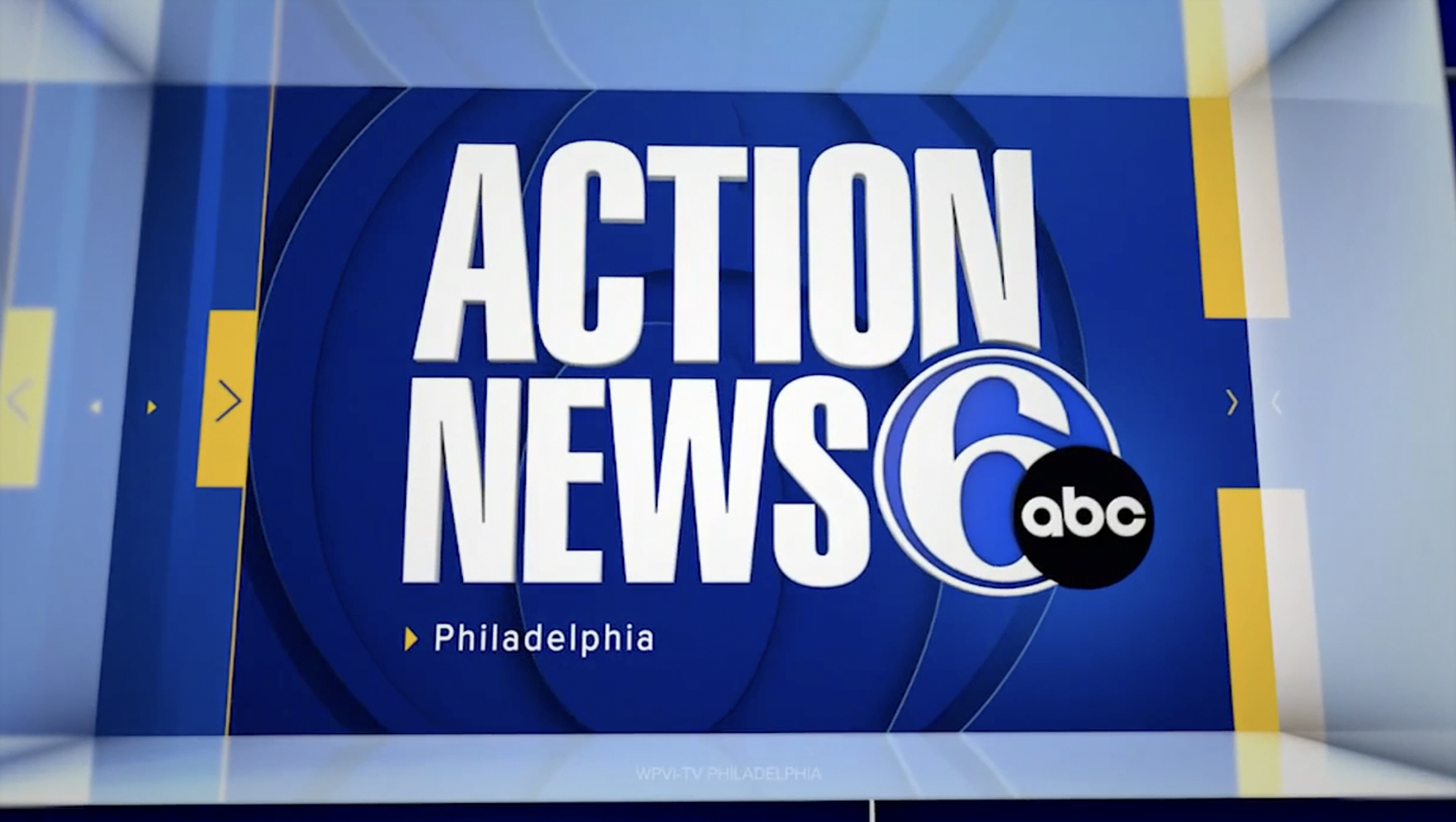
6ABC gets new ABC-owned graphics — but retains distinctive opens
Weekly insights on the technology, production and business decisions shaping media and broadcast. Free to access. Independent coverage. Unsubscribe anytime.
WPVI, the ABC-owned station in Philadelphia, switched over to the group’s new graphics on March 13, 2024, at noon — but, as with just about everything supposedly “standardized,” the station is doing things its own way.
The station, which is a longtime market leader and local institution, is often prickly about making changes for fear of upsetting viewers. For example, in 1996, the station paid to have its iconic “Move Closer to Your World” theme performed by the London Philharmonic Orchestra but had to revert back to the 1985 version after only three days when viewers complained.
Much of this is attributed to the fact that the station attracts high viewership, and its longtime viewers feel connected to certain elements of the newscast, including talent, graphics and, as the “MCTYW” debacle proved, the music.
The station, not surprisingly, retained “MCTYW” along with the distinctive opens featuring a variety of shots from around the viewing area. It has also kept the voiceover referencing “Delaware Valley’s leading news program” and talent names (even the rather unrefined “CC” designator remains the same).
At the end of this sequence, an animation that feels similar to the in-show stingers that other ABC-owned stations use stands in for a title card rather than the local imagery-heavy and information-driven look used by its sisters that features a version of the station ticker and the time and temperature.
This sequence also strays a bit from the more free-flowing rotating animations used for stingers and segment opens, but does feature the station’s longtime “6” logo entering using a quick series of concentric rings much like that seen at other stations in the group.
Elements from the package, including the information-driven approach, do show up elsewhere at WPVI, with a live ticker appearing in select weather stingers and opens. Animations feature fewer accents, such as microtext, though the arrow element is still fairly consistently used.
The package has also been tweaked to use oversized versions of the “6” logo and “Action News” logotype.

The new graphics package’s blockier, more structural look is a departure, especially in fullscreen elements, from the station’s previous package, which centered around more curved elements. It’s surprising that WPVI doesn’t seem to use the curved versions of the new package more since it could maintain some consistency between old and new.
Overall, the station also seems to use fewer instances of animated stingers and segment opens in general, echoing its previous style and pacing.
The old lower thirds.
It’s worth noting that many viewers likely won’t notice much of a change in the most common type of graphic — the lower third. Closer observers will note changes to the typography, color, margins, spacing and use of lines, boxes and stacked hashmark accents, though.
The station already has many distinctions from many of the other ABC Owned Television Stations, which partnered with Vivid Zero and Ross Video’s Rocket Surgery to create the package.
WPVI, for example, does not use the “Eyewitness News” branding like sister stations WABC in New York, KABC in Los Angeles, WLS in Chicago, KTRK in Houston, Texas or WTVD in Raleigh, North Carolina. In fact, the “Eyewitness News” format and name actually came to Philly when Westinghouse brought the KYW calls, management and format to town in 1965 from Cleveland, prompting the WFIL (now WPVI) news director to create the Action News format.
It’s also not branded as being on Channel 7 like WABC, KABC, WLS, or KGO in San Fransisco. Like WPVI, KFSN also uses “Action News” while KGO is simply “ABC 7 News,” something that Chicago’s WLS tried for a time.
All of the other ABC-owned stations also use at least some of Gari’s “Eyewitness News” theme music except KFSN (KGO uses the theme music despite not using the “Eyewitness” name).
The station, which has long been dominant in the ratings, has often been slow to adopt on-air changes over the years, likely for fear of changing more than it thinks viewers can handle.
For example, WPVI continued to use real walls with painted maps and movable text placards in place of chroma key graphics and maps until much after most other stations.
It’s not immediately clear why WPVI took so long to roll out the new look, whether this was the planned implementation schedule or the station was wrestling with how to make the look work within its trademark style.
As with the other stations in the group, WPVI also received a variety of control room upgrades with the rollout, supplied by Ross Video.

tags
ABC Owned Television Stations, Move Closer to Your World, philadelphia, Rocket Surgery, Vivid Zero, wpvi
categories
Branding, Broadcast Business News, Broadcast Design, Graphics, Heroes, Local News