‘Don Lemon Show’ graphics are one big sour mess
Weekly insights on the technology, production and business decisions shaping media and broadcast. Free to access. Independent coverage. Unsubscribe anytime.
Former CNN anchor Don Lemon’s new digital show launched March 18, 2024 with a look that leaves much to be desired — and is perhaps illustrative of just how far the former cable news star has fallen.
Titled, rather unimaginatively, “The Don Lemon Show,” the first episode features graphics that are distractingly bad and outdated.
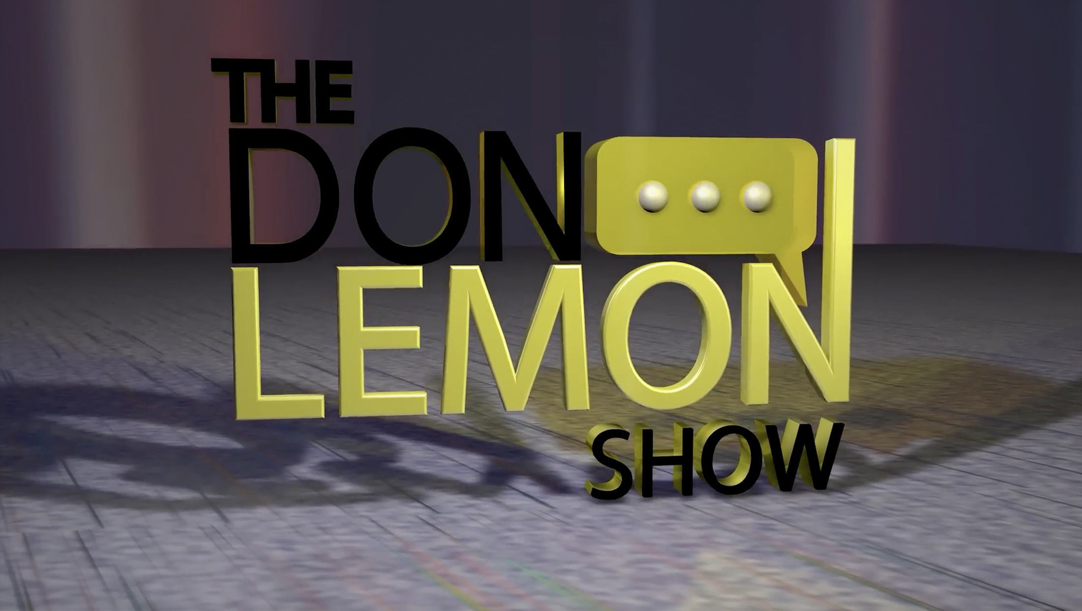
The fairly awful logo with odd spacing and seemingly inexplicably extended “N” somehow manages to get even worse in the show’s opening animation.
For the open, the logo is now 3D — complete with shiny gold sides on black elements that feel like a crash between WordArt and some 2000s-era Photoshop layer effects.
The entire logo sits within a murky dark space with an odd gray texture that feels like a blanket of 8-bit tiles. Beyond this surface’s “horizon” is a murky background of an odd blend of gray, tans and a sort of dusty orange.
A bit of that orange — along with a magenta — also appears in the quick animated sequence before the full logo appears. In this case, it’s a close-up view of one leg of the “M” rendered as if its made of stained glass with an overkill of beveling and lighting effects.
Despite the choice of yellow being an obvious nod to Lemon’s last name, the shade selected here feels a bit sour. There’s a sort of strange overcast to it and it even gets a bit of a sickly sallow.
Oddly, the shades of yellow used in the brief glassy rendition of the “M” actually briefly get a slightly more cheerful tinge to them despite starting out feeling a bit too much toward the green end of the spectrum. However, right around the same time, the shade starts to feel a bit more “lemony,” it’s also hard not to get the feel of floating through — shall we say, a certain type of medical specimen.

In the open, the three dots in the speech bubble icon become animated. The white-ish orbs, which also seem to suck in the muddiness of the rest of the scene, fly into the surface of the bubble and then seemingly get sucked in, as if it’s made of jelly, before poking back out to suggest a live chat-style “typing” animation.
The whole open is wiped clean with a burst of another glassy look and flash of light reflecting off the overly-beveled edges.
During the bulk of the show, a black bar with a smear of yellow runs along the bottom of the screen, advertising Lemon’s social media handles and other information.
The bar has rounded yellow caps that resemble a crescent moon (or maybe a slice of lemon?), but the entire design feels, again, like someone had a bit too much time with Photoshop layer effects back in the 2000s. It appears the bar is sort of trying to be like the famous Apple “gel” buttons, except that it’s solid and the end caps feel thrown on as an afterthought.
Making matters worse is the unrefined default-looking typography that introduces another sans serif to the mix that can’t even be bothered to match the logo.
Social media icons appear with overly prominent white reflection effects (though a keen eye will notice the Spotify one is inconsistent, and X’s X icon, which doesn’t lend itself to the effect, gets a sort of partial circle white overlay.
The entire first show features a sort of wannabe sidebar element on the right side of the screen set in blue (where did that come from?). It appears to be an attempt to match the glassy edges in the open and other parts of the limited graphics, though its semitransparent mask help knock down the edginess a bit.
The sidebar oddly fades out about two-thirds of the way up the screen — and it’s never entirely clear why it’s there (other than just to be there). Camera framing doesn’t really seem to account for it.
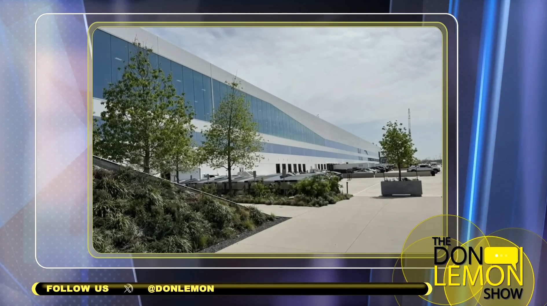
The blue sidebar suddenly makes sense when it’s used with a fullscreen graphic, such as this photo of a SpaceX facility.
Below the blue element is an oversized show logo bug placed on top of a kaleidoscope of overlaying circles with varying levels of transparency.
This element is perhaps the strongest part of the graphics package (which isn’t saying much) and perhaps should have been explored as an overall motif for the show. Instead, it ends up feeling a bit out of place amidst all the in-your-face straight edges and glassy textures with light bursts.
The circles also suffer from being in a similar icky yellow — and the blue background behind it doesn’t help, creating pools of sort of green-ish, sort of yellow-ish in the corner of the screen as the circles move around.
While all that animation might be a bit of overkill for a bug, the overall idea shows some promise — including as an interesting way to incorporate the concept of “Lemon” and “lemon slices” into the visuals without being overly literal. The idea could also probably use some refining in terms of not only the shade of yellow but also the comparative brightness and transparency of the solid borders and fills used.

All that said, Lemon’s show does get one key thing right — the lighting on the host setup.
The lighting notably gives of crisp reflections from the black phone on Lemon’s desk, which is also bathed in a nice pool of light. It also brings out the silver in the old-fashioned microphone on the other side of the desk, though its placement feels entirely too stiff.
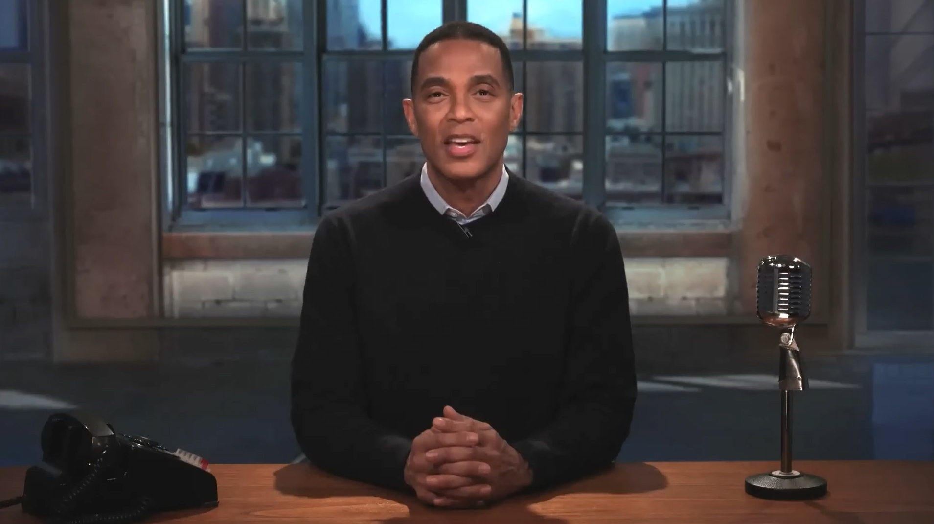
Lemon sits in front of a background that appears to be attempting to create the feel of an industrial loft. The image used here feels low-resolution and has some odd textural decisions, but overall isn’t that bad.

tags
Don Lemon, The Don Lemon Show 2024
categories
Broadcast Design, Featured, Graphics