Paramount, Skydance attempt to combine their logos — and the results aren’t great
Subscribe to NCS for the latest news, project case studies and product announcements in broadcast technology, creative design and engineering delivered to your inbox.
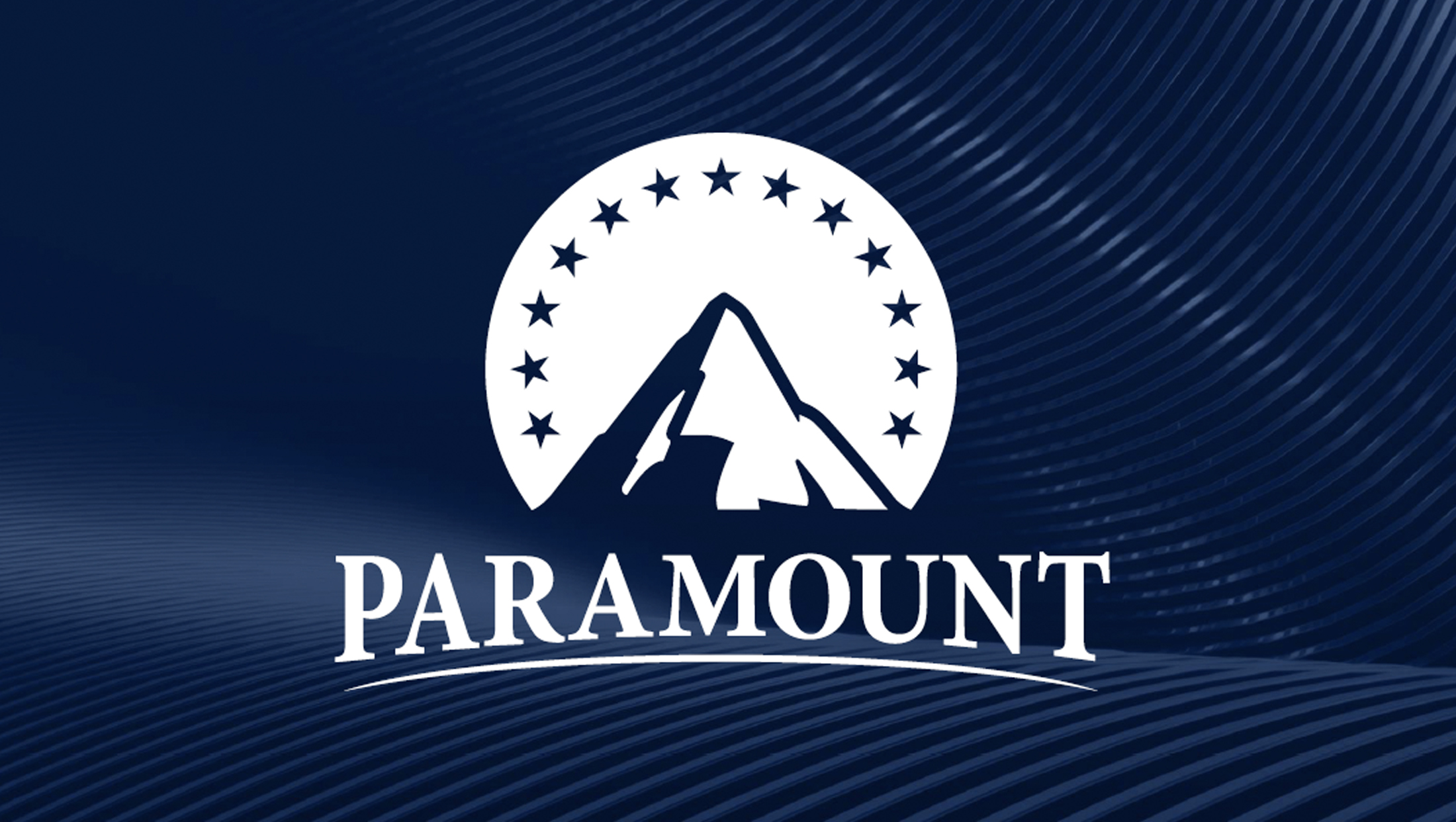
During an investors’ call July 8, 2024, Paramount Global and soon-to-be-owner Skydance Media unveiled a mockup of a potential new logo for the combined company.
The logo, which has not been confirmed as being final and could change at any point, combines the Paramount mountain emblem with a typographic element spelling out the company name in a similar way to how Skydance styles its logo.
It’s also possible the Paramount Global logo introduced July 8, was meant more as a symbolic representation of the two brands coming together than an actual corporate logo.
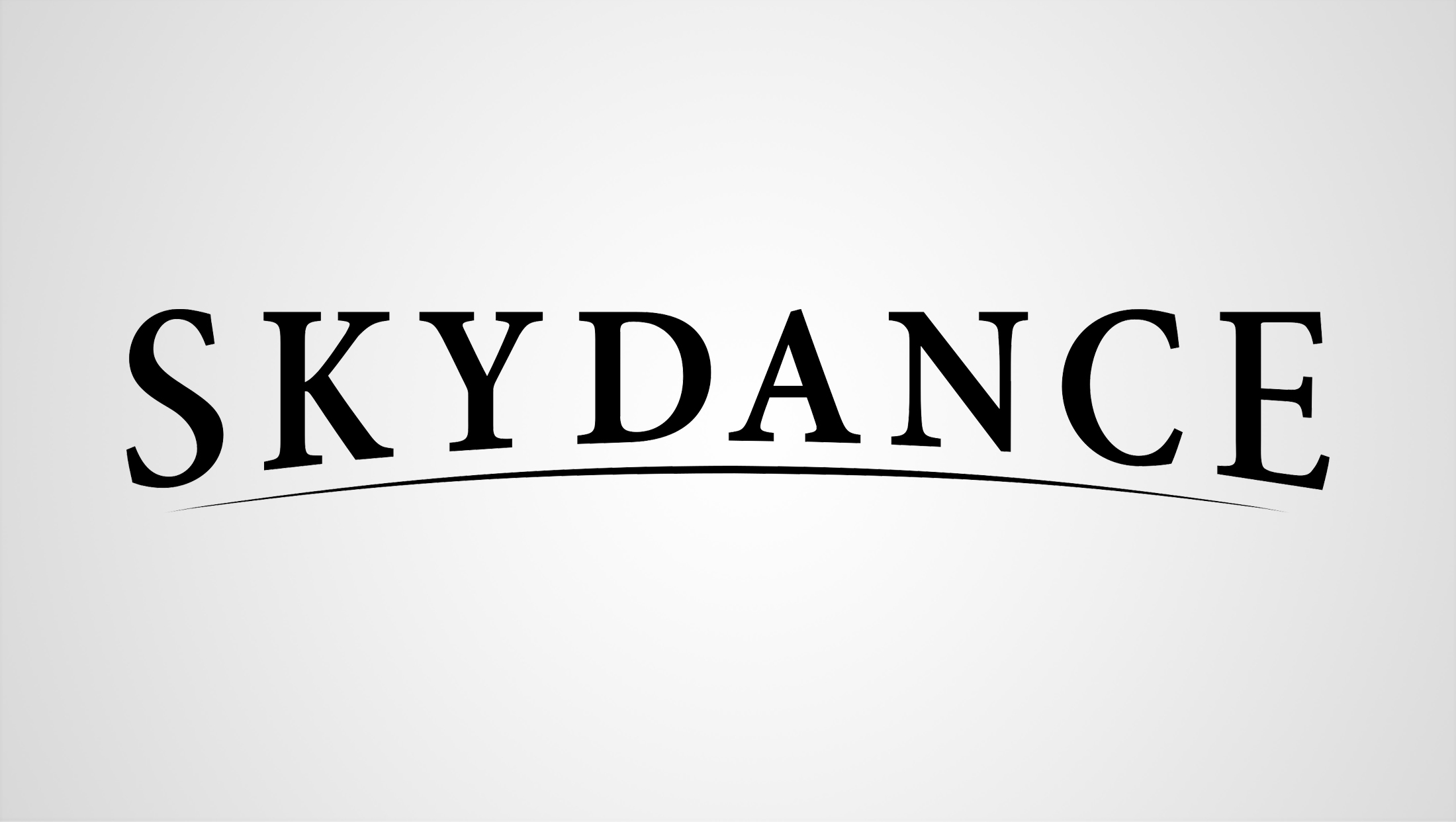

The Skydance logo.
The font, which appears to be a bold version of Minion, also includes the thin arc accent found in the Skydance look below.
Unfortunately, the result is less than ideal — but not unexpected given it was likely a quick attempt to quickly blend two brands’ looks together.
It’s fairly clear that “Paramount” was simply typed out in all caps, morphed slightly to follow the curve of the arc below. Little attention has been paid to the spacing between letters, especially with how the tips of the series interact with each other.
Minion is known for the distinct “tail” in the “R” and that does appear in the merged logo but feels like it could have been refined a bit.
In some way the use of both a mountain with circular surround and ring of stars and the curved arc, which could be interpreted as a hill or horizon, also creates a mixed metaphor of sorts.
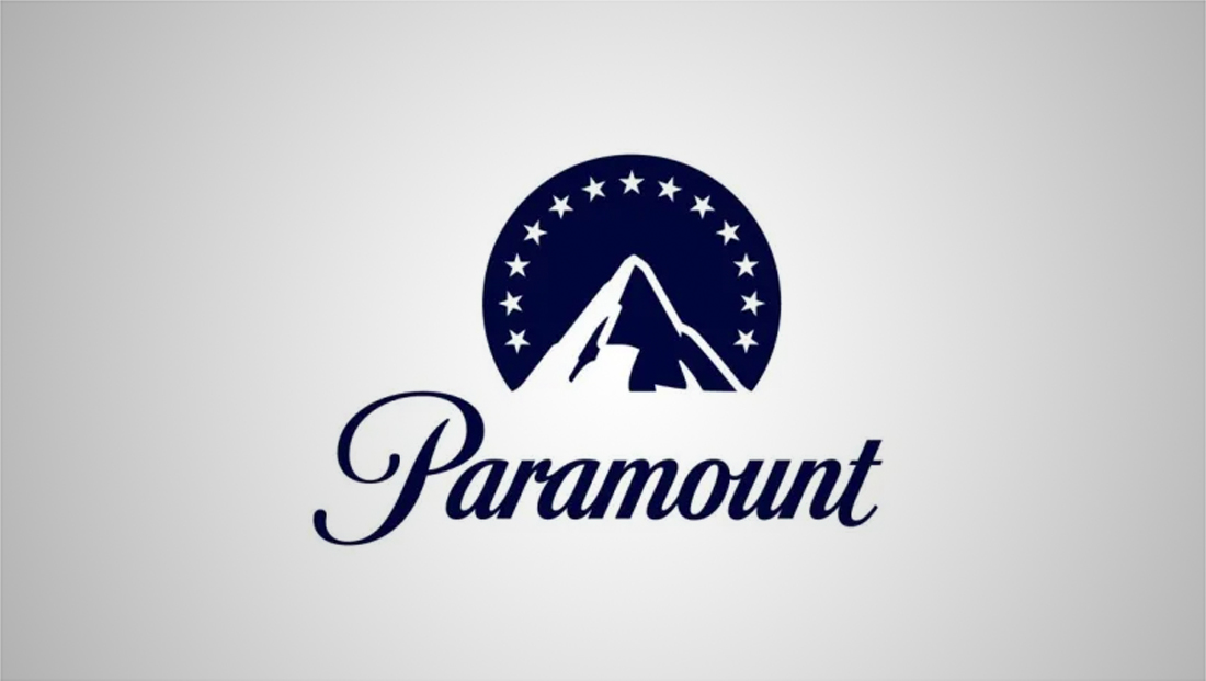

The Paramount Global logo introduced in 2022.
Paramount Global’s current logo was first introduced in 2022 when ViacomCBS opted to take on the name of its legacy film studio. It notably has never contained the word “Global.”
The logo created at the time drew on its historic roots, with a slight redraw of the distinctive Paramount script logotype. The mountain peak was simplified and the number of starts reduced for the corporate version of the logo.
The redraw version of the Paramount name was also used as a basis to create the Paramount+ logo, which has a custom drawn plus symbol with angles designed to match the angle of the script lettering.
Most of the brands under Paramount’s CBS umbrella have migrated over to using the TT Norms typeface, which has lead to a consistent look inside of the division.
Again, there’s no official word that this is the final version of the logo the new company will use or if it was simply created for the presentation to investors.
It’s not uncommon for large companies to release temporary logos ahead of major mergers.
Warner Bros. Discovery, for example, released the logo below in the early days after the merger between Warner Bros. and Discovery Inc. was announced in June 2021.
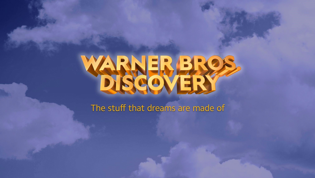

The ‘preview’ version of the Warner Bros. Discovery logo with tagline inspired by classic WB film ‘The Maltese Falcon.’ The design was later revealed to not be the final version of the combined companies’ logo.
The logo was an attempt to take the golden 3D effect used on many iterations of the “WB” shield into a wordmark — and the result was pretty bad too.
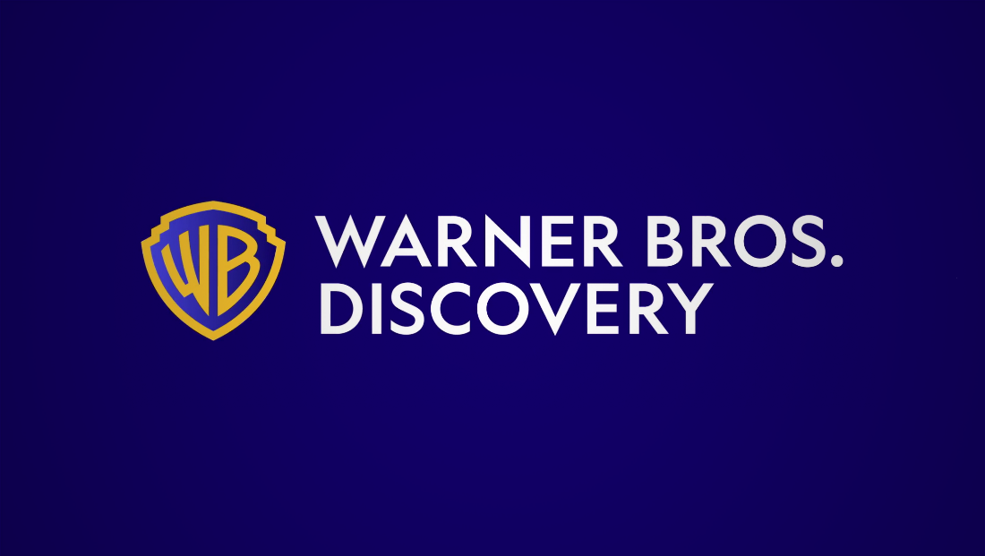

The final (and current) Warner Bros. Discovery logo.
Shortly before the merger was finalized, different versions of the WBD logo began circulating until the official lockup and color palette was formerly introduced.
The Paramount design shown above was extracted from a PDF of the presentation Paramount Global and Skydance showed to investors July 8, 2024.
Subscribe to NCS for the latest news, project case studies and product announcements in broadcast technology, creative design and engineering delivered to your inbox.




tags
logo design, Minion, Paramount, Paramount Global, Paramount Pictures, Skydance Media, TT Norms typeface
categories
Branding, Broadcast Business News, Broadcast Industry News, Heroes