
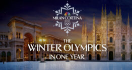
NBC’s Milan Cortino logo reimagines Paris’ layout as snowflake
Weekly insights on the technology, production and business decisions shaping media and broadcast. Free to access. Independent coverage. Unsubscribe anytime.
NBC Sports released its 2026 Winter Olympics logo, a look that continues the trend of using a stylized border element along with a distinctive wordmark.
On the surface, the full lockup of NBC’s logo reads as a snowflake, a graphical look that is achieved with two separate mirror-image elements that include a variety of curves and shapes to provide a simplified version of the fractal pattern found in real flakes.
These two elements wrap neatly around the elements in the middle, which include the NBC peacock, year and Olympic rings as well as the “Milan Cortina” wordmark, which extends outside of the snowflake thanks to open “gaps” on either side.
Detail of upper snowflake element.
The actual shapes and lines that make up the upper and lower snowflake segments are kept relatively simple compared to some snowflake designs and also have visual similarities to the myriad of patterns found on hand-painted tiles and ceramics that are common across Italy.
The outermost points could also be read as having a subtle connection to the Italian fleur-de-lis, which is known as the giglio bottonato locally, which has both cultural and historical significance throughout the country.
What isn’t quite as in line with Italian design is the faint blue-gray color the snowflake elements appear in, though it’s easy to see why NBC went with this choice instead of the bolder colors that are often found in such designs. Not only does it make it easier to read the shapes as a snowflake, but it also avoids competing with the colors in the peacock, Olympic rings and wordmark.
Detail of wordmark.
In the middle of the logo, NBC spelled out the names of the two nearby host cities in Italy in distinctive sans serif, which appears to be at least based on Recline from Digitype Studio, that uses a combination of pointed elements and bold angles and more gentle, curved strokes that also vary in width.
The result is a sort of sleek, modern look that still has a bit of sophistication to it.

NBC modified the lower horizontal line of the “L” to overlap into the left leg of the “A,” likely to help reduce the negative space there that could create trapped white space issues. Other distinctive features include an “R” that has extends from the top of the vertical, hooks around and then, without rejoining the vertical, takes a bit more dramatic southeast route.
In the teaser promo the network released at the one-year-out mark, the network also included an elegant, sans serif with some very distinctive curves and strokes, but it’s not immediately clear what it is or how extensively it might be used. In many ways, it has some characteristics of the Paris 2024 font, though perhaps even more unique strokes.
For the year under this, NBC used a geometric sans serif similar to the one in Paris, but this one has some distinct features.
The two “2”s feature a more rounded and exaggerated curved part of the numeral as well as a horizontal baseline that doesn’t quite extend the width of the widest part of the glyph. The “6,” meanwhile, also uses the more prominent curved shape, which essentially creates a higher x-height that means the top portion of this numeral seems slightly diminutive.
The juxtaposition of using “top heavy” “2”s along with a “bottom heavy” “6” is also interesting.
![]()
It’s pretty apparent how the Milan Cortina logo continues the trend of NBC’s Paris 2024 logo, with both designs featuring a diamond-like wraparound element with a stylized wordmark. The branding was designed by the agency Sibling Rivalry, who also worked with NBC on the 2024 logo.
For Paris, NBC also used an alternative version of the logo that includes only the wordmark, year, peacock and rings.
![]()
For Beijing 2022, NBC’s logo had a bold stylized word mark capped with a geographic reference to snowy mountains, which have been a common theme in logo designs for winter games going back years.
It’s worth noting that the 2026 look does not include a direct reference to mountains, though it could perhaps be argued that the snowflake points could be read as mountain peaks.
![]()
As always, it’s important to keep in mind that the logo that is the primary focus of this article is one developed by and for NBC, as the U.S. English-language rights holder to the Olympics.
It will only be used on NBCUniversal-owned platforms. Other rights holding broadcasters often created their own logos and looks.
The organizing committee for the 2026 Winter Olympics had previously released its own logo, which, if tradition holds up, appear on venue signage and inspire the printed graphic panels that are frequently seen inside of the venues.
The non-NBC Milan Cortina logo was picked after a contest.

tags
2026 Winter Olympics, logo design, nbc peacock, nbc sports, Sibling Rivalry
categories
Branding, Broadcast Industry News, Heroes, Olympics, Sports Broadcasting & Production