
Inside ESPN’s two-year overhaul of college football graphics and branding
Weekly insights on the technology, production and business decisions shaping media and broadcast. Free to access. Independent coverage. Unsubscribe anytime.
ESPN spent nearly two years rebuilding its college football design from the ground up, creating a visual identity that works simultaneously across traditional television, streaming platforms, social media and marketing campaigns.
For ESPN, the project served as both a design refresh and a test of a more coordinated way of working across creative, production and digital teams under its ESPN Creative Studio.
The approach treated college football as more than a single broadcast or program, aiming for consistency across distribution platforms, studio shows and marketing toolkits.
“We’ve completed nearly a two-year journey, really re-imagining what college football looks and feels like across all the ESPN networks, ending in probably one of the most ambitious rebrands we’ve taken on,” said Marissa Dempsey, director, creative strategy & integration, ESPN Creative Studio.
Dempsey described the overall process to the final product as a “first-of-its-kind approach” inside ESPN, starting with the overall brand positioning and logos and ending with the various on-air touchpoints.
“In the past, branding work often happened in silos,” Dempsey said. “This time, we built a company-wide process that included executives from every team. The goal was to think holistically about how the brand lives across platforms.”
The rebrand coincided with preparations for ESPN’s direct-to-consumer platform launch, creating new opportunities to drive fans into the platform while recognizing different entry points.
“It was a company-wide effort, not only to reimagine how college football appears across every product and what that brand looks like, but how we really start to elevate and integrate the ESPN brand itself more prominently,” Dempsey explained.

Joe Lauria, senior creative producer, oversaw production implementation across ESPN’s expanded ecosystem, which now includes 136 FBS teams requiring individualized animations while maintaining flexibility for FCS schools and high school teams.
“At first glance, it’s a little bit daunting. The scale of this project, it’s just massive,” Lauria said. “The challenge was really building a system that works for every single scenario and the wide scope of how we deliver college football to our fans.”
The system needed to function across traditional TV broadcasts, digital shows on YouTube and social media platforms, and ESPN’s direct-to-consumer service.
“A lot of factors to think about when we were planning and executing this whole thing. And it’s just been a massive success for our team,” Lauria noted.
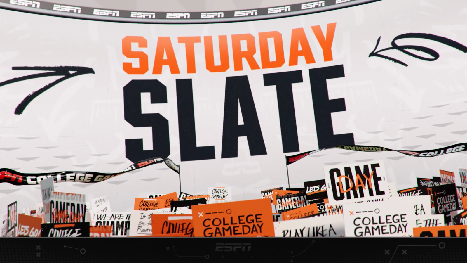
The package also extends to “College GameDay,” which received its own refresh.
Stadium-centric design philosophy
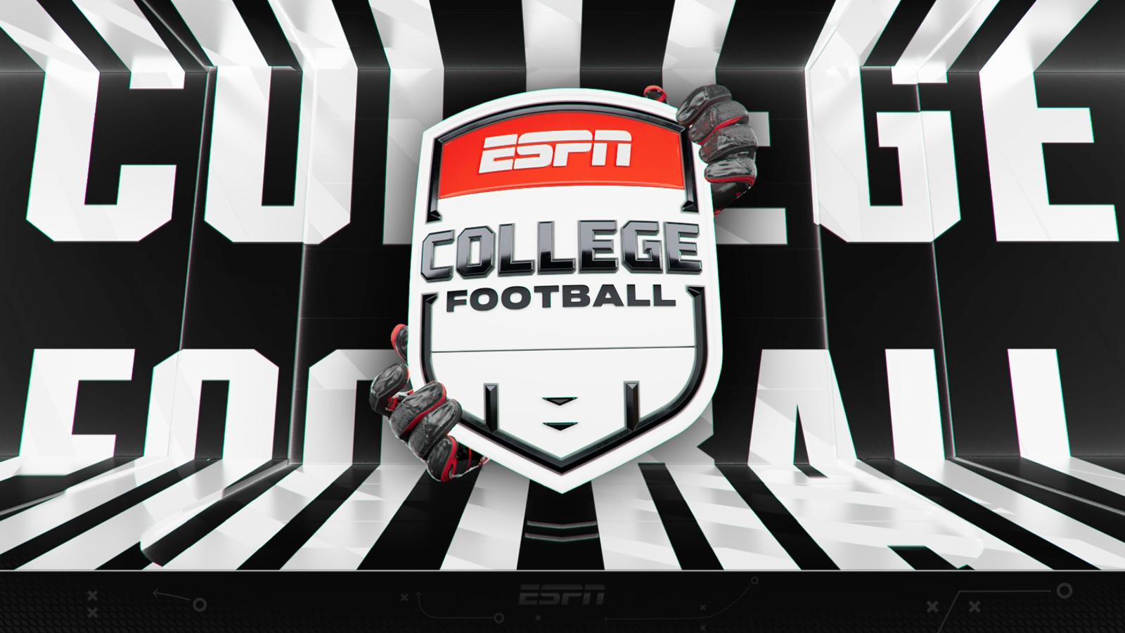
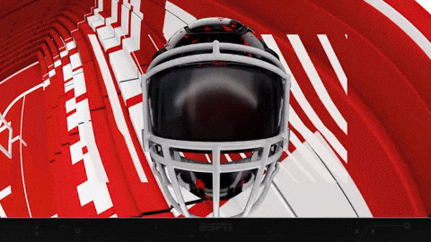
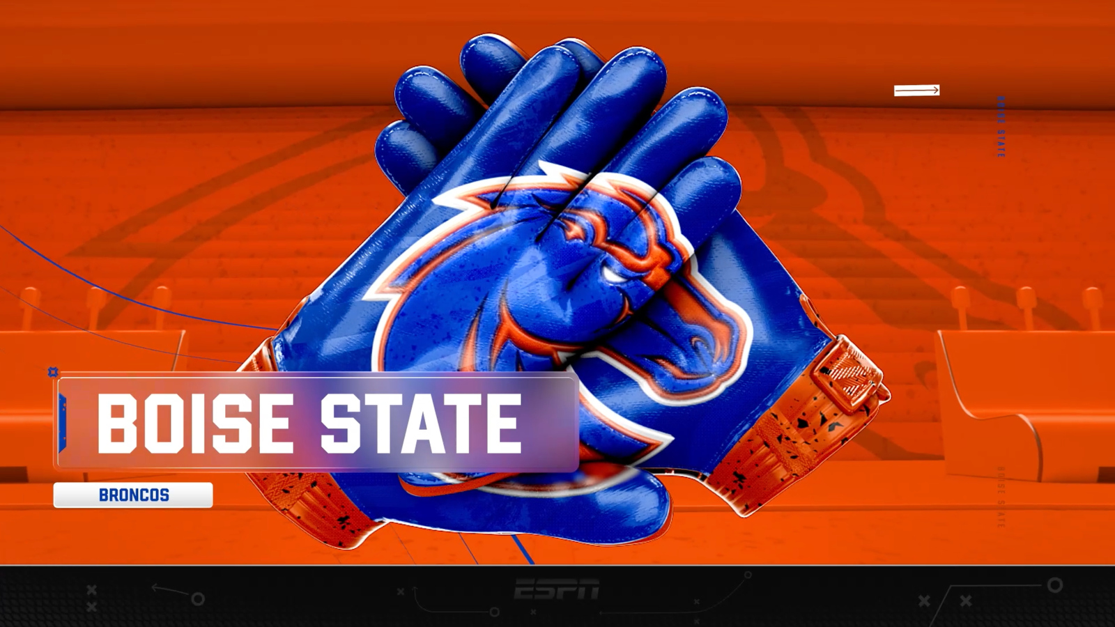
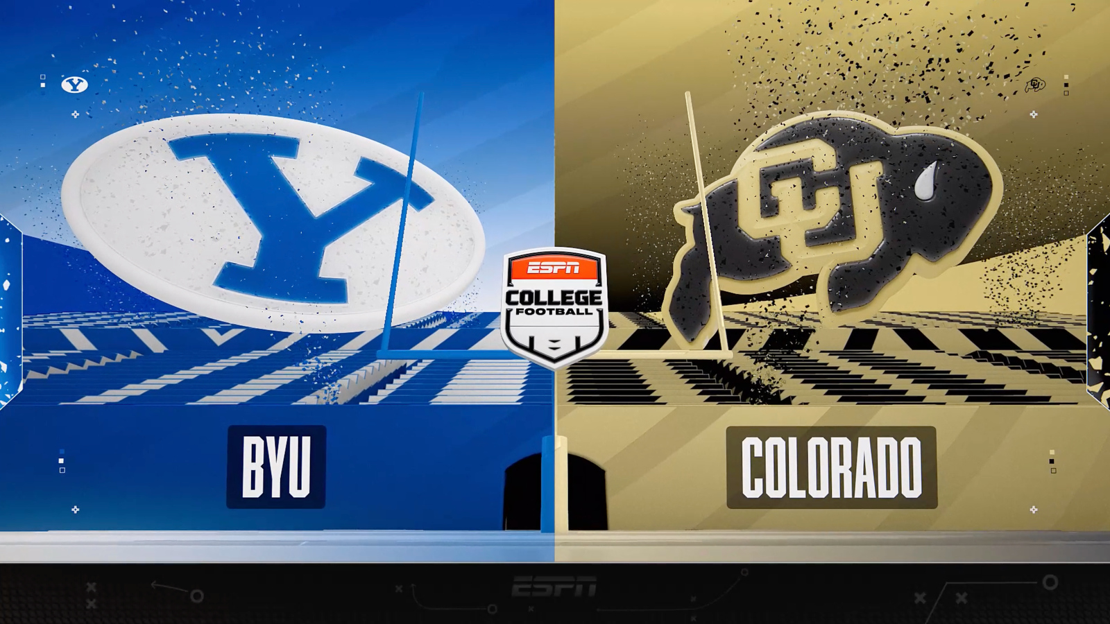
The new visual identity centers around stadium atmosphere as its core design element.

“Our mission was to be bold, colorful, energetic, and fun,” said Brian Girardin, art director, ESPN Creative Studio. “We wanted to embrace the spirit of college football rather than take an overly serious approach.”
The college football shield logo incorporates notches representing crowd and bleacher sections, uprights, end zone elements and field lines to create what Girardin, who led the design work, described as “loose terms of our sort of north stars encapsulating the stadium within the college football shield.”
![]()

This stadium concept extends throughout the animation package, with all elements existing within the stadium and designed to “activate and energize that environment and flood team color through it with typography, team logos, team color and make everything vibrant.”
The rebrand deliberately moved away from the cinematic approach of ESPN’s previous college football package.

“That was an awesome look,” Girardin said of the previous design. “But we wanted to purposely diverge from how moody and intense that was.”
Instead, the team established a mission statement to be “bold, colorful, energetic and fun.”
“Make it really encapsulate the college football atmosphere from fans to game to just fandom as a whole. Let’s have fun. Let’s have color,” said Girardin.

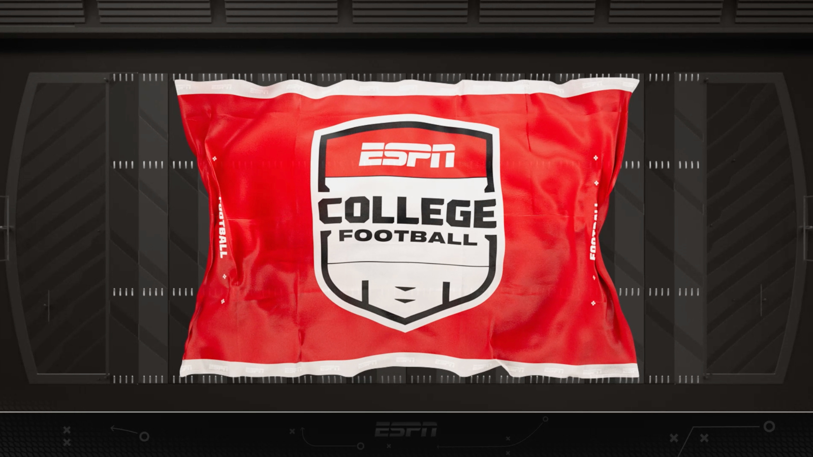
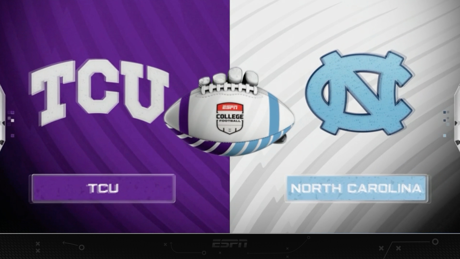
Leaning into this idea of fun, the package incorporates unexpected elements, including animated hands that grab and move design elements.
“We wanted to have a little bit of that fourth wall breaking aspect to things where some of those moments are a little unexpected and you wouldn’t necessarily think of two hands kicking a paper football for a matchup in a football game,” Girardin said. “It’s like, why not? It’s fun.”
Technical evolution and scoreboard design
The new scoreboard design builds on ESPN’s “blitz towers” concept, first implemented in the 2023 “Monday Night Football” redesign and subsequently used in “SEC on ABC” and College Football Playoff coverage.
“The CFB scoreboard is essentially the best of both worlds in terms of what we learned from the ‘SEC on ABC’ scoreboard and what we learned post that for CFP,” Girardin explained.

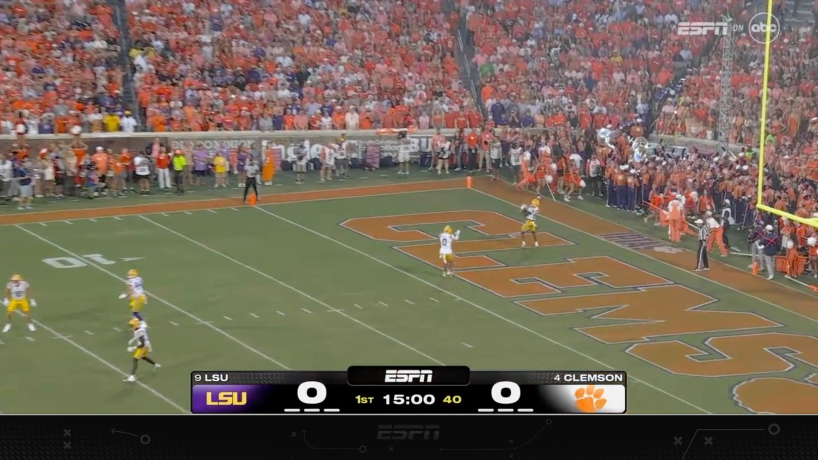
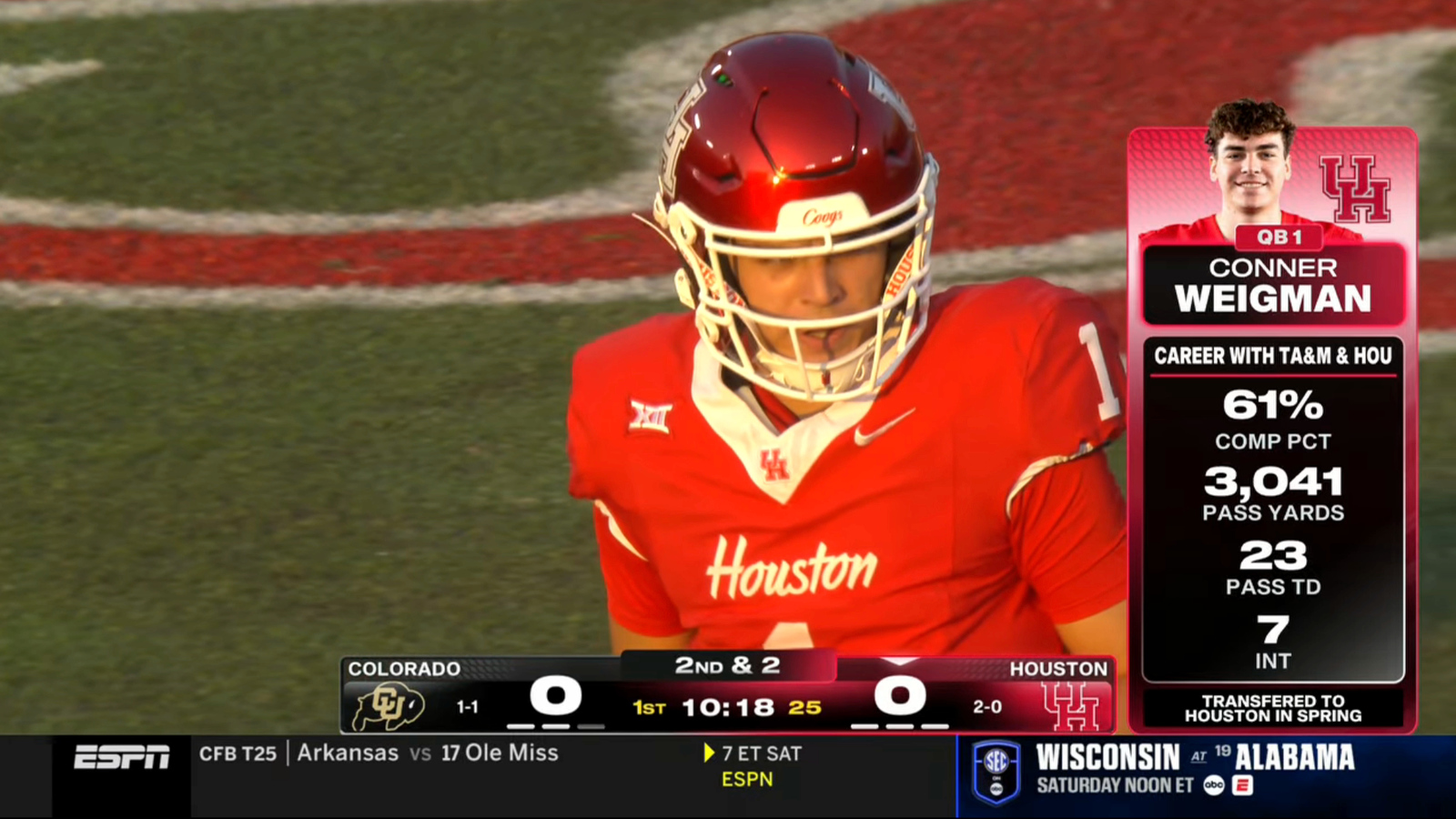
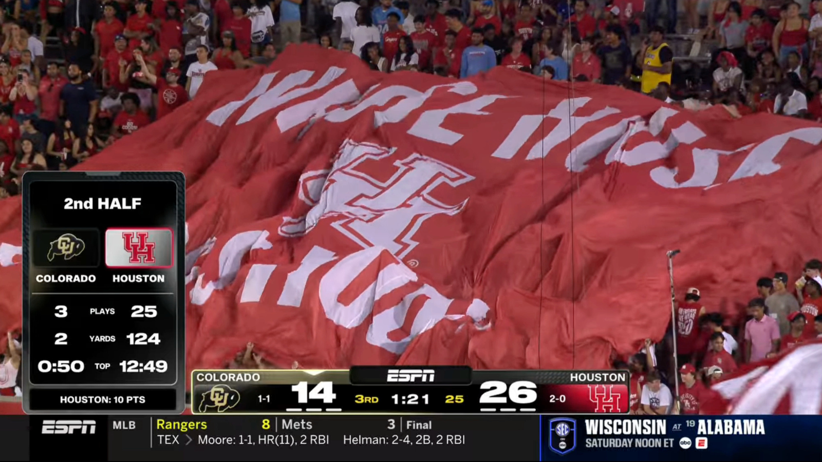
The scoreboard remains persistent on-screen, with score, down, distance and clock information remaining visible during most game situations. Side panels can display additional content without covering the main scoreboard elements.
“The sole intent is to keep that thing up as often as possible and find ways to storytell around that in ways that utilize the left and right side of the screen,” Girardin said.
The design philosophy reflects ESPN’s evolution in utilizing the full real estate on screen.
“It took us 15 years after the HD transition, but we were all finally comfortable using all of the 16:9 frame and not the 4:3 safe zone,” Girardin joked. “There’s a ton of room on the left and right side, and I think this look is a good utilization of that space to be eye-catching, but not overly intrusive on screen.”
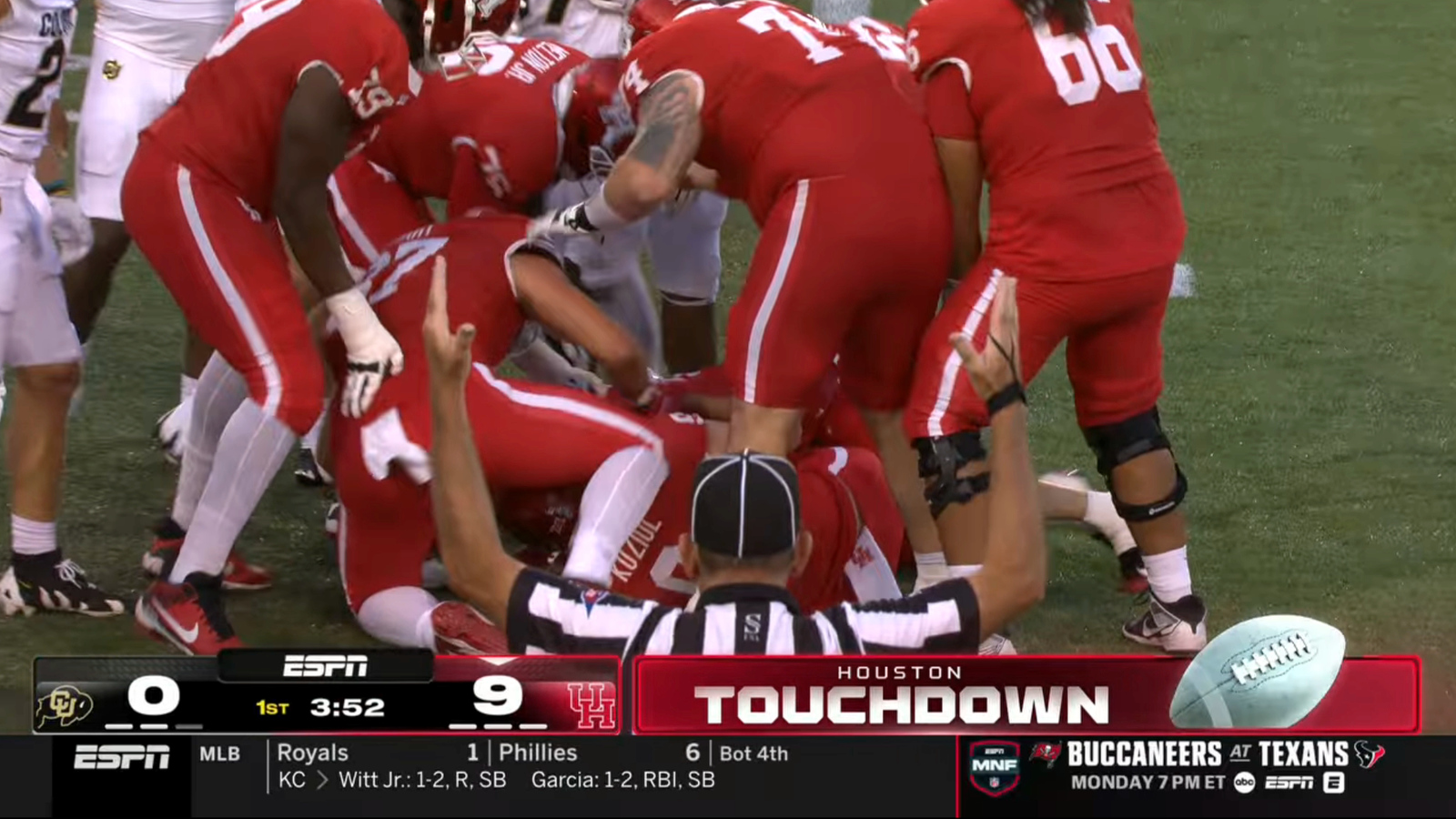
Even touchdown celebrations maintain scoreboard visibility.
“Even through touchdowns where we’ll slide left or right and do what we refer to as sort of like a micro score. You just slide it over, do the touchdown animation and bring it back in… keeping those consistent elements on screen,” Girardin explained.
Cross-platform integration
The rebrand reflected ESPN’s shift toward treating creative projects as comprehensive brand ecosystems rather than isolated graphics packages. Marketing materials were developed alongside the broadcast package to ensure consistency across touchpoints.
“In the past, we’ve kind of worked in silos alongside each other with the marketing teams,” Dempsey said. “But now we’re all one creative studio team. So we’ve had a lot of success and cohesion by creating intentional marketing packages during the design phases when we’re working with our partner agency. So everything looks cohesive.”
The process was built on lessons learned from the College Football Playoff rebrand.
“The first time we started to do this was with CFP where we’re developing a toolkit for marketing alongside the event rebrand,” Girardin said. “Now we sort of know each other’s toolbox a little bit more. We could all learn from each other as the process goes, because I’m sure they’re doing things that we could also be influenced by.”
The rebrand also established network-specific variations, with ACC Network games using a blue version of the shield.
Updating ‘GameDay’ while keeping it ‘center stage’
“College GameDay” presented unique challenges within ESPN’s broader rebrand effort. The iconic pregame show required its own specialized treatment that could incorporate new design elements while preserving the visual DNA that fans have come to expect over decades.
The “GameDay” package uses what ESPN calls a “center stage” concept, positioning the show as “the epicenter of the college football world” and “the hub of the college football world.”
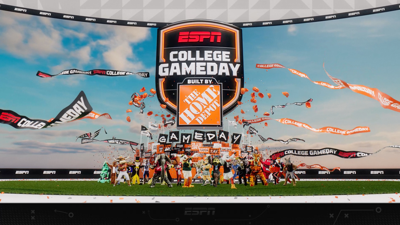
This approach recognizes “GameDay’s” unique role in college football culture… it’s not just another broadcast but a weekly cultural event that attracts thousands of fans to campus locations.
“It’s tough to redo ‘GameDay.’ It’s hard to picture it without orange, without like, how do you do ‘GameDay’ without signs? You can’t do a 180 degree on it and still have it feel like the same,” Girardin explained, highlighting the delicate balance required when updating such an established brand.
The design approach embraces what makes GameDay distinctive rather than attempting to radically transform it. The package incorporates what Girardin described as a “multi-layered environment that captures the spirit of the crowd,” creating “that sort of magnetic atmosphere where it’s the game day shield around this little like ring of signs and mascots and just sort of like frenzy in a way.”
ESPN’s solution involved using “GameDay’s” signature visual elements, including the crowd signs, as foundational design components.
The “GameDay” look uses the signs and posters to create layers and texture in the package.
“How do you not embrace that and capture that energy?” said Girardin.
Rather than fighting against “GameDay’s” established visual vocabulary, ESPN chose to modernize and expand upon it, ensuring the show maintains its distinctive identity while integrating with the broader college football brand ecosystem.
For the overall college football rebrand, ESPN worked with external agencies Two Fresh for the event package and edit toolkits and Compadre on the “College GameDay” elements.

tags
college football, College GameDay, Compadre, ESPN, espn college football, ESPN Creative Studio, football, Two Fresh, Two Fresh Creative
categories
Branding, Broadcast Design, Graphics, Heroes, Sports Broadcasting & Production