Key art updates may provide hints at MS NOW’s graphics package
Weekly insights on the technology, production and business decisions shaping media and broadcast. Free to access. Independent coverage. Unsubscribe anytime.
New key art for shows that currently air on MSNBC — which is set to change its name to MS NOW in mid-November 2025 — has begun popping up that could hint at the network’s new look.
The art began appearing on various connected TV apps and vMVPD user interfaces in the late hours of Oct. 31, 2025, and into the morning of Nov. 1, 2025, for most of the shows currently branded under the broad “MSNBC Reports” banner.
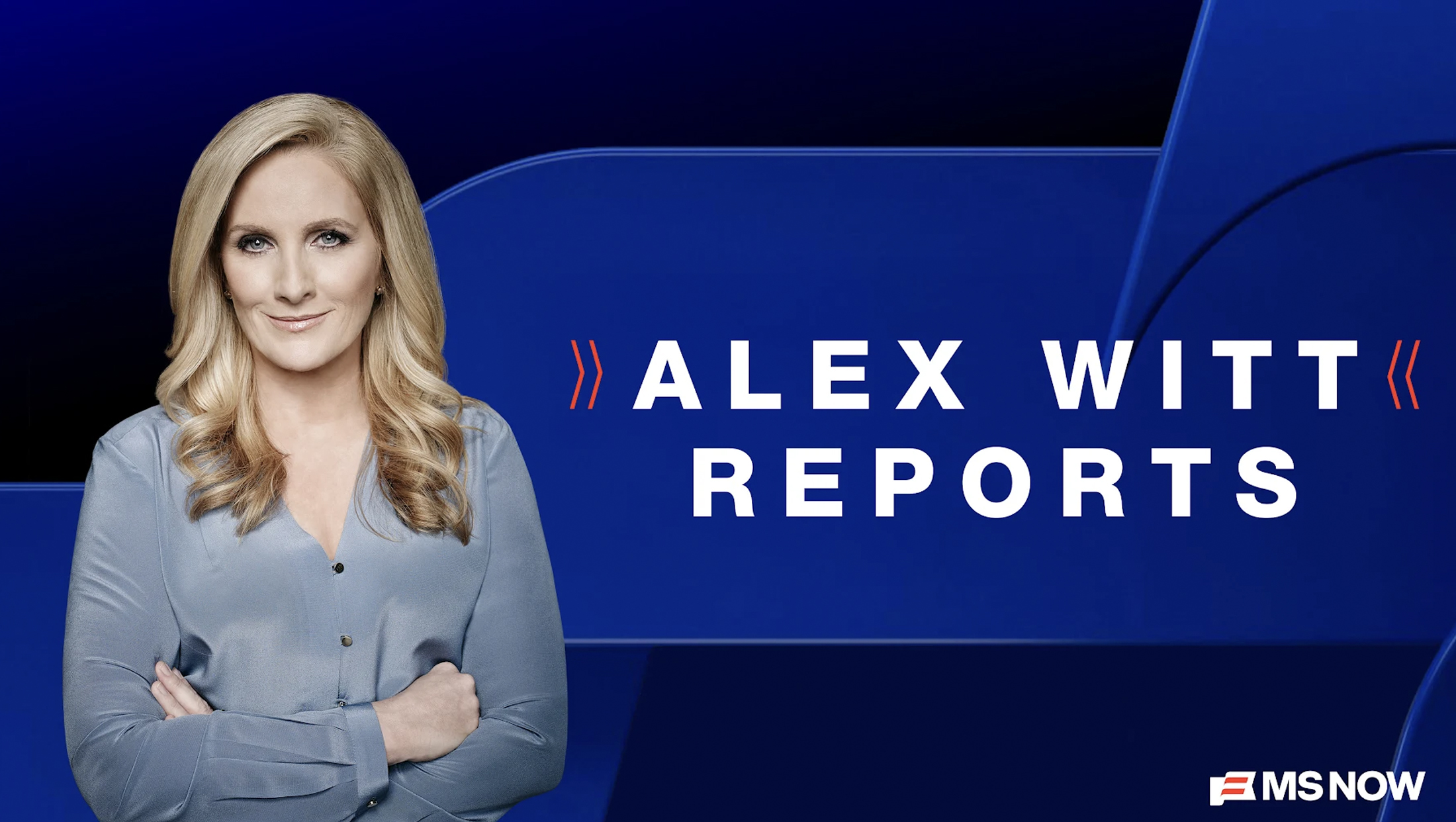
Individually, these shows are officially titled as “(Anchor Name) Reports,” as in “Katy Tur Reports,” and have specific animations featuring imagery of each anchor.
Back in 2021, MSNBC introduced a graphics overhaul with new lower third insert banners and an isometric look for “Reports” that had a blue, white and yellow look (with an alternate red option for breaking news).

Some programs, including primetime hours, retained their own individualized looks, but switched to the same banner design.

Meanwhile, there are also some blocks of rolling news coverage without permanent hosts that use the generic name “MSNBC Reports” and the key art for those have also been updated to feature an “MS NOW Reports” logo on a similar background.


The new key art for “Reports,” meanwhile, appears to center around a deeper blue palette accented with red and white, similar to the logo design Versant released in August 2025.

The key art also has a series of bevel shapes that appear to be inspired by the red stripes found in the MS NOW logo icon.
The shape, which features both gentle curves and tighter corners, essentially creates two horizontal parallelograms stacked on top of each other but slightly offset to match the overall angle of the icon.
That angle also appears in the new key art, as does a sharper point-like shape that looks to be inspired by a negative version of the stripe elements.
Show titles are set in a sans serif that appears to be a match for the MS NOW wordmark, with the line featuring the anchor’s name framed out by a pair of inward-pointing thin red double chevrons.
These elements match the arrow-like negative space left on the far right of the stripped banner icon and left leg of the “M” in the logo and serve as a subtle way to draw attention to the name between them.
It’s not clear if the key art releases were timed as a sort of way to phase in changes or if they may have been activated earlier than intended.
It’s also not clear whether MS NOW will overhaul its lower thirds or other graphics, though it’s worth noting that the horizontal parallelograms could form the basis of an insert banner.
This post has been updated with the “MS NOW Reports” graphic.


tags
Alex Witt, Alex Witt Reports, Ana Cabrera, Ana Cabrera Reports, Branding, katy tur, Katy Tur Reports, MS NOW, MSNBC
categories
Branding, Cable News, Graphics, Heroes