
CNBC’s new logo points to future while integrating into current design

Weekly insights on the technology, production and business decisions shaping media and broadcast. Free to access. Independent coverage. Unsubscribe anytime.
As NCS first reported earlier this week, CNBC is set to rebrand on the morning of Saturday, Dec. 13, 2025, dropping the NBC peacock icon after nearly 30 years.
The new logo design was formally unveiled during the inaugural Versant Investor Day on Dec. 4, 2025.
“It’s a symbol of the direction where we’re headed and the exciting new chapter we’re headed into,” said KC Sullivan, president, CNBC, during the investor day presentation. “Every day I’m reminded that now, more than ever, CNBC is a powerful, essential global brand.”
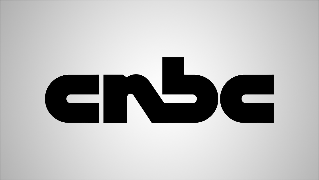
The new logo of CNBC, set to debut on Dec. 13, 2025.
The logo nods to the network’s financial expertise while also referencing the original logo from 1989. The “N” connects the past with the present and provides an area to integrate the new logo icon in the letter’s negative space.
The original logo of CNBC from 1989.
The new upward arrow icon closely aligns with the network’s on-air design language, building from the deconstructed square motion theory introduced in the 2023 on-air redesign, which uses the arrow throughout as a repeating symbol and to form the box holding the CNBC logo.
And, of course, the arrow ties in nicely with business and finance, representing stocks moving up and down on the exchanges. In this case, the icon is pointing towards a good day on the market with some upward price action.
The arrow also creates a unique tie-back to the former NBC peacock icon, appearing almost like a piece of the peacock feather “left behind.”
Typographically, the logo tightly kerns the letters, creating another nod to the historical logo.
Similar to the rebrand of MSNBC to MS NOW, the change drops the proprietary NBC Tinker font – which is based on Sweet Sans Pro – for Gotham.

Besides the customizations on the letter “N,” the letter “B” has also been modified to remove a piece of the letter in the shape of a much smaller, downward arrow.
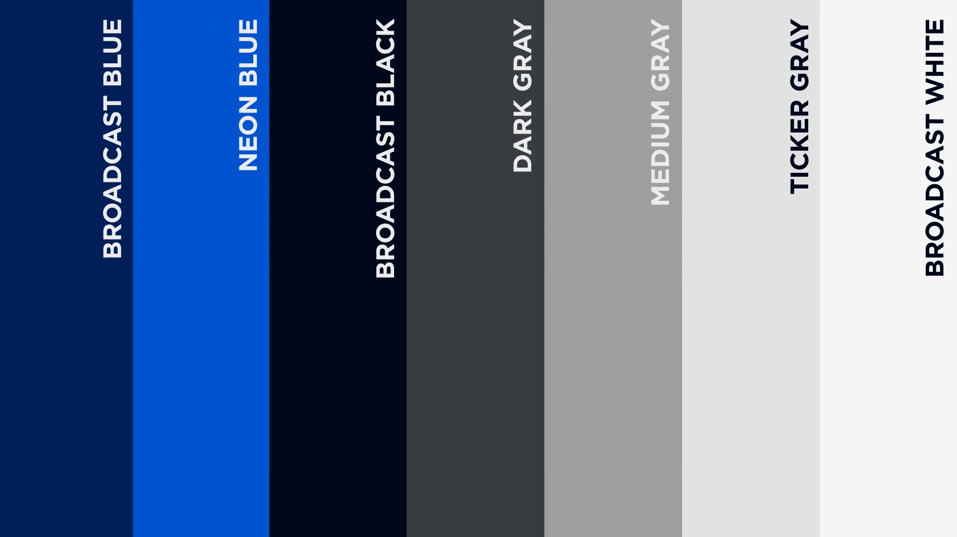
Colorwise, the new logo leans into the blue palette the network introduced with the 2023 redesign, with the icon using a hue close to Neon Blue from the brand standard.
On-air, CNBC will need to update its various show opens, which feature both the logo and close-up animations of the NBC peacock, for the Dec. 13 rebrand. The studios will also need to be updated to remove the abstract peacock references and step-and-repeat logos.
To promote the rebrand, CNBC will begin airing a new promo spot on Friday, Dec. 5, looking back at the network’s past logos and launch.
The spot also prominently mentions the full acronym, “Consumer News and Business Channel,” reminding viewers that the name is not tied soley to NBC.

tags
Branding, CNBC, Gotham, logo design, Logo Designs, Versant
categories
Branding, Cable News, Graphics, Heroes