
CNBC loses its color for prime promos
Subscribe to NCS for the latest news, project case studies and product announcements in broadcast technology, creative design and engineering delivered to your inbox.
Update: Check out this post for more details on the CNBC Prime brand.
CNBC, the business oriented cable arm of NBCUniversal, has opted to shed the full color NBC peacock in its logo for black and white, text centric promos for its primetime lineup.

The new promos, which have been airing for some time now, utilize a distinct typeface reminiscent of OCR characters. The words are set in black against blocks of white, with the only color in the spots coming from the teaser video from the actual programs.
Often, instead of using video clips, the promos make use of entirely white screens with large black text or stock imagery as the main visual element. Many of the visual elements have blocky transitions between them as well.
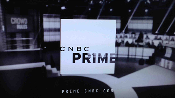
It’s also worth noting that nowhere in the promos can one find the iconic NBC peacock perched above the letters “CNBC” — the normal arrangement for the network’s logo.

Instead, “CNBC” is simply placed, in reverse, in a large square along with “Prime” appearing in larger letters under it. Both lines of text are positioned vertically off center and so their negative space stretches past the edge of the square.

Subscribe to NCS for the latest news, project case studies and product announcements in broadcast technology, creative design and engineering delivered to your inbox.

tags
CNBC
categories
Branding, Cable News, Graphics