
A look back at the history of HLN’s branding, logos
Subscribe to NCS for the latest news, project case studies and product announcements in broadcast technology, creative design and engineering delivered to your inbox.
![]()
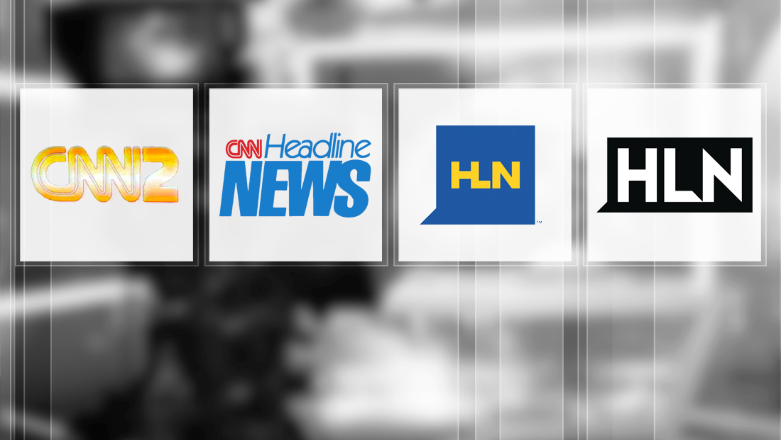
In 2008, the network dropped the “CNN” reference altogether while also shortening its name to just the letters “HLN” (ostensively short for HeadLine News).
At the same time, the logo became square with a “speech bubble” “tail” on the lower left, a nod to the interactive, social media fueled strategy the network announced it would take on. The logotype, meanwhile, merged the right side of the “H” with the left side of the “L,” a move that some said made it difficult to distinguish the letters.
![]()
The network then switched to a rectangular version of its logo, while still retaining the speech bubble motif. The “H” and “L” became distinctly separate characters, while the “L” and “N” also took on sharp, 45-degree angles that matched the speech bubble “notch.”
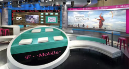
The logo change was accompanied by a move to Studio 7 in Atlanta, the former home of CNN. The set was updated with darker wood tones and incorporated the logo prominently.
This logo continued to be used even after the network began shedding its social media focus in 2015.
![]()

That brings us to the latest iteration of the HLN logo — a blue square with rounded corners with subtle curves in the lower left of the “L” and upper right and lower right portion of the “N.” The logo has notably lost its speech bubble element, and the new square motif mirrors how the CNN logo is often locked up, especially on its website and apps.
The new iteration also switches back to blue, though its a bit brighter of a shade than the previous blue square logo and also does not attempt to mirror the merged “H” and “L” either.
Although with the new logo, the network also updated its graphics package.
Subscribe to NCS for the latest news, project case studies and product announcements in broadcast technology, creative design and engineering delivered to your inbox.

tags
CNN, cnn headline news, CNN2, headline news, HLN, logo design, TV station logo design
categories
Branding, Broadcast Design, Cable News, Featured