‘Meet the Press’ switches to brighter, ‘faceted’ graphics package, new logo
Weekly insights on the technology, production and business decisions shaping media and broadcast. Free to access. Independent coverage. Unsubscribe anytime.
NBC News‘ “Meet the Press” unveiled a new logo and graphics package Sunday, Nov. 12, 2017 that includes a renewed emphasis on brighter imagery and a visual “connect the dots” motif that suggests the multifaceted nature of politics and the varying perspectives debated on the show.
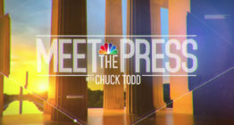
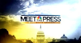
The new logo retains a similar layout as the old one, which was used as far back as when David Gregory hosted the show — with the NBC peacock perched above the word “The” and “Meet” and “Press” on either side with the host name below.
![]()
The new look, however, sheds the rounded rectangular boxy look in favor of rules above and below the main portion of the logotype.
The typography has also switched away from the wide sans serif typeface to a narrower, condensed font, giving the look a bit more of stronger, more powerful look that is, in some ways, reminiscent of the militaristic style “Situation Logo” the show used from 2012 to 2015.
tags
chuck todd, logo design, meet the press, NBC News
categories
Branding, Broadcast Design, Broadcast Industry News, Graphics, Heroes, Network Sunday Public Affairs Shows, Networks, TV News Graphics Design, TV News Graphics Package