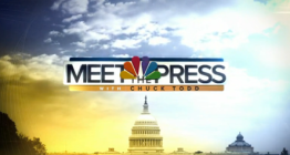
‘Meet the Press’ switches to brighter, ‘faceted’ graphics package, new logo
Weekly insights on the technology, production and business decisions shaping media and broadcast. Free to access. Independent coverage. Unsubscribe anytime.
In addition to a new logo, the show’s extended open was also revamped, with new banner designs featuring bold blue gradients with gold accents and small typographic accents.

Some of those typographic elements include referenced to host Chuck Todd’s name and the show iconic tagline “If it’s Sunday, it must be ‘Meet the Press’,” as well as purposefully illegible blurred microtext.
The open itself, which retains actor Dennis Haysbert’s voiceover, takes on a more colorful look that emphasizes brighter colors and sunrise imagery, whereas the old look featured white and saturated blue and gold overlays.
While the show’s old graphics package featured extensive imagery of Washington, D.C., it was used a bit more abstractly — such as using the curved rings of the painted interior of the Capitol dome as a prominent background element.

The open artfully ends, quite literally, on a high note, with a final note of the show’s longtime music coordinated with a bright burst of gold and an outlined version of the NBC peacock before Todd kicks off the show.


For the new look, the on-set graphics fed to the show’s video walls have also been updated, retaining the D.C.-centric video feeds and virtual frosted logo band with the new logo.
Also with the new look, the show’s lower thirds have switched to a blue gradient rectangular with a thin white and gold line parked next to the new bug, which animated between the show’s new logo and NBC News logo.
In addition to a shift in the overall color palette, the new look also adds faint connected lines, similar to those used in the borders of the lower thirds, with small stars as well as small typographic accents. These lines also create polygonal shapes that create the illusion of a faceted “lens,” shifting the view or perspective of the imagery behind it.
The angular theme could be read as both a nod to the strong angles found in the peacock “features” as well as a graphical connection to the NBC O&O “Look N” graphics package. The faceted effect, meanwhile, could be an illusion to shifting and differing perspectives.

The thin lines continue to be used in the show’s two box design, though here light accents on the lines place a strong emphasis on the outer boxes.

tags
chuck todd, logo design, meet the press, NBC News
categories
Branding, Broadcast Design, Broadcast Industry News, Graphics, Heroes, Network Sunday Public Affairs Shows, Networks, TV News Graphics Design, TV News Graphics Package