
Newshub site includes color coding, symbols for sections
Weekly insights on the technology, production and business decisions shaping media and broadcast. Free to access. Independent coverage. Unsubscribe anytime.
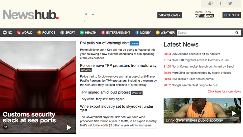
In addition to launching a new brand for its newscasts, New Zealand’s TV3 also debuted an online home for Newshub that features color coded navigation and unique symbols for each section.
The site, Newshub.co.nz, includes a relatively clean design that’s heavily typography based. Large photos also draw attention to content.
Running along the top of the site is a narrow black bar with various sections. Each section includes a colored dot that matches with the coding used on other platforms. In addition, a letter or symbol is enclosed in the circle — including “NZ” for New Zealand news, “+” for health and “$” for financial news.
Other sections without an obvious symbol, such as world, simply use the single letter approach. Weather, meanwhile, notably eschews the use of typographic symbols and features a cloud and sun icon.
The color coding, however, doesn’t appear to carry over prominently in each section, though, at least for now, the site featuring branded advertising-style backgrounds on pages that include a large version of the icon. Story thumbnails also make use of the iconography.
The overall design of the website does, however, feel a bit cluttered. Some more generous spacing would have helped make the site match the look and feel of the on air and apps design elements. It would have also been nice to see the color coding taken a bit farther and more of an effort made to find and use icons for each section, rather than a rather odd mix of single letters, double letters, typography elements and an illustration.
For example, why not a star for politics or entertainment, an asterisk reminiscent of the sun for weather or a globe or circle for world? The idea could have turned out quite clever if all of the elements chosen were typographic, especially given the popularity of icons and emoji-style images.


tags
new zealand, newshub, tv3, website
categories
Featured, Heroes, Online and Digital Production