
German’s N24 uses grid to create portal to content in redesign
Subscribe to NCS for the latest news, project case studies and product announcements in broadcast technology, creative design and engineering delivered to your inbox.
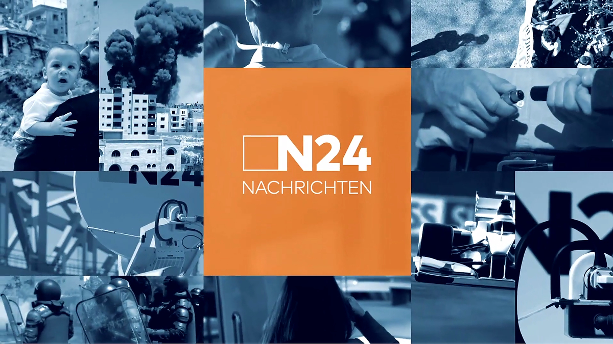
“While discussing the spectrum and sheer mass of the channel’s contents, the idea of a grid emerged quite quickly and naturally. It is a design that allows us to show the visual diversity, whilst remaining within the language of the channel’s logo.”
Motion was worked into the grid design to create a constant movement on-air while serving as a portal to display content.
“Our intention was to keep it simple and clean. We wanted the design to focus on its function, allowing the contents to be the main center of attention and not be compromised by intricate design elements,” said Khalil.
“This simplicity also had the advantage of being easily transferable on to other media, such as online, mobile and print, as well as out-of-home screens, maintaining the overall aesthetic.”


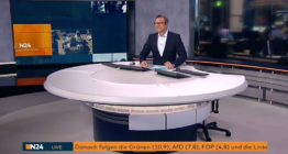
During the main news open and show opens, the grid transforms to become a true portal to video. Throughout the news, many infographics are present to help break down information, along with a custom font that is a variation on FF Mark Pro..

“The main idea was to incorporate as much as possible of the channel’s contents, showing their abundance and diversity on every level and throughout the entire design. However, in order to not overwhelm the viewer with the load of information, we opted for semi-transparent grid.”
“It was a mutually benefitting process of communication, which made the final product possible. It was a good challenge and quite stimulating working with N24,” added Khalil.
Subscribe to NCS for the latest news, project case studies and product announcements in broadcast technology, creative design and engineering delivered to your inbox.

tags
Bleeding Fingers Music, EdenSpiekermann, Extreme Music, Hans Zimmer, Jürgen Schmidt-André, Kays Khalil, logo design, motion graphics package, n24, news branding, rebrand, thefinest, tv motion graphics
categories
Branding, Broadcast Design, Exclusives, Featured, Graphics, Heroes, TV News Graphics Design, TV News Graphics Package, TV News Motion Graphics Design