‘Chicago’s very own’ draws on city for inspiration

Subscribe to NCS for the latest news, project case studies and product announcements in broadcast technology, creative design and engineering delivered to your inbox.
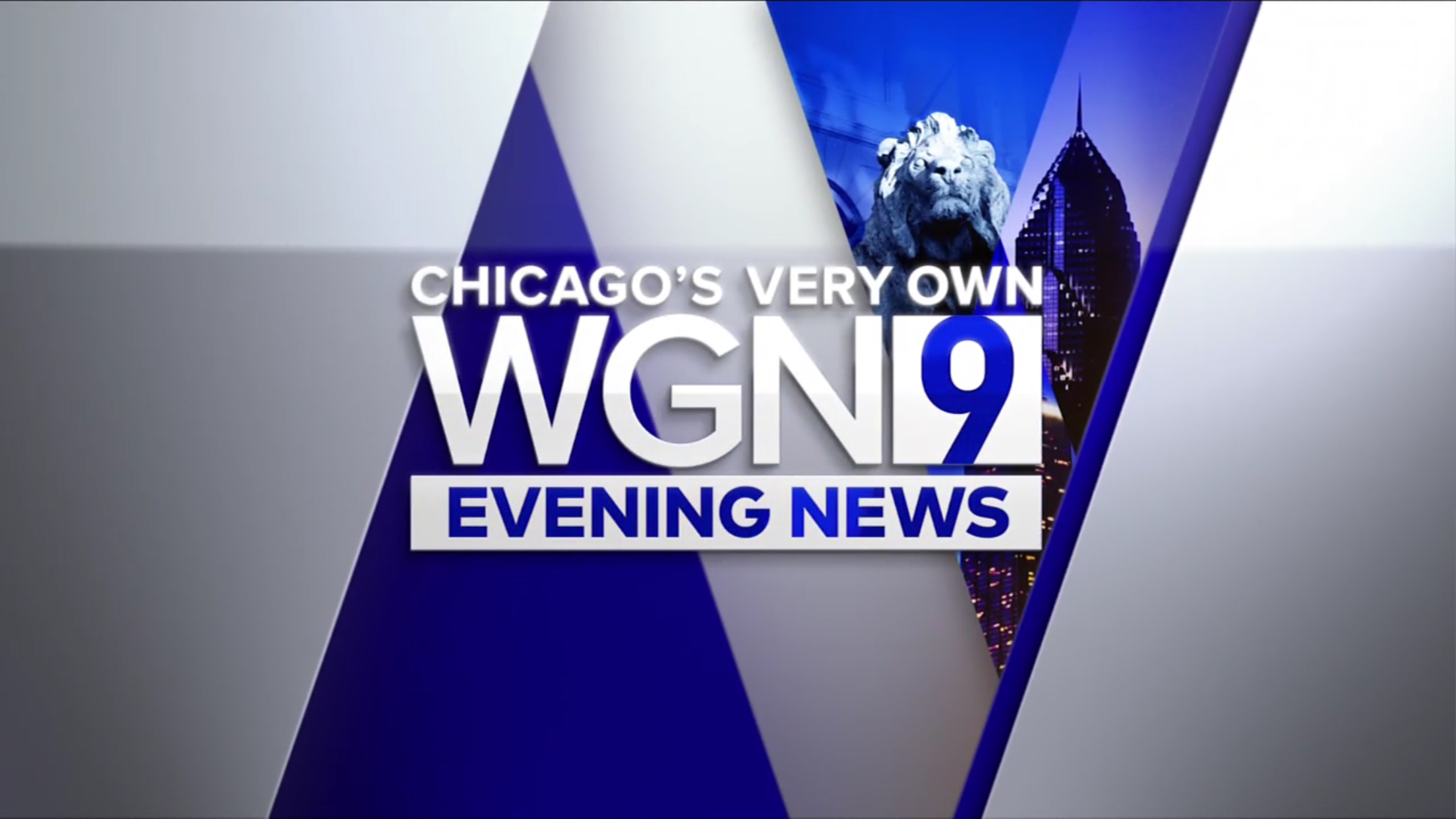
In addition to the new set, WGN also updated its Channel 9 logo design to be a condensed “9” in DIN placed inside a box next to the call letters in Proxima.
The station’s tagline is perched atop the logotype.
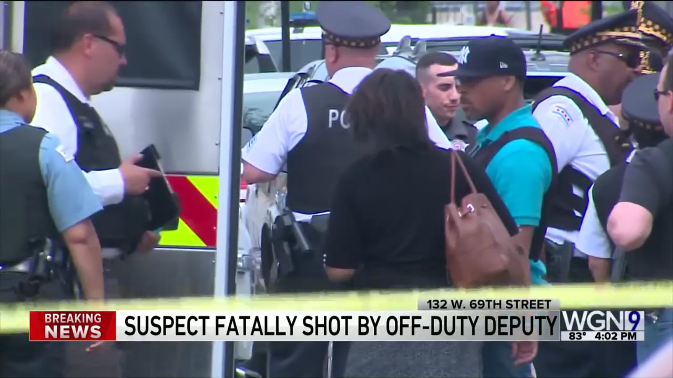
The logo is also featured prominently as the station’s new bug, with a thick white bar below it featuring the time and temperature.

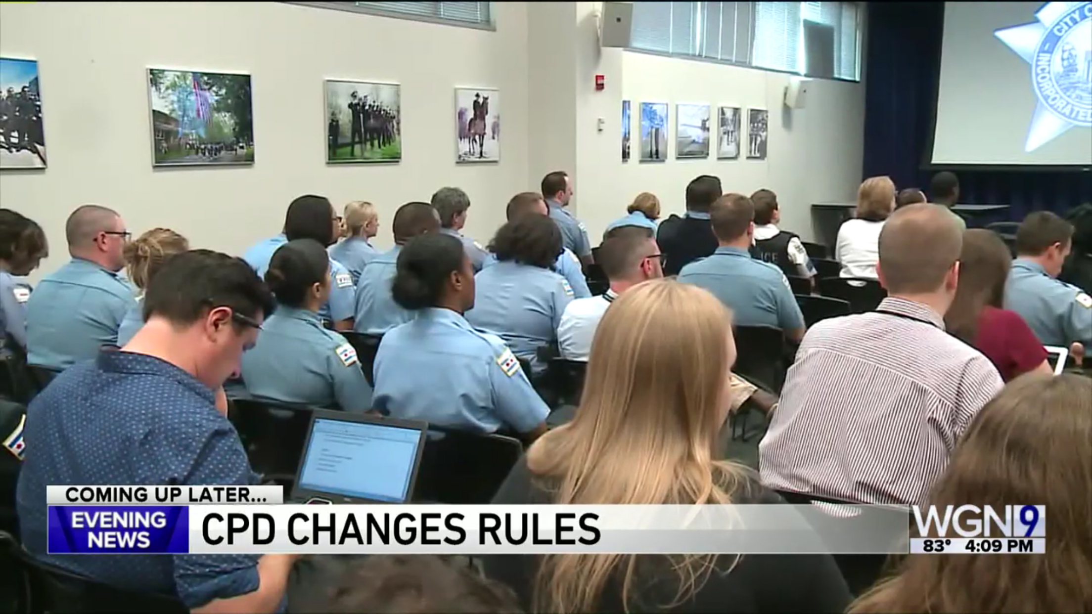
In addition to the new logo, WGN updated its lower third insert graphics to take advantage of the full 16:9 aspect ratio. The new look shed the station’s angled motif, though that design is still retained in show opens and select full screen graphics, albeit with updated typography and logos.
The angles also make an appearance in the subtle animations used for the camera right and left walls and anchor desk ribbon.

The updated lower thirds also include the option to feature show, franchise, breaking news or other branding in a colored box on the far left.

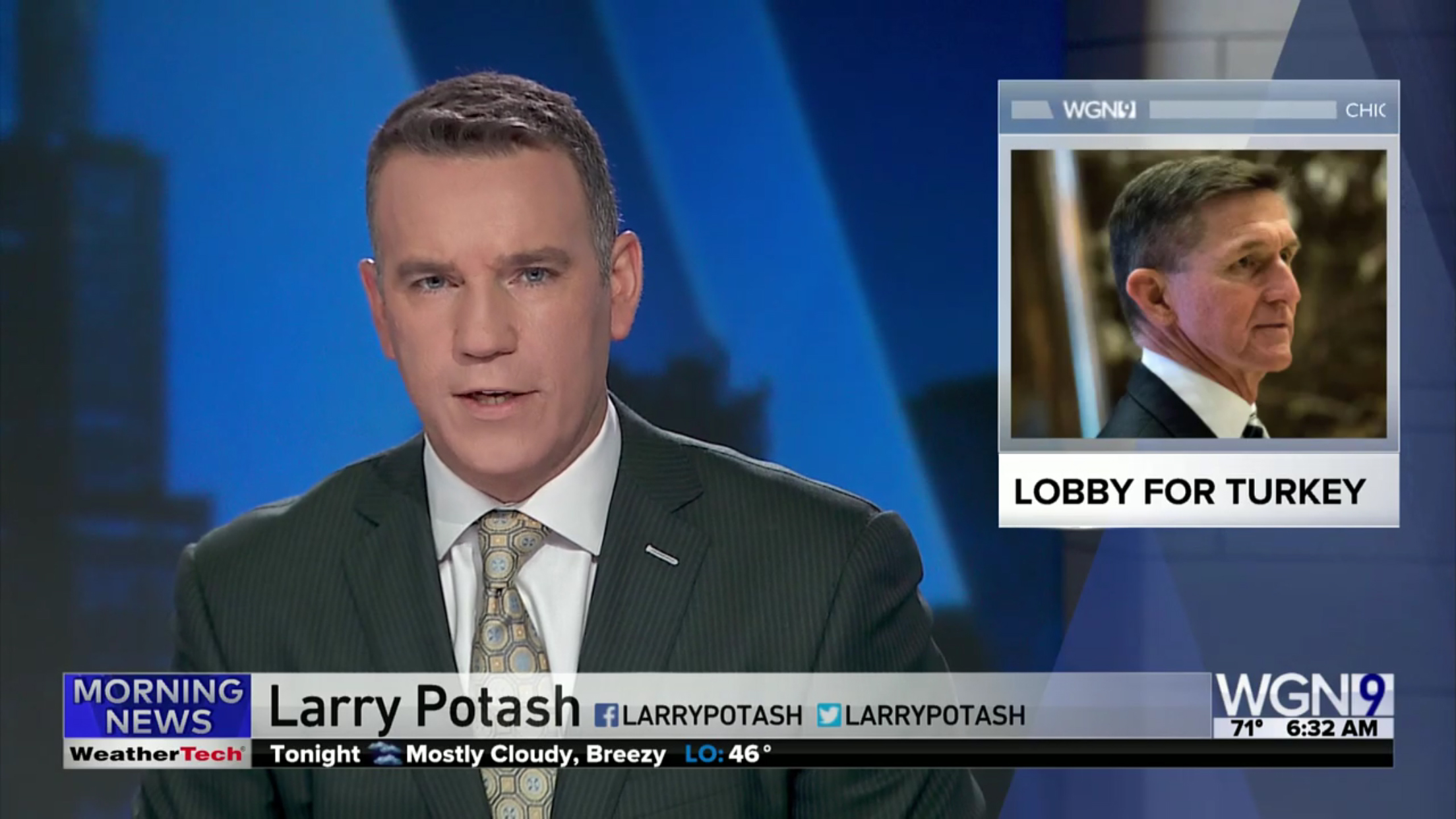
Name lower thirds now appear with the person’s name in large type followed by, in the case of station talent, social media handles or, for other individuals, an identifier line, located in smaller type on the same tier.
An additional space is available to the far right of the lower third bar, just to the left of the bug, for a locator line, with a similar small rectangular available on the opposite side for “coming up” and similar labels.
Subscribe to NCS for the latest news, project case studies and product announcements in broadcast technology, creative design and engineering delivered to your inbox.


tags
Broadcast Design International, Chicago, WGN
categories
Branding, Broadcast Design, Heroes, Set Design, Studio Technology, TV News Graphics Design, TV News Graphics Package, TV News Set Design