
‘Jim Jefferies Show’ mixes mystery, contrast in set, graphics
Weekly insights on the technology, production and business decisions shaping media and broadcast. Free to access. Independent coverage. Unsubscribe anytime.
Comedy Central’s “The Jim Jefferies Show” is a visual study in contrast and opposing forces — but also manages to keep its intentions a bit of a mystery.
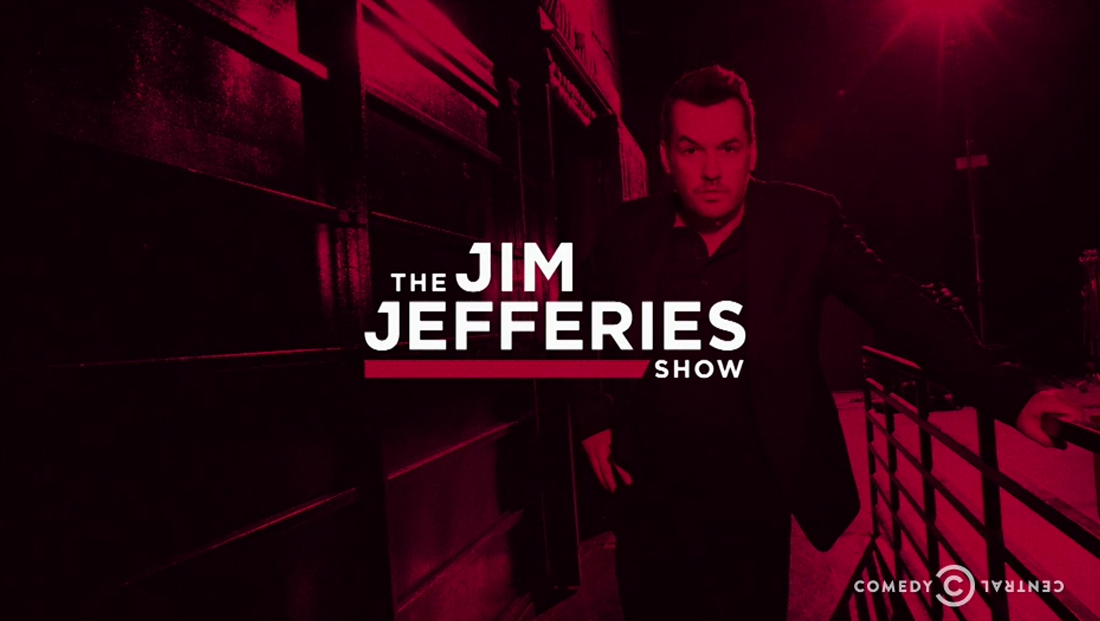
The show’s logotype features the host’s name in a clear sans serif typeface with distinctive, custom drawn “J”s that emphasize the alliterative structure of the host’s name.
The letters feature “caps” that are distinct in two ways — they do not extend to both the right and left side of the ascending line of the “J”s and are also “chopped off” at an angle on the left side.
The shape formed by the “caps” here is flipped horizontally in the bold red line under “Jefferies” that draws the eye to the word “Show,” which appears in smaller type below.
This “bar with an angle” motif continues to make an appearance through the shows’ graphics from Trollbäck + Company and scenic design — and also serves as a visual nod to the concept of division, comparison and contrast.
For instance, the’s show’s open uses a fullscreen version of the angle to combine, often ironically, two photos in a diptych — such as an image of the Pope with Jefferies’ own headshot.
Perhaps most entertaining, however, the bar itself also becomes a “peep hole” in the midst of bushes for White House Press Secretary Sean Spicer’s image, a not-so-subtle nod to the now infamous “Spicer among (or ‘hiding in,’ depending on who you believe) the bushes” incident.
Meanwhile, the set, designed by JPConnelly and fabricated by Warner Bros. Design Studio, continues the idea of contrasting ideas visually — combining sleek, more traditional news set surfaces and finishes with rough, industrial textures.


The anchor desk, for example, echoes the angled bar shape with a sleek, thick border and shiny tabletop. The front of the desk, however, features an aged metallic finish with accent lighting that creates an interesting blend of styles.
Jeffries opens the show from the desk, which is backed by a teal-blue map of the world — another traditional news set element.
However, upon closer inspection, viewers will notice the map is actually mirrored horizontally from the traditional view.
The Western hemisphere, for example, appears on the right side of the triptych, which also incorporates an aged, almost crackled texture.
It’s worth noting that both the tone of the map and basic concept of switching up the traditional layout of the world was also used on another Comedy Central news, political and culture show, Larry Wilmore’s “The Nightly Show,” which ended in August.
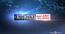
“Nightly,” however, flipped the map vertically. Ironically, the vertically flipped version of the map may have been more appropriate for Jefferies, who hails from Australia, as the “upside down” map is often associated, albeit cheekily, with how Australians view the world.
The anchor desk’s front and backdrop’s industrial feel is matched by the set’s exposed metal columns with large rivets and rough, textured walls, all of which are dramatically uplit to not only bring out the texture and colors, but also bring a bit of modern flair to the warehouse-like space.

Above the set, rust-orange girders that bend downward on the right side of the set drive home the strong diagonal theme.
The set also includes a large video wall camera left that’s wrapped in the textural concrete wall.


This wall is used for both standups and as an OTS backdrop from the anchor desk.

The opposite side of the studio features a one-on-one interview area is situated in front of a more modern, backlit backdrop with bold horizontal banding.
This area was used as a backdrop for Jefferies’ cold open on the debut episode.
Overall, whether the show’s strong visual contrasts are meant to represent division, polarization or opposing views (or all of the above) is, likely purposefully, left as an open question.
The show does take aim at the divisive nature of culture and viewpoints, so there’s no mistaking that the visuals are meant to conjure up that from a thematic standpoint.
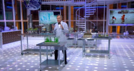
However, James Pearse Connelly manages to create, much like his blend of old and modern on “Bill Nye Saves the World,” a bit of a mysterious element to the design.
One could interpret this as meaning Jefferies has been “banished” from (or is shunning) mainstream media and is serving up his wry blend of views from an “undisclosed location” that’s been converted for broadcasting.
There are probably a slew of other scenarios viewers can imagine — and no doubt that’s both the strength of the design and a way for Comedy Central to play into the imaginations, views and uniqueness of each viewer.

tags
comedy, comedy central, entertainment set design, entertainment show set design, James Pearse Connelly, Jim Jeffries, JPConnelly, Larry Wilmore, logo design, The Jim Jeffries Show, The Nightly Show, Trollbäck+Company, Warner Bros. Design Studio
categories
Broadcast Design, Cable News, Heroes, Set Design, Talk Show Set Design