
Scranton station debuts new graphics, tweaks branding elements
Weekly insights on the technology, production and business decisions shaping media and broadcast. Free to access. Independent coverage. Unsubscribe anytime.

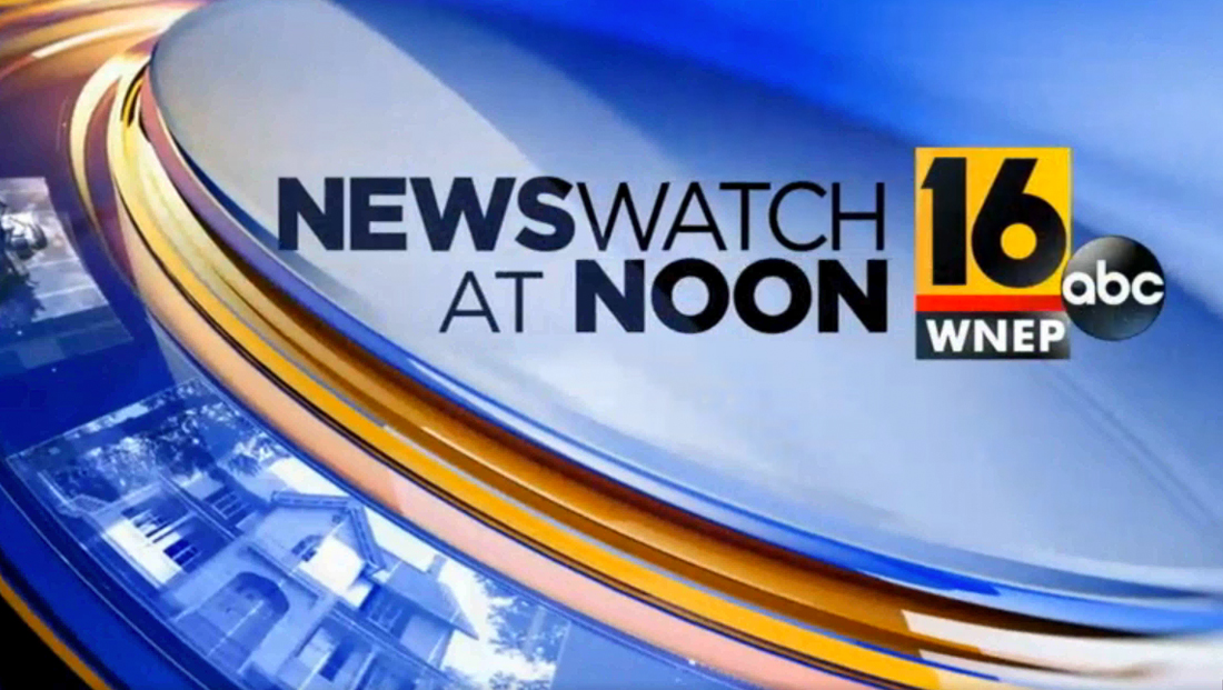
The station’s graphics package mirrors that at other Tribune owned or operated stations and uses blue and gold circular elements.

The circular center element, which is sometimes used for the station’s network logo, instead houses the number “16” the station’s distinctive logotype.

Like the other stations using the look, the package also includes localized imagery.
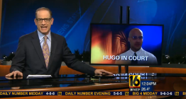
The lower third insert graphics include bold blue and white bars with a rounded left side, right aligned text and a thin gold line separating the tiers. For story banners, meanwhile, a solid blue bar is used and in general readability is significantly improved.
Perhaps one of the more interesting, albeit subtle changes, is the move to a square shaped logo in the bug, which also removes the station’s call letters from the black box below (perhaps for a future time and temp bug?).

The station has also added the ABC logo to its bug and opens.
The station’s last graphics update came in 2015 — and it was a change at least one viewer wasn’t happy about, calling the station a “bunch of jerks” in a feedback segment.
The station also updated its weather graphics with a similar look, though the color scheme along the top is white, red and black.

The station kept its “Stormtracker” weather branding, though, just like “Newswatch” the name is now more “split.”
It’s also worth noting that, previously, the weather branding was actually “Stormtracker 16” and the new graphics typically don’t include the “16” reference.
In addition to the in-show graphics, the station’s on-set video wall is also sporting the new look and logo.


tags
scranton, wilkes-barre, wnep
categories
Branding, Broadcast Design, Graphics, Heroes, TV News Graphics Design, TV News Graphics Package, TV News Motion Graphics Design