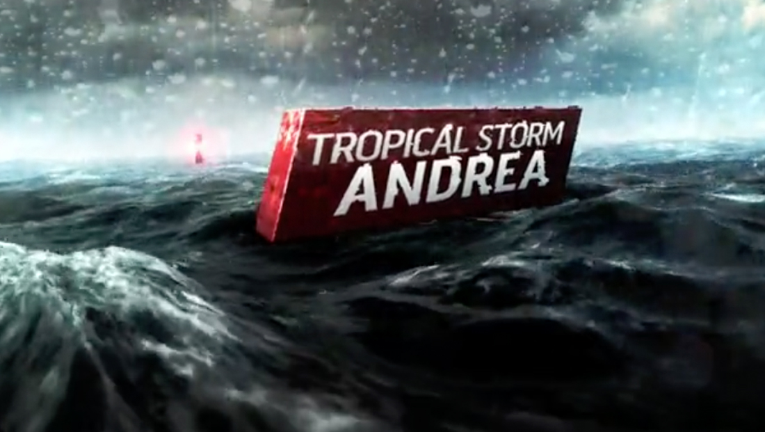
Evolution of NBCUniversal’s hurricane coverage branding

Subscribe to NCS for the latest news, project case studies and product announcements in broadcast technology, creative design and engineering delivered to your inbox.
As the years have gone by and the names of hurricanes cycles through he alphabet, it’s interesting to note that one motif has remained relatively consistent — the NBCUniversal look for its hurricane coverage.
Launched in 2010 for The Weather Channel, which NBCUniversal had acquired in 2008, the look drew inspiration from the red and black hurricane warning flags, which features a thick red border with a black square in the middle.
The original look featured the image of a rough sea with the hurricane name in a red, angled box bobbing atop the waves.
The cool grays and blues in the ocean also became, along with the red and black, the color palette for much of the hurricane branding on other NBCUniversal properties over the years.
The package was designed so that any storm’s name could be popped into the look, giving the networks the ability to keep branding consistent between each storm and hurricane season.

The look would eventually be simplified to drop much of the ocean imagery, but the same color scheme remains.
The new look also places a stronger emphasis on the interlocking ring look, an element that did appear in the original look.

The Weather Channel also introduced a parent-brand of sorts with its “Hurricane Central” name that was used as an overarching name for its coverage, while the same general look and feel is used for covering tropical storms before they become hurricanes as well as Pacific storms and tsunamis.
Conveniently, the ring looks also play into looks of NBCUniversal properties MSNBC and “Today Show” looks.


The look also continues to make use of the square hurricane warning flag element, though it’s a more subtle accent that appears to one side of many of banners atop many of the Weather Channel’s maps and other graphics.
As the look has continued to evolve, different broadcasts use different elements from the original look, mixing in new elements, most of which remain similar to the original motif.
MSNBC, for example, is using the red polygon box for its Hurricane Harvey coverage along with the steely-blue background accented with its concentric ring design.


The Weather Channel also uses the ring element, mixing in dark black and blue colors and blurred rain imagery.
“NBC Nightly News” has used a mix of looks for its hurricane coverage, such as this look for 2016’s Hurricane Matthew, but the red polygon element is still used (albeit a slightly darker shade), with the background appearing in a brighter blue and mixes in a grid and water drop background.


On the “Today Show” Hurricane Harvey coverage, meanwhile, the square hurricane flags were used as prominent element, as is the use of a red box and blue-gray color scheme. However, the angled look was dropped in favor of slightly rotating the entire logo.


Subscribe to NCS for the latest news, project case studies and product announcements in broadcast technology, creative design and engineering delivered to your inbox.


tags
Hurricane Harvey, NBC, NBC News, NBC Nightly News, NBCUniversal, the weather channel, Today Show
categories
Branding, Broadcast Design, Featured, Graphics