
NBCNews.com previews new look
Subscribe to NCS for the latest news, project case studies and product announcements in broadcast technology, creative design and engineering delivered to your inbox.
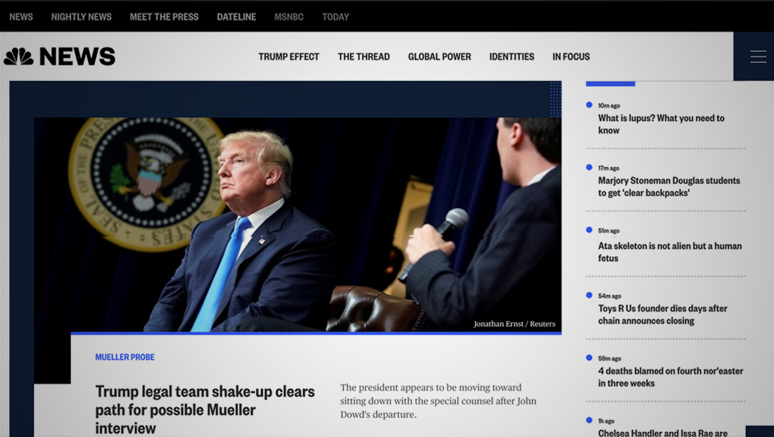
NBC News is giving viewers a peek at the new look for its website — one that’s heavily inspired by some niche “vertical” sites it has been using for some time now.

The site, located a beta.nbcnews.com, switches away from a narrower, more restrictive grid-like layout in favor of more generous spacing, large blocks of color and white “tabs” to help label content.
Elements, many of which are blocky, appear to flow naturally from one block to another or are clustered around each other in sections where boxes in a variety of widths and heights are blended together to create distinct zones for imagery, text and other elements.
A similar design approach has been used on the network’s niche sites Mach, Think and Better, which cover space and technology, perspectives on the news and healthy lifestyle content and served as a sort of testing ground before the design was rolled out on a wider scale.
A network source tells NewscastStudio the design will continue to be rolled out across nbcnews.com in the coming weeks.
“Redesigning all our properties for all platforms in one coordinated initiative is an enormous undertaking,” said Moritz Gimbel, VP of product and design for NBC News in a statement. “We are so excited to show such an important element of it publicly today for the first time. Our audience, advertisers, and journalists will reap the benefits for years to come.”
This homepage relaunch is a significant component of more sweeping design changes underway across all of NBC News Digital’s properties, including today.com, msnbc.com, our mobile and OTT apps and more.

The new look’s main navigation bar has been switched over to feature a black NBC peacock along with the word “News” next to, a similar approach used on the single topic sites.
Meanwhile, a small collection to “Channels” — or featured topics — is also included, with the site’s main, more traditional section based navigation placed under a “hamburger” menu in the upper right, which also devotes significant real estate to “Channels,” which are displayed in a carousel-style layout.

Other features of the new site include larger and cleaner typography, imagery and video embed, as well as more prominent tools to let users quickly share articles, videos or smaller bits of content.
The project also included creating a faster, more user-friendly interface that encourages deep engagement, page layouts that change based on the intensity of the news cycle and high-impact, ‘sticky’ ads that are simultaneously more visible and more visually pleasing, according to NBC.
NBC rolled out an extensive redesign of its website back in 2014, but the result was less than popular (though some users praised it) and the network rolled out an updated version about six months later, which, in turn, lead to general design still used today.

NBC has embedded a feedback widget on all pages sporting the new design, which lets users rate and comment on everything from the design to content.
Subscribe to NCS for the latest news, project case studies and product announcements in broadcast technology, creative design and engineering delivered to your inbox.

tags
Moritz Gimbel, NBC News, nbc news digital, nbc peacock, nbcnews.com
categories
Heroes, Networks, Online and Digital Production