Telemundo begins rolling out Look N-inspired graphics package — with a twist

Subscribe to NCS for the latest news, project case studies and product announcements in broadcast technology, creative design and engineering delivered to your inbox.
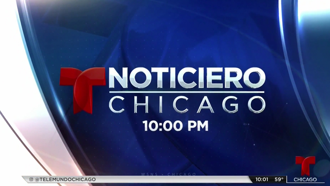
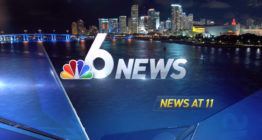
Telemundo O&Os have begun rolling out a new group graphics package that borrows heavily from its corporate cousin NBC O&Os’ so-called “Look N,” though with a key change that takes the network’s branding and logo design into consideration.

Instead of the mostly straight lines and angles inspired by closeup views of the NBC peacock, Telemundo’s iteration of the graphics package, which was also created by NBC Arthouse, adds curved “end caps” to many elements, an element borrowed for the curved elements in the network’s logo.

This includes an updated “top bar” that the NBC version also uses, which, for Telemundo stations, is curved on both sides, as well as lower thirds and tease graphics with a curved left hand side.
The ticker’s left side has also been switched to curved, as have elements in the bug and weather graphics.


Subscribe to NCS for the latest news, project case studies and product announcements in broadcast technology, creative design and engineering delivered to your inbox.


tags
Look N, NBC, NBC Arthouse, nbc peacock, telemundo
categories
Broadcast Design, Broadcast Industry News, Graphics, Heroes, Local News, TV News Graphics Design, TV News Graphics Package