Canadian networks’ World Cup open gets royal treatment
Weekly insights on the technology, production and business decisions shaping media and broadcast. Free to access. Independent coverage. Unsubscribe anytime.
Faceted “tiles” rotate to reveal photographic imagery of high profile players, also set against additional team and league imagery, as well as a field of floating team icons. Then, they zoom out through a mix of global iconography, gem-like renditions of European footballs and a rotating Russian seal, all before giving a brief glimpse of the jeweled ball again before a series of diamonds reveal the networks’ title slide.

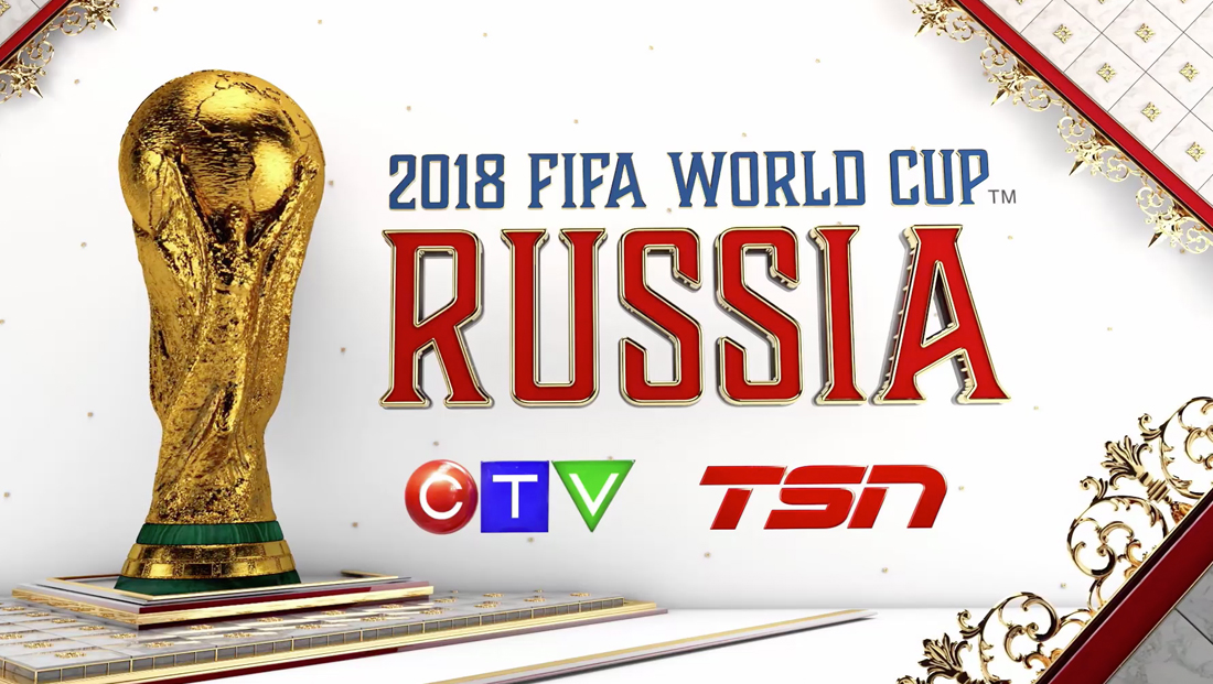
A detailed rendition of the World Cup trophy is placed to the left of the title, which is rendered in an intricate serif typeface in blue and red with metallic accents.
The total package includes multiple promos, interstitials and insert graphics to help the networks cover the games. You can explore more of the intricate look in our gallery.
Project Credits
Creative Director, Design: Stephen Gilmore
Associate Creative Director Design: Luis Torres
Associate Creative Director Design: Matt Mamic
Motion Design: Luis Torres, Matt Mamic & Thomas Bove
Post Sound: Michael Banani
Set Design: Thomas Bove, Simon Ballarino

tags
2018 World Cup, CTV, ctv sports, FIFA World Cup 2018, Luis Torres, Matt Mamic, opening titles, Stephen Gilmore, Thomas Bove, title sequence, TSN
categories
Branding, Broadcast Design, Graphics, Heroes, Sports Broadcasting & Production