
‘Jeopardy!’ pays tribute to iconic elements, topics in 35th anniversary graphics

Weekly insights on the technology, production and business decisions shaping media and broadcast. Free to access. Independent coverage. Unsubscribe anytime.
After going through two distinct scenes, the view switches to a a 3D rendering of the show’s logo floating above a “dais” created from rotated, staggered diamonds edged in gold.
Although the new title card doesn’t feature the “35th anniversary” typography found in the show’s key art, it is included in the bug at the very start of each episode.

The diamond shape is incorporated into other graphics, including the contestant introduction screens, which continue the similar blue, violet and pink color scheme the show has been using for the past few seasons.

The angular look of the diamond is continued through the use of geometric, fractal wipes.
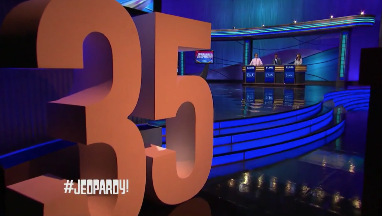
Although the set itself remains the same, the show did wheel in oversized dimensional “3” and “5” numbers for one side of the set. The numbers appear to be the same ones used for sister show “Wheel of Fortune” during its 35th anniversary season last year.


tags
Jeopardy!, Key Art
categories
Branding, Broadcast Design, Broadcast Industry News, Featured, Game Show Set Design, Graphics