NBC News Now looks to peacock, other digital properties for look

Subscribe to NCS for the latest news, project case studies and product announcements in broadcast technology, creative design and engineering delivered to your inbox.
A streaming service from NBC News officially debuted May 29, 2019. Called NBC News Now, the look of the service represents an evolution of its previous streaming efforts while also drawing on the look and feel of its other digital properties.
NBC News launches its streaming service https://t.co/62mM4g05dJ #TVNews #BroadcastNews
— TVNewsMix (@TVNewsMix) May 29, 2019
When NBC originally announced its plans for a streaming news service, the branding “NBC News Signal” was used. (NBC also produced a streaming-only newscast under that name that used a red, white, blue, violet and orange graphics package.)
NBC announced earlier this year that it would used the name “Now” instead.
The network has quietly been streaming content under the Now branding over the past week, which has given us a glimpse into how the service looks before it begins streaming its first official eight-hour block May 29 at 3 p.m. eastern.
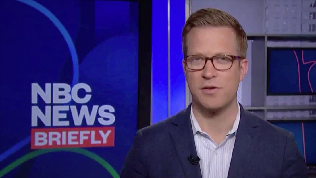
The new look is centered around blocks of color, unique uses of the NBC peacock icon and clean, bold typography.
Like its website headlines and many other digital properties, the font Founders Grotesk is used heavily within the NBC News Now look.
Much of the network’s color scheme is centered around a dark blue with white and a shade of red that skews toward coral.

That red shade is used to box in the word “Now” in the network’s logo, which uses the traditional NBC peacock along with logotype in a wide version of Founders Grotesk that has also been used on NBCNews.com to form various logos.
On the website, the “NBC” is eliminated in favor of having the peacock stand in for it — with “News” or other vertical brand names such as “Mach” or “Think” placed after it.
Meanwhile, similar shades of blue and violet have been incorporated into the graphics on the network’s Snapchat and Instagram newscast, “Stay Tuned.”
In many senses, NBC appears to be creating a more consistent digital look with shared typography and palettes while also giving each brand a unique flair.
For example, “Stay Tuned” uses a bright teal as a signature color — whereas Now appears to rely more on the red and orange hues — with violets and blues as the base.
Subscribe to NCS for the latest news, project case studies and product announcements in broadcast technology, creative design and engineering delivered to your inbox.


tags
NBC, NBC News, NBC News Now, OTT, streaming, Studio 6E
categories
Branding, Broadcast Design, Broadcast Industry News, Graphics, Heroes, Networks, Streaming