‘Access Hollywood’ refines typography, switches colors along with reverting back to old name
Subscribe to NCS for the latest news, project case studies and product announcements in broadcast technology, creative design and engineering delivered to your inbox.
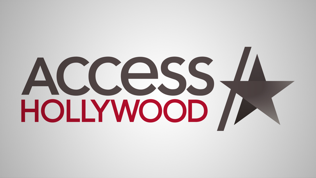
NBCUniversal’s syndicated entertainment program that was formerly known as “Access” — that was also formerly known as “Access Hollywood” is becoming “Access Hollywood” again — and along with that change comes a new logo design.
The new logo returns the show to the same layout it used before the name change, but with some typography updates.
“Access” remains shown with a capital “A” followed by full height lowercase letters, but the font is slightly less “rounded” than before and a bit more geometric.
The world “Hollywood” is still parked under “Access,” but becomes the same width as the line above it and also switches to a less rounded font.


The logo ‘Access Hollywood’ used before the name change.
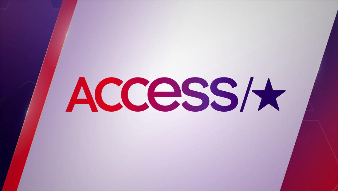

The logo remained largely the same — though obviously sans ‘Hollywood’ from 2007 to 2019. The color scheme was also switched to a deep violet and red.
The design retains the “slash” that separates the logotype from the star icon.
In addition to a new color scheme of a brownish-gray and red (think red carpet), the star now features two distinct segments with slightly different gradients.
In addition, the star itself has moved over so that it now intersects with the slash.
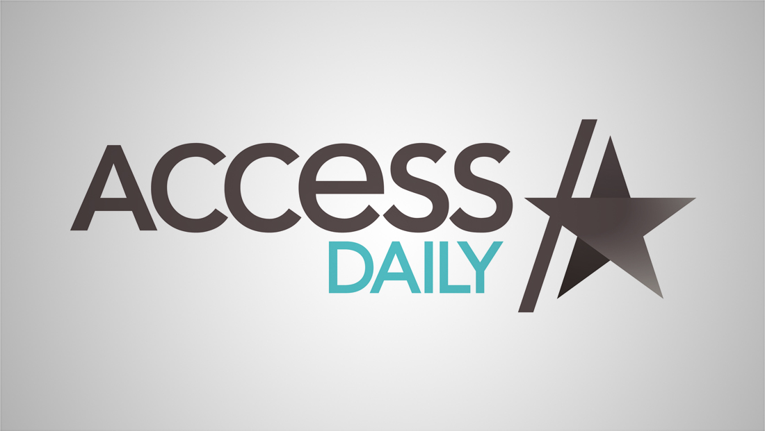

“Access Daily,” which was previously known as both “Access Live” and “Access Hollywood Live,” got an updated matching logo — but with teal used in place of red.


Here’s the speech bubble inspired ‘Access Live’ logo the show used previously.


Prior to that, this arched version was used.
Subscribe to NCS for the latest news, project case studies and product announcements in broadcast technology, creative design and engineering delivered to your inbox.



tags
Access, Access Daily, Access Hollywood, Access Hollywood Live, Access Live, logo design
categories
Branding, Broadcast Design, Heroes