‘Today All Day’ channels blend of broadcast, digital design elements

Subscribe to NCS for the latest news, project case studies and product announcements in broadcast technology, creative design and engineering delivered to your inbox.
NBC News introduced its “Today All Day” streaming service — which features a mostly reassembled blend of softer content from the show — July 15, 2020, and the service uses its own unique look that plays homage to several of its corporate big sisters.
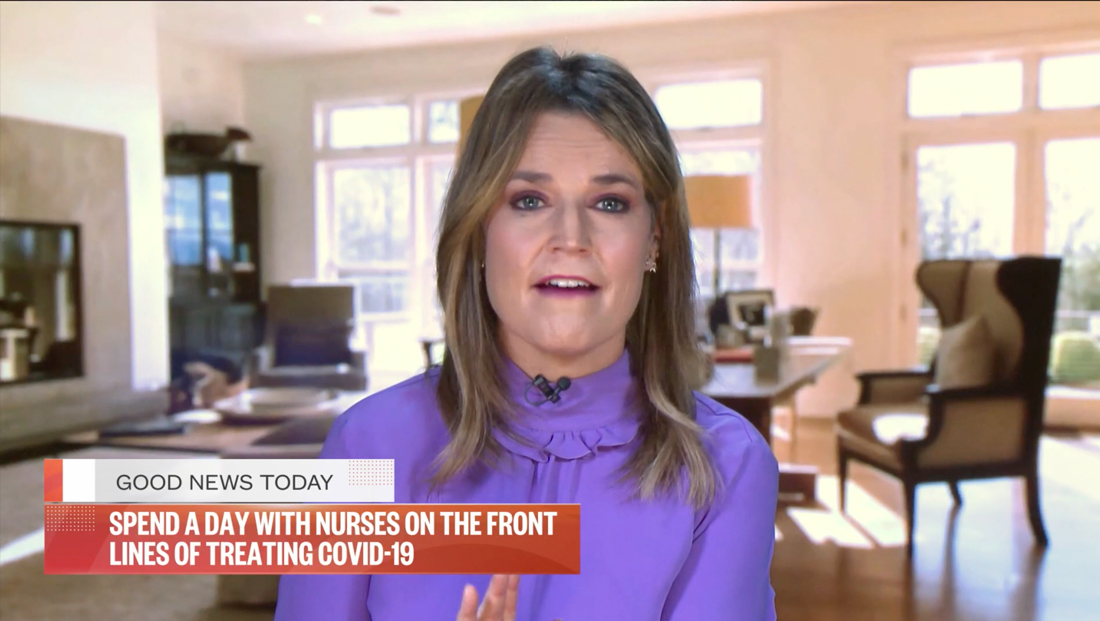
As a digital product, it makes sense that the stream’s look skews more toward the look and feel of both NBCNews.com and Today.com, relying heavily on the Founders Grotesk and Mono fonts used on both sites, while also incorporating the elegant serif Publico family for softer looks.
NBC News’ ‘Today All Day’ streaming service repackages content that showcases softer content https://t.co/Z7CNDBukIY #TVNews #BroadcastNews
— TVNewsMix (@TVNewsMix) July 15, 2020
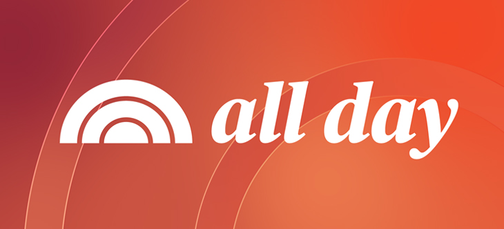
The “Today All Day” logotype uses the italic version of Publico. Some lockups of the logo include the “Today” logotype along with the sunrise icon, while others sort of let the icon stand in for it.
The insert graphics that identify the segment title and topic are rectangular and feature textured backgrounds with hints of the “Today” sunrise but also feel more like the layout of the websites, which rely of large blocks of color and white in the background.
The boxy, left aligned look also blends well with the show’s main lower thirds as well as the distinct “Pop Start” look.
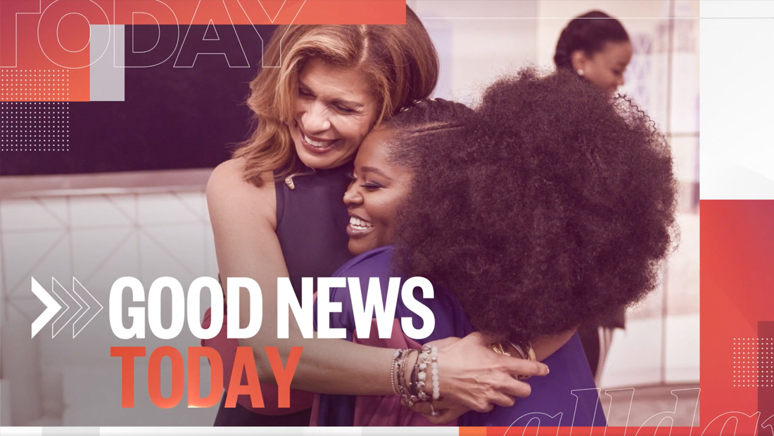

Most of the graphics still center around the orange shade found in the “Today” logo and opening graphics but tend to be a bit darker and richer while also blending in rustier and redder shades and deep violets, the latter of which connects well with the “Today 3rd Hour” look.
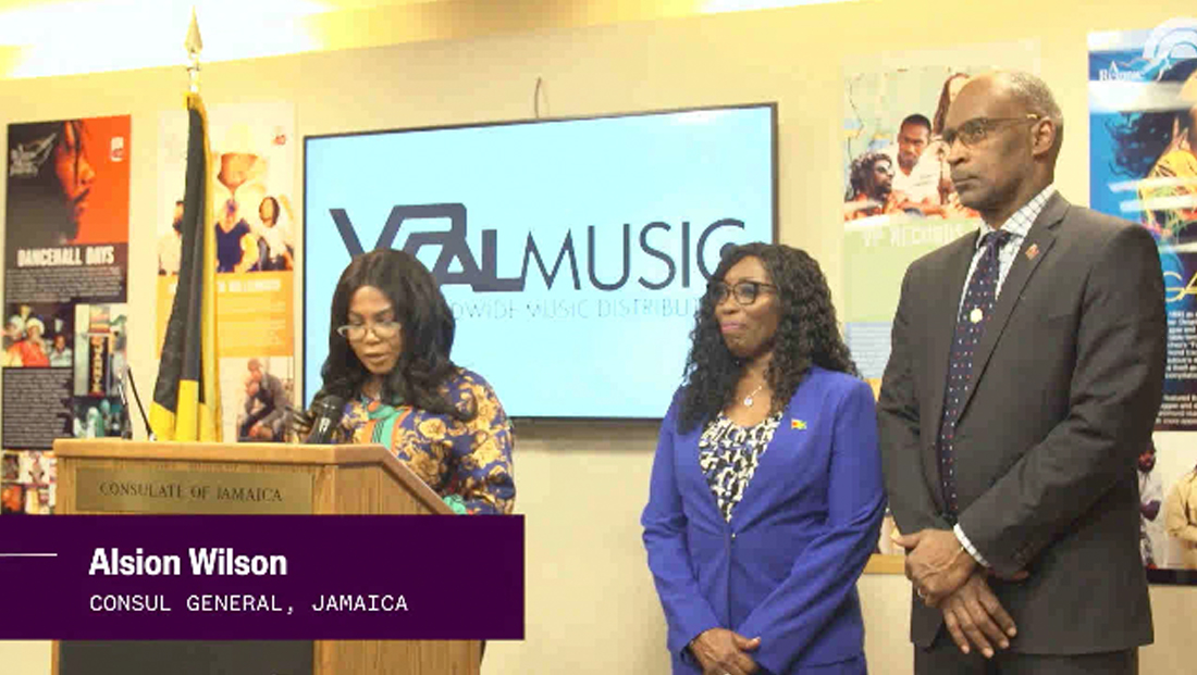

The plum shade also appears in the lower third insert graphics that have been used on “Today” digital video features for some time now — and also uses Founders Grotesk and Mono.
Other prominent graphical details include thin outlines of text and icons, including the “Today” and “Today All Day” logo as well as square dot patterns borrowed from Today.com and the horizontal bars found in the show’s main open.
“Today All Day” also borrows the familiar “Today” signature fanfare, also featured in the main open, as the music cut on many of its segment stingers.
Subscribe to NCS for the latest news, project case studies and product announcements in broadcast technology, creative design and engineering delivered to your inbox.




tags
logo design, NBC, NBC News, streaming, Today, Today All Day
categories
Branding, Broadcast Design, Broadcast Industry News, Featured, Networks, Streaming