
Oscars telecast attempts to transform itself into a film, with varying success
Weekly insights on the technology, production and business decisions shaping media and broadcast. Free to access. Independent coverage. Unsubscribe anytime.
Like just about everything on TV lately, the 93rd Academy Awards telecast looked different thanks to the coronavirus pandemic — but the producers seemed to attempt to embrace that idea to create an interesting blend of nods to diversity, old Hollywood and films themselves.
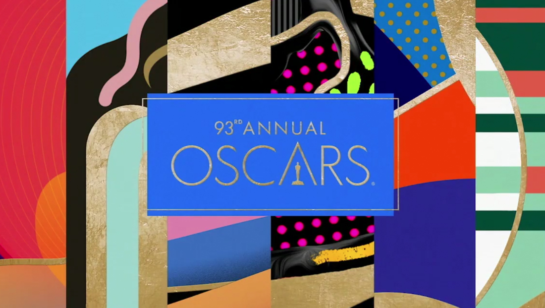
In the past, the Oscars telecast look has often been filled with elegant reds, blacks and golds to tie into the palette of the golden statuettes and red carpet. While those colors and elements didn’t disappear from the Sunday, April 25 broadcast, there was a decidedly graphically diverse look.
Awards telecasts also typically use a lot of the same shots — wide sweeping views of the audience, those boxes of nominees that zoom in on the winner (with the other nominees clapping politely) and tight shots on the presenters and winners.
This year, Jesse Collins, an actor, Stacey Sher, a producer, and Steven Soderbergh, the big-name director and producer behind “Ocean’s Eleven,” “The Laundromat” and (ironically) “Contagion” among a slew of other works, co-produced the telecast, a task that included working around COVID-19 protocols.
Last year’s Oscars took place in February 2020, about a month before widespread lockdowns forced other awards shows to modify their formats.
Soderbergh’s influence was particularly visible right from the top, thanks to a single-take style open of presenter Regina King walking from the outdoor lounge — built outside the alternate site of Union Station in Los Angeles — to the indoor presentation set. Both spaces were designed by the Rockwell Group, who also designed the interior of the Oscars’ normal home, the Dolby Theatre.
Rockwell Group’s PR firm did not respond to repeated requests for additional comment for this story beyond the original press release announcing the design strategy.
Producers also used a variety of effects to add the look and feel of a Hollywood film — including off center framing that avoided having presenters and winners looking directly into the camera, dramatic rack focuses and more depth, texture and a distinct lighting design.

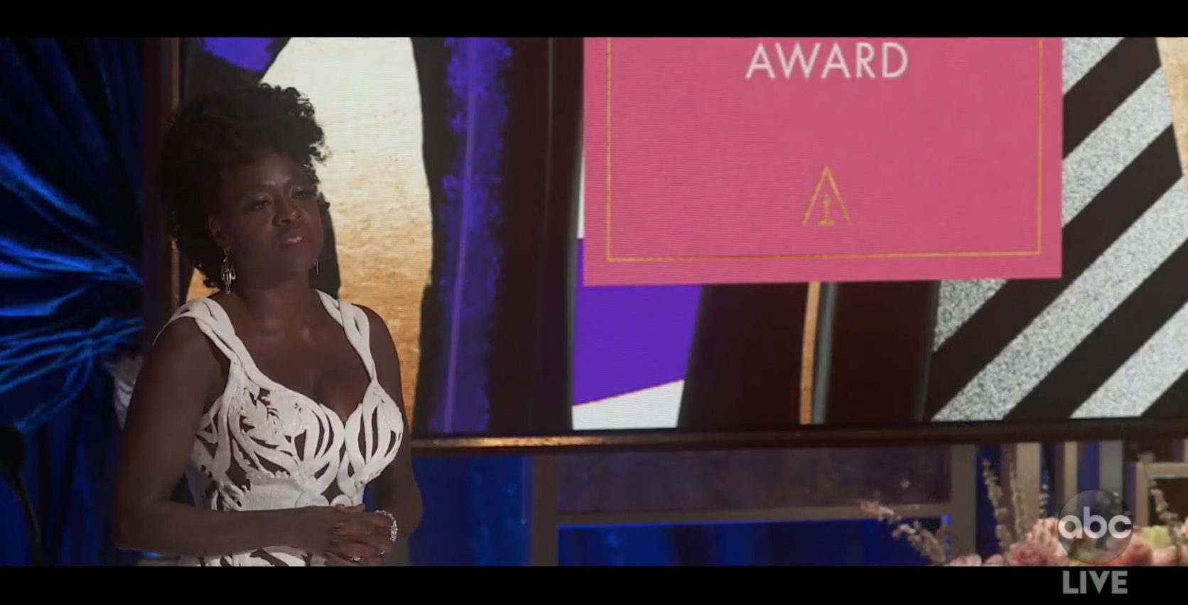
One of the recurring references to films was the fact that live action parts of the telecast had a letterbox (note how the ABC bug extends below the live picture) into the black area, meaning the black bars on top and bottom were meant to be seen.
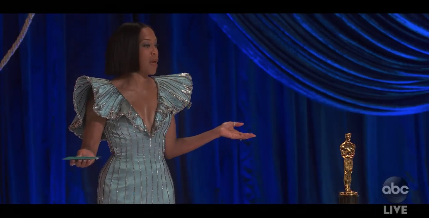
Presenters and winners were typically shot off axis and off center, which meant they weren’t looking into the camera. The wider ‘live’ screen area, made slightly wider thanks to the letterboxing, could be filled with an Oscar statuette perched on a plinth next to the person to help reduce physical contact with the award being carried out from backstage. Other blocking included out-of-focus views of the audience or backgrounds.
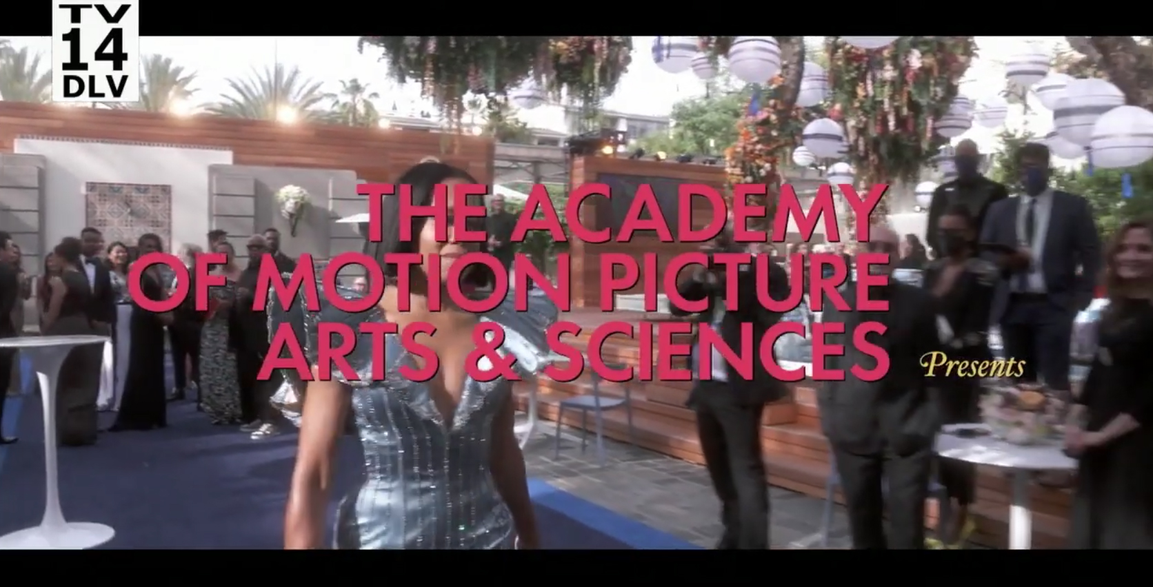
Color typography that blended a geometric sans serif with a vintage script serif in a variety of color schemes was used at the top of the show to mimic film credits, such as this ‘presents’ screen mimicking the studio credits that many films use.
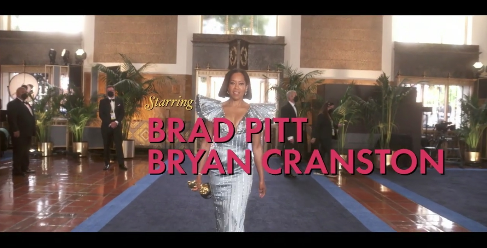
Presenters were also listed over the single-take handheld shot of Regina King walking with ‘star’ billing.
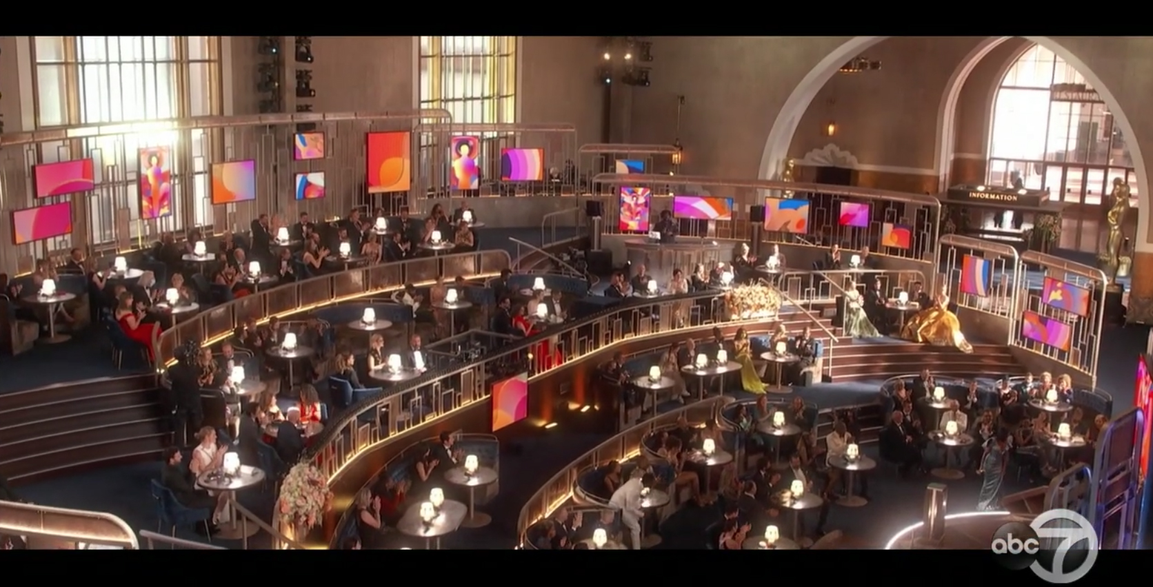
Old Hollywood glam found its way into the tiered set that was restricted to on-site nominees and close friends or family members, thanks in large part to the gold railings and wraparound framework. The set also featured ‘live picture frames’ that could alternate with the colorful, often geometric designs that coordinated with the show’s insert graphics. These were also used to showcase historic photographs, typically in black and white.
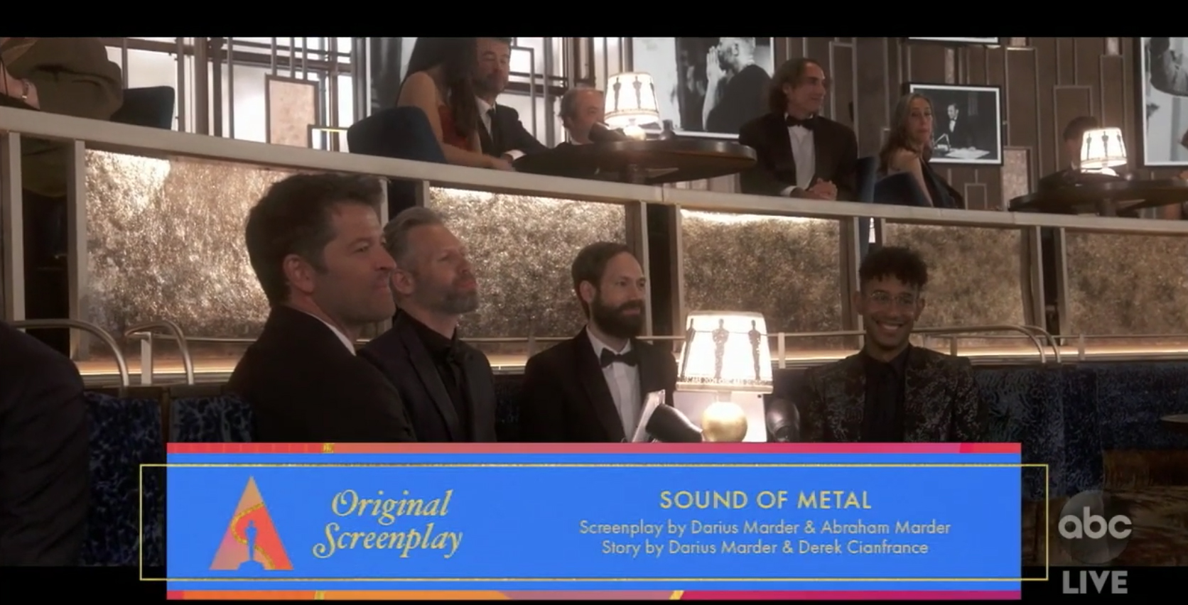
Nominees were identified on screen with rectangular, multicolor graphics and typography matching the open. The colors of these and the box views changed throughout the broadcast, with the live video panels around the set updating to match.
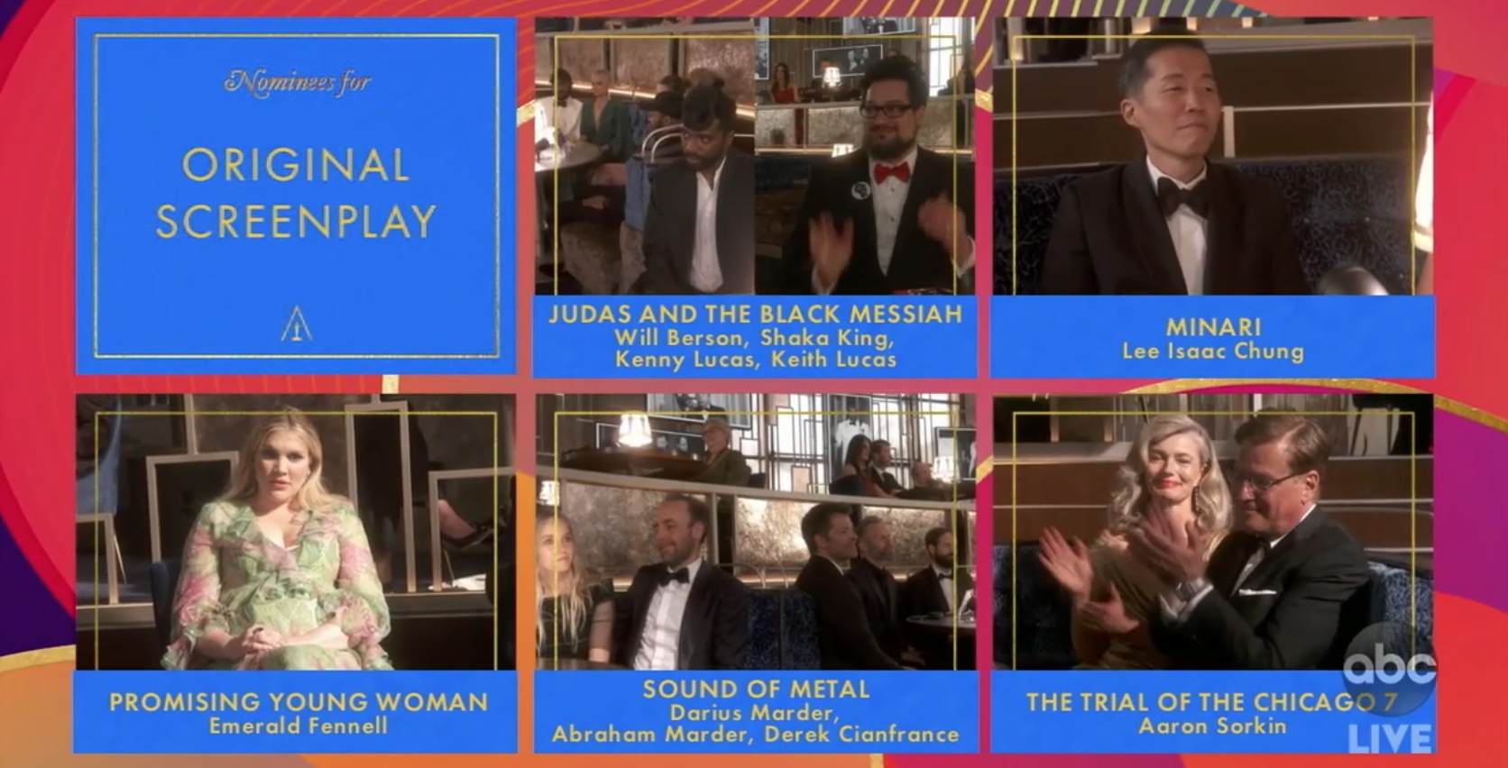
Nominee feeds were put inside of boxed designs like this ‘five box’ approach. Note that most fullscreen graphic applications like this lost the letterbox.
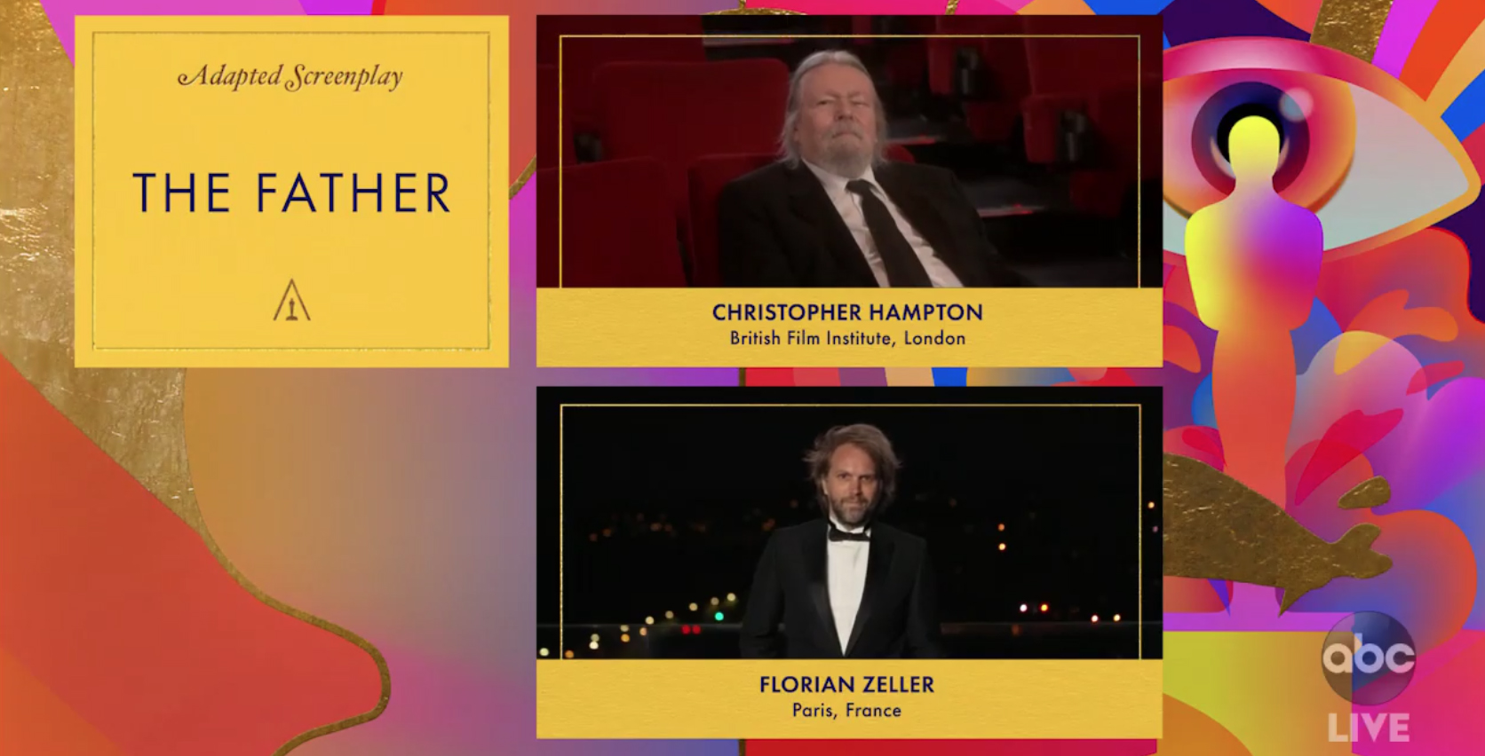
Awards with less nominees used a variety of layouts that also incorporated the colorful motifs.
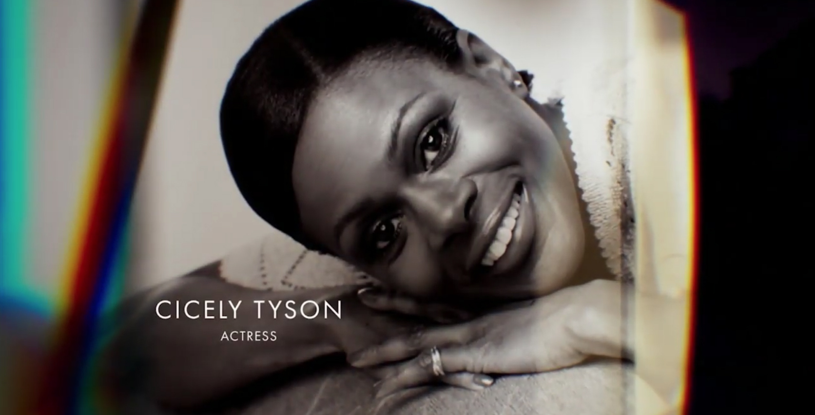
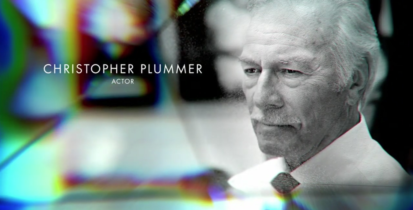
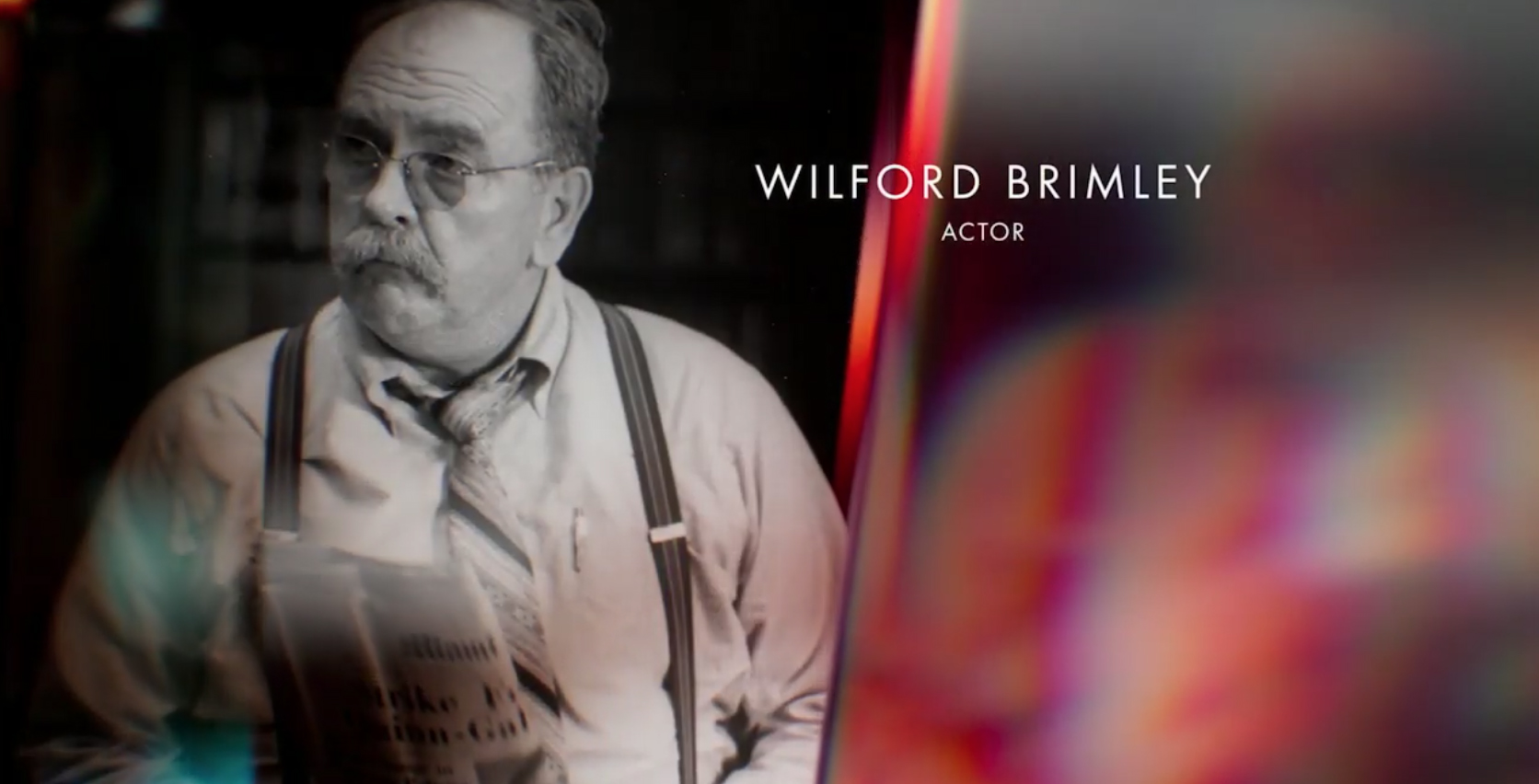
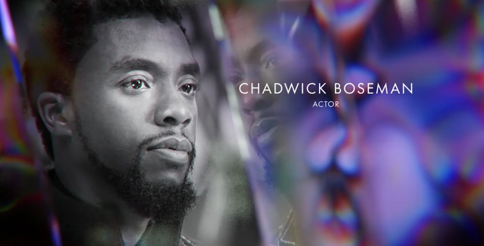
For the popular ‘in memoriam’ segment, photographs were combined with a faceted look of blurred angles and colors in a variety of styles, some of which follow. These looks carried through the colorful look of the rest of the show’s graphics, but had more depth and parallax-style effects than the flatter graphics used elsewhere in the show.
The Oscars lost over half of its audience over last year https://t.co/aUPblsXDYS #TVNews #BroadcastNews
— TVNewsMix (@TVNewsMix) April 27, 2021
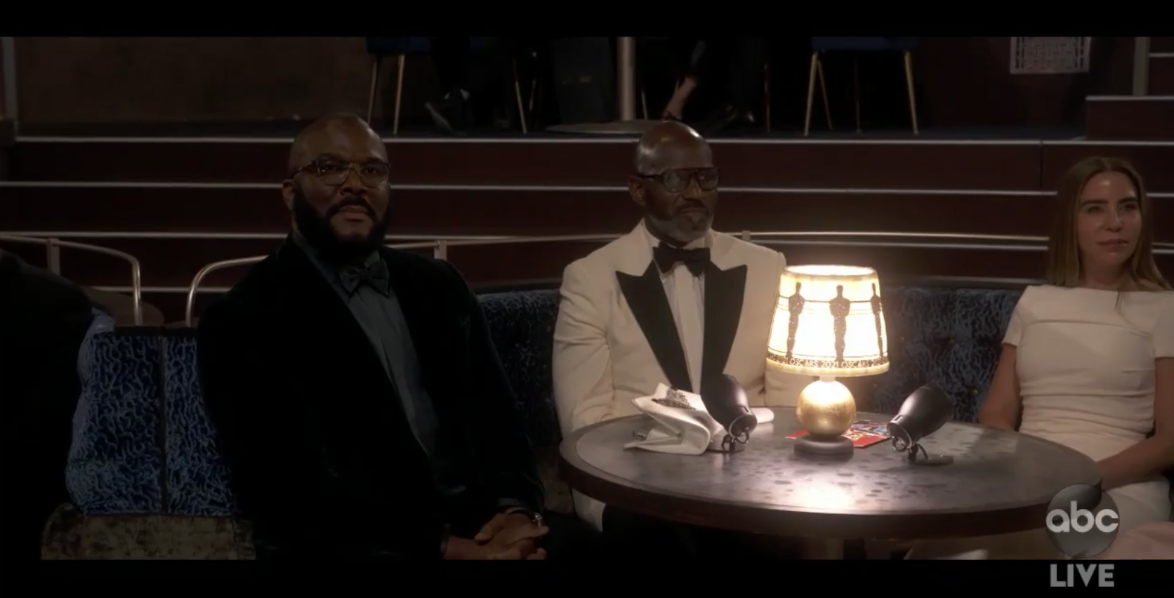
As previously announced, nominees sat at a variety of banquet and cafe tables throughout the space, some of which had custom-designed Oscar-themed lamps. As part of the more dramatic, cinematic lighting approach, shots from the Union Station set often appeared a bit dark with little to no backlight (in fairness, the high ceilings likely would have made this challenging without bringing in extensive rigging). Despite the show’s attempts to be more diverse, this seemed to affect individuals with darker skin more. The lighting also had to account for the changing light coming from the station’s 40-foot windows, and, later in the evening, shots became even darker.
The Oscars’ format didn’t appear to resonate well with viewers, with many on social media panning the format — and initial ratings data shows the broadcast lost over half of its 2020 audience.

tags
ABC, Awards Shows, Oscars
categories
Awards Shows Production Design, Heroes