WarnerMedia, Discovery announce their pick for their new combined company name

Subscribe to NCS for the latest news, project case studies and product announcements in broadcast technology, creative design and engineering delivered to your inbox.
WarnerMedia and Discovery Inc. have announced that they plan on naming the company formed by their previously announced merger Warner Bros. Discovery.
The new name comes after the May 17, 2021, announcement that the two companies would merge, with AT&T selling its stake in WarnerMedia, a conglomerate that includes, in addition to the various Warner Bros. ventures, CNN, HBO, TNT, TBS and more.
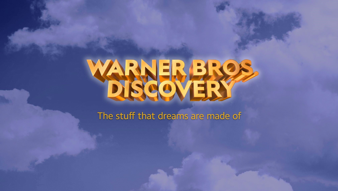
Along with the announcement of its intended name, Discovery also released an “initial” wordmark for the new venture, which appears heavily inspired by the classic Warner Bros. look of a gold shield emblem set against a blue sky with fluffy white clouds (though the company announced a redesigned brand look in November 2019).
The logotype includes the letters rendered with an extreme extruded 3D effect that borders on a Microsoft Office WordArt look and also includes no reference to the iconic Discovery Inc. globe icon that’s been part of its branding for decades.
The tagline, at least for now, is “The stuff that dreams are made of” — a line from the classic Warner Bros. film “The Maltese Falcon,” and the initial lockup appears to have the tagline sort of “slapped on” the design.
“The Warner Bros. Discovery name will honor, celebrate and elevate the world’s most-storied creative studio in the world with the high quality, global nonfiction storytelling heritage of Discovery,” reads a statement from Discovery.
The Warner Bros. name is one of the oldest in the entertainment industry and survived through the Time Warner and AOL Time Warner days. It started as a film studio before evolving into Warner Communications.
The new name follows a widely used practice of combining, in some form or another, the names of the two companies involved in a merger, though it notably eschews the camel case trend that WarnerMedia itself used when it rebranded after AT&T acquired select Time Warner assets in 2018.
In other words, “WarnerDiscovery” or “DiscoveryWarner” weren’t picked.
From a typographic standpoint, the name “Warner Bros. Discovery” is a bit awkward because of the abbreviation of the word “brothers” and the resulting period that gets thrown in the middle of the name.
Could some audiences think the name of the company is “Warner Bros” as in “bros, what’s up?” or think the period is some kind of typographic stylization or full stop?
It’s important to note that the logo and tagline (and even the name) could all end up changing down the road. Companies often release initial designs and then end up making changes, sometimes significant, later on.
Subscribe to NCS for the latest news, project case studies and product announcements in broadcast technology, creative design and engineering delivered to your inbox.


tags
Discovery, logo design, Warner Bros. Discovery, WarnerMedia
categories
Branding, Broadcast Industry News, Heroes