
TelevisaUnivision logo uses generic typeface with unique placement, bold gradient
Weekly insights on the technology, production and business decisions shaping media and broadcast. Free to access. Independent coverage. Unsubscribe anytime.
After closing on a previously announced deal to merge, Mexican broadcaster Televisa and U.S. network Univision unveiled a new corporate look earlier in February 2022.
The new company, known as TelevisaUnivision, combines the names of the two separate entities while keeping the capital letter at the start of each.
Initial announcements styled the new company name as Televisa-Univision, with a hyphen, although removing the hyphen doesn’t fundamentally the name. The official corporate entity that owns the combined company is TelevisaUnivision Inc., which also uses the camel case formatting.
For a logo, a rather generic sans serif is used with “Televisa” on one line and “Univision” on another. The “Univision” line, however, is bumped to the right a bit so that the left upstroke of the “U” aligns with the middle stroke of the “T” above, though the two glyphs don’t merge together but rather maintain a thin line of separation.
The new lockup creates a significant amount of “trapped white space” thanks to the three dots on the lowercase “I”s in the word Univision, which is a bit of a visual misstep.
While this also means the left side of both tiers don’t align either, it appears to be just enough to not look like an error, while the fact the word “Univision” is longer and sticks out on the ragged right side helps balance the look a bit.
The logo’s lettering, meanwhile, is filled with an orange to magenta radial gradient, giving it a vibrant, bold look.
Overall, the look isn’t great, but it isn’t exactly horrible either — unless you happen to be finicky about trapped white space and it’s certainly not the first logo to create a similar situation.

That said, one possible solution would have been to set both names in all capitals, which still would have allowed the “T” and “U” to connect.
The gradient is also not revolutionary, though its use of two hues that don’t have a lot of contrast is another interesting, albeit not totally original move. Much of the corporation’s new website sticks with just orange — without any gradient effect and sets the logo in white.
For smaller applications, a “T” and “U” icon is available. In a nod to the “connection” between the two letters in the full lockup, the icon tucks the “U” under the right “arm” of the “T.”
![]()
TelevisaUnivision is expected to maintain most of the brands their various logos and brand standards currently under its ownership, including the Univision name and “tulip” logo in the U.S. and Televisa logo in Mexico.
In what was probably a wise move, the TelevisaUnivision logo did not attempt to combine elements from both company’s identities.
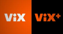
However, VIX, which the company acquired shortly after the new company was officially formed in February 2022, will receive a new logo as it becomes the shared streaming brand for both broadcasters. As part of that move, announced Feb. 16, the PrendeTV brand will sunset.
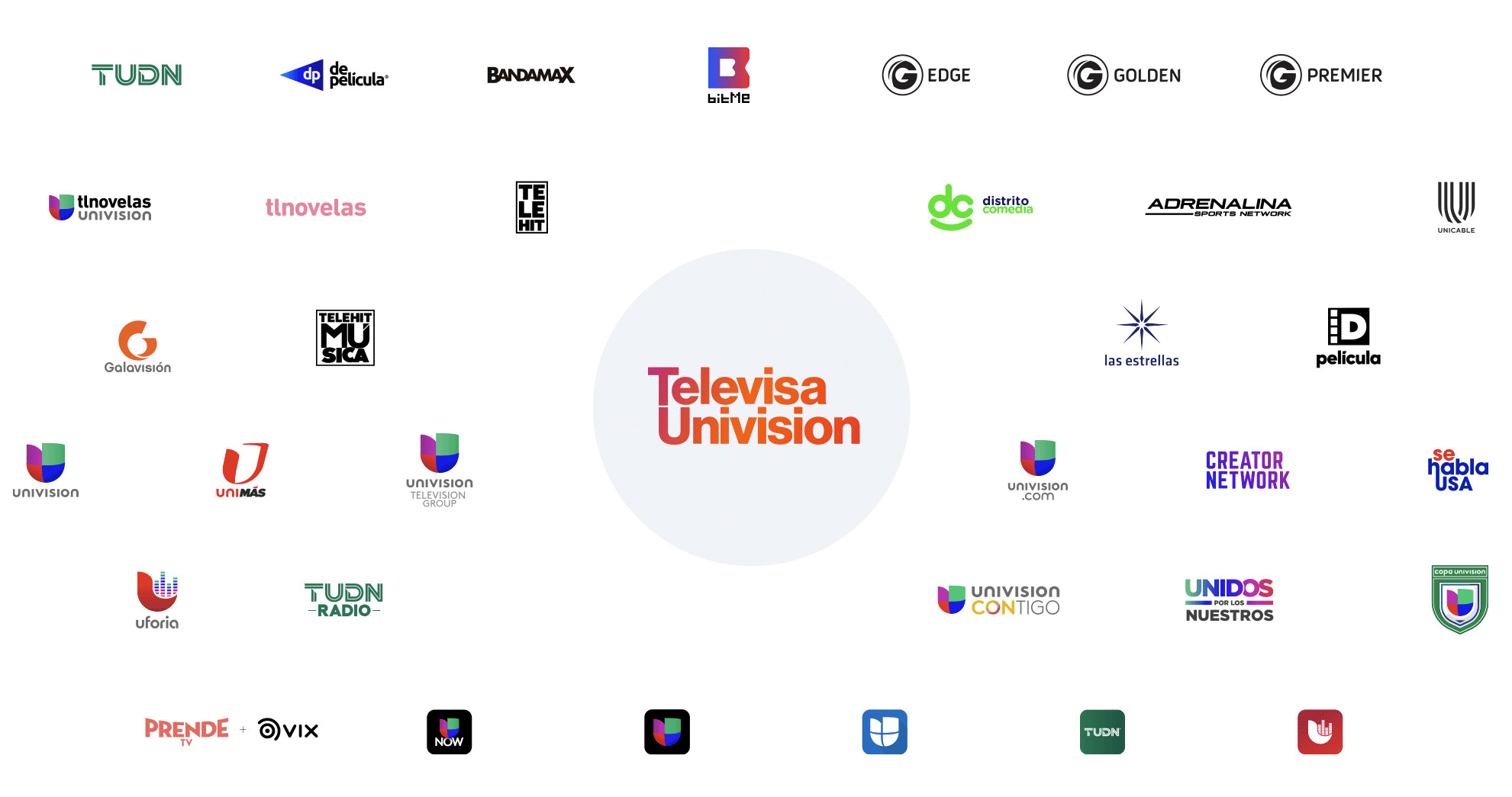
A collage of TelevisaUnivision brands. The PrendeTV and old VIX logos are included in the lower left because this image was posted before plans were announced to use the name ViX for a combined streamer and fold PrendeTV into that.
TelevisaUnivision’s mixed case, single word stylizing is similar to that used by ViacomCBS, which changed its name to simply Paramount in Feb. 16, 2022, and WarnerMedia, which is expected to change its name to Warner Bros. Discovery after AT&T spins it off to merge with Discovery.

tags
logo design, Televisa, TelevisaUnivision, Univision
categories
Branding, Broadcast Industry News, Featured, Networks