
Richmond station’s new look blends subtler 3D with traditional accents
Weekly insights on the technology, production and business decisions shaping media and broadcast. Free to access. Independent coverage. Unsubscribe anytime.
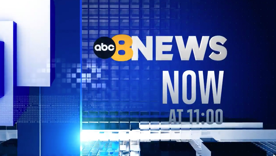
WRIC, Nexstar’s ABC affiliate in Richmond, Virginia, has debuted a new graphics package that combines boxy elements and more subtle 3D effects while still incorporating nods to the metallic, glassy looks and light bursts that have long dominated newscasts’ design.

Created in-house by Nexstar’s creative team led by Rey Rodriguez, senior art director, the package is known internally as NDC-3, with the initials being short for the group’s graphics hub known as the Nashville Design Center.
![]()
While WRIC is the first of Nexstar’s stations to debut the look, it is reportedly available for others to use in the future.

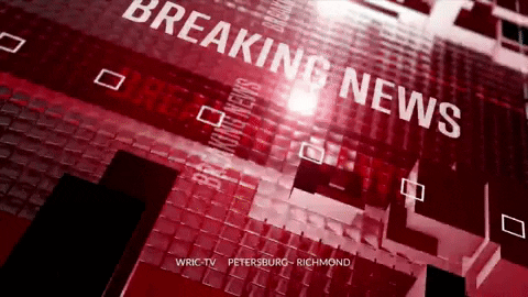
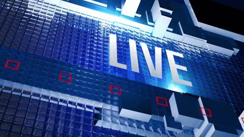
The design is centered on a blue and white palette that blends well with the station’s yellow “8” numeral logo. Red is used as a secondary color in some portions while becoming dominant for breaking news opens and stingers. It also makes prominent appearances in the form of square outlines that are often used to form a horizontal repeating band.
The package’s fullscreens also use textural backgrounds of squares arranged in grid patterns, including ones where squares flicker on and off.
Some of these grid patterns get that glassy look — and even the ones that don’t get the full treatment still get an overlay blending mode that suggests glass or metal.

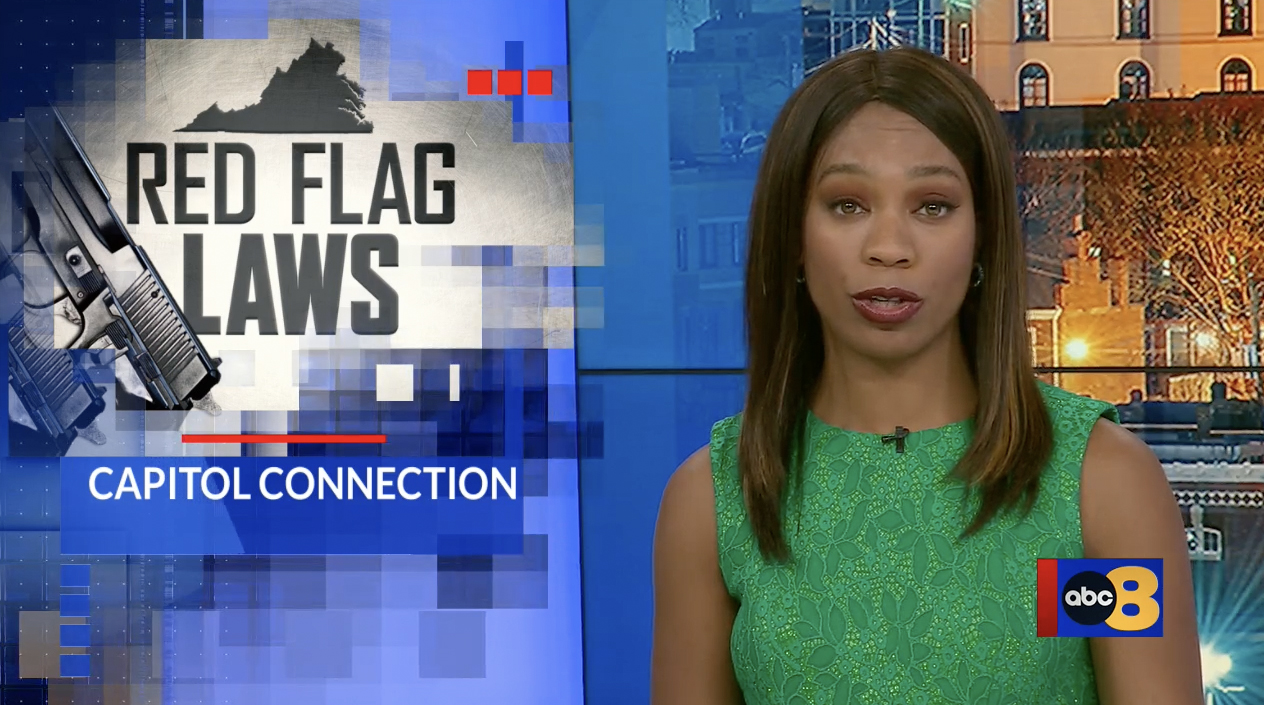
Although WRIC relies heavily on in-studio video walls with topical graphics, the new graphics do include a traditional OTS overlay. The template includes a clear space for up to two lines of text as well as a ‘window’ for the story imagery that’s framed with a square pattern effect that mixes various transparency levels. Red accents also help draw the eye first to the image and then the headline. The chunky font used to spell out ‘Red Flag Laws’ is used commonly across WRIC’s video wall graphics.
Meanwhile, the grid is retooled as clusters of blocky 3D elements that take advantage of subtle shadowing and leverage the vanishing point to convey dimension throughout the package.
This concept is also used in the station’s updated lower thirds that use the open-source font Lato for typography, a typeface that also appears in other parts of the new look. The design also has a condensed sans serif that appears to be carried over from a previous package as well as the distinctive font the station has used since dropping its previous logo in 2016.
This font is used for both the word “News” in the 8News lockup as well as the Storm Tracker 8 logo with notably diagonal ends on the horizontal strokes found in letters such as “T” and “E” that has similarities to the typeface the ABC network frequently uses in its branding.
The foundation of the lower thirds features a series of blocky elements that build a sort of platform for the text, including a narrow segment that juts out of multiple layers to the left serving that draws the eye there and, by extension, the banner’s lettering.
The edges of these elements feature a blend of deep blue and white gradients that manage to keep the look on the flatter end while still suggesting hints of metallic and glassy surfaces.
In addition, the entire design runs on an animated loop that incorporates angled segments of light that interact with the underlying elements — along with more traditional light bursts that glide along the sides of the blocks. One point of the animation also features a micro version of the grid pattern that adds another layer to blend with the lighting effects.
While this entire block base provides an obvious clear zone for on-screen banner text, the background color appears to leave the 3D space and become more of a traditional insert graphic container sans any 3D as it runs into a red vertical line that separates the banner from the bug, which, in turn, features a solid blue background.
In some ways, this creates an M.C. Escher-esque effect of toying with perspective, but it also appears not only to improve legibility by keeping the text and bug on their own layer, at least visually, that seemingly isn’t affected by the animation or lighting effects.
Likewise, fullscreen lists of text are contained in a white-gray gradient box that manages to convey the feeling of being created from multiple solid blocks behind combined but purposefully avoids overusing 3D effects.
These screens also use a bold red line along the left side of this container that draws the eye to the content next to it.

The package’s animation, transition and wipe elements are crafted to echo the feel of the design, including an effect that borrows both the square outline and solid square shapes in its mask.
Another variation includes a cluster of rotating cubes that morph into vertical segments with varying degrees of transparency, creating a connection to the glassy references.
The lower third design also uses an entrance animation that creates the effect of various segments of the design entering from either the bottom or left side of the screen, giving the effect of the graphic being built on-screen.
Animation is also heavily used in the package’s opens and stingers, which include “breaking news,” “just in” and franchise variations in a variety of layouts.
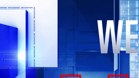
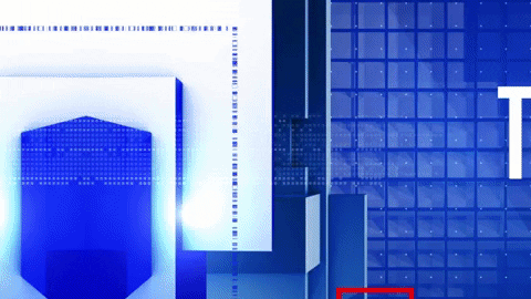
Assets designed more as opens, typically identifiable thanks to the station’s FCC-required ID text on them, tend to use dramatic off-axis viewports of what appears to be a wall of glassy segments, solid blocks and text within the 3D-space that rotates from the top of the screen to bottom revealing a final look with a sort of L-shape frame for larger text and logos.
These layouts also typically include two lines of microtext or DNA-like hashmarks that intersect at a right angle, creating another take on the box look.
Another version, used more for stingers, features a primary look with the 3D blocks forming more of a sidebar on the left side of the screen, with the rest of the space filled with a corresponding image with varying amounts of the grid patterns. The entire sequence, however, starts with the viewport zoomed in on the sidebar and a portion of the text, which purposefully runs off the screen.
In instances where the background is a photo or video clip, the text is typically set inside of a solid color banner that extends the full width of the screen with line of red boxes moving across the screen.
For stingers that appear more frequently and are less likely to have corresponding imagery, the background remains in the blue glassy box texture and text simply floats above this, accented by another row of red boxes.
There is an alternate, longer open look that uses a more intricate off-axis wall of elements that include city imagery and bottom-to-top animation that suggests the side of one of the buildings featured in the background.

In addition to the graphics used during the bulk of its newscasts, redesigned weather graphics were also unveiled.
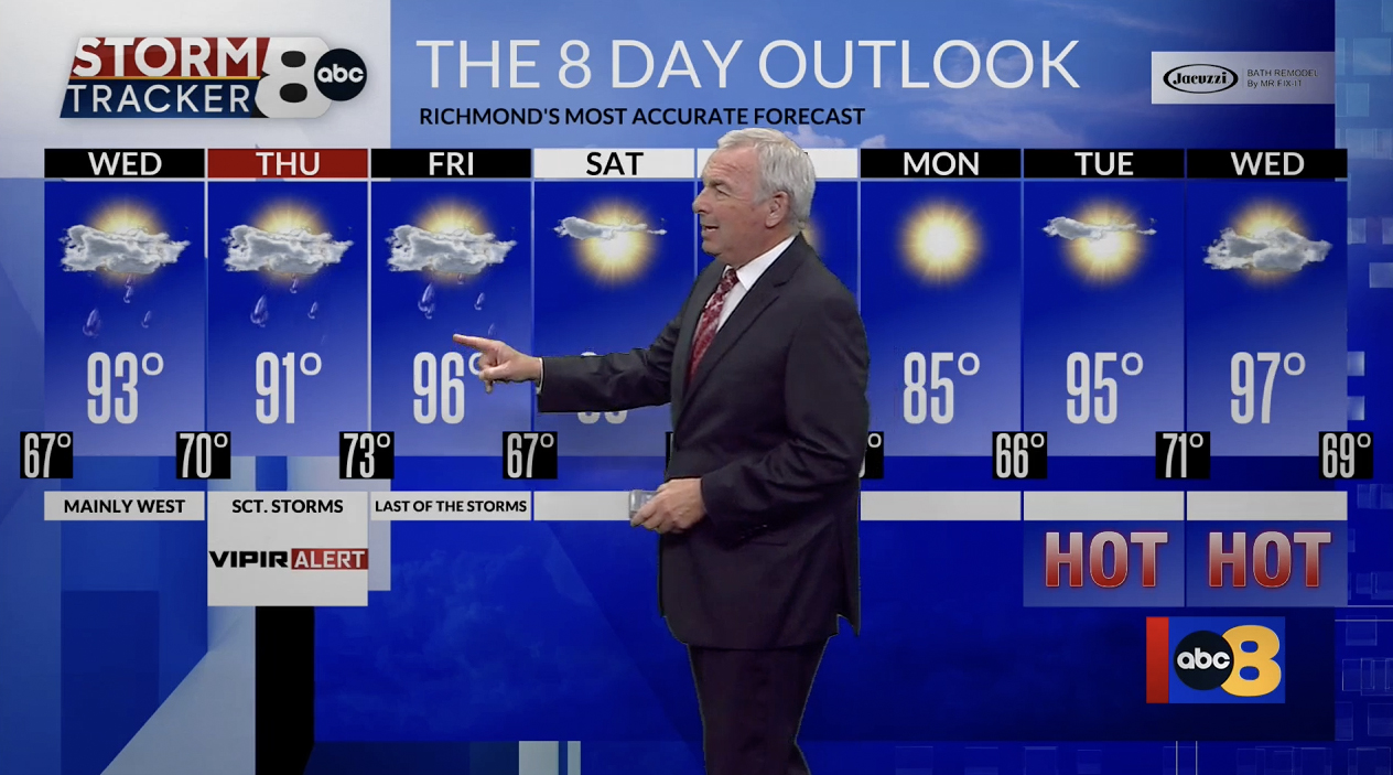
These layouts draw inspiration from the primary look, but tend to all but eliminate the 3D effects, likely a move to help keep the emphasis on the maps and on-screen imagery being used in the forecast.
In many weather elements, including first weather stingers and the station’s “most accurate” reopen, backgrounds are created using a variety of angled elements that appear to be inspired by the vanishing point elements in the 3D aspects, flat rectangles in a variety of shades and some arrays of semitransparent boxes.
In addition to the graphics used during newscasts, the redesign also includes a matching look for the station’s network and syndicated programming promos.

This includes stingers featuring words such as “tomorrow” along with the fullscreen graphics most stations insert at the end of provided spots to localize them as well as a way to list upcoming shows in a schedule format.


These looks tend to feature backgrounds created using a blue field of 3D boxes with roll-down animation that transitions to an L-shaped bar with a window on either the left or right side of the screen for imagery, including additional box elements for talent photos.

tags
Nexstar Media Group, Richmond, WRIC
categories
Broadcast Design, Broadcast Industry News, Graphics, Heroes, TV News Graphics Design, TV News Graphics Package