NBC redesigns logos for NFL pre-game show, coverage
Subscribe to NCS for the latest news, project case studies and product announcements in broadcast technology, creative design and engineering delivered to your inbox.
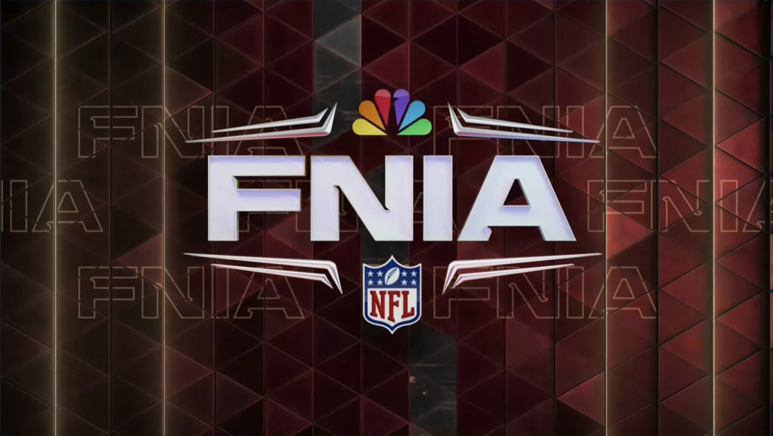
NBC Sports has kicked off “Football Night in America” and “Sunday Night Football” with new logos and new looks for the new season.
The network is also starting to refer to the two broadcasts with the initialisms “FNIA” and “SNF” — similar to how ABC and ESPN have branded “Monday Night Football” as “MNF.”
“FNIA” is the pre-game show to NBC’s Sunday night NFL game and started using that name in 2006, while “SNF” is the name used for the actual game. NBC has not officially retitled the shows, however, and both the full names and initials are used throughout the same broadcasts.
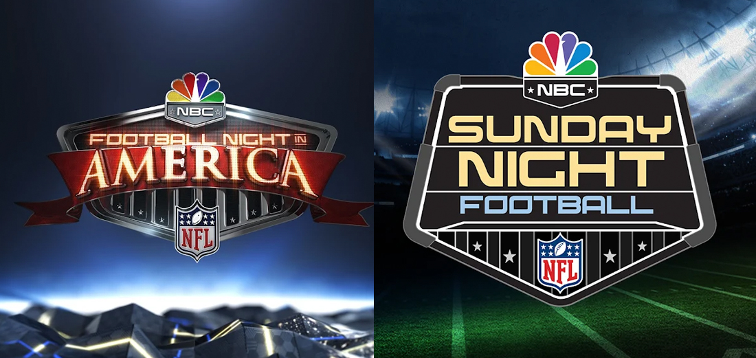
The previous ‘Football Night in America’ and ‘Sunday Night Football’ logos.
The new designs drop the pentagon shield-like lockups in favor of cleaner typography with subtler accents.
Typography now uses a distinctive sans serif with notches taken out of key spots, typically where a stroke meets another.
It shares some similarities to the font NBC used to promote the 2022 Winter Olympics in Beijing, Zuume Cut Bold Italic (a non-italic version of the font is also used for NBC’s logo for MLB “Sunday Leadoff” games streamed on Peacock).
The sharp angles in the type are complemented by both the triangular pattern in the background, a look that was introduced in February 2022 for NBC’s coverage of Super Bowl LVI.
The font being used for NFL games, however, feels more refined, and also has an extended width version typically used for the initials, while a more condensed typeface is used for the top line when the full name is spelled out on screen, likely a strategic move to help save space.
These spelled-out versions use the wider version for “in America” and place a rule above and below “in.”
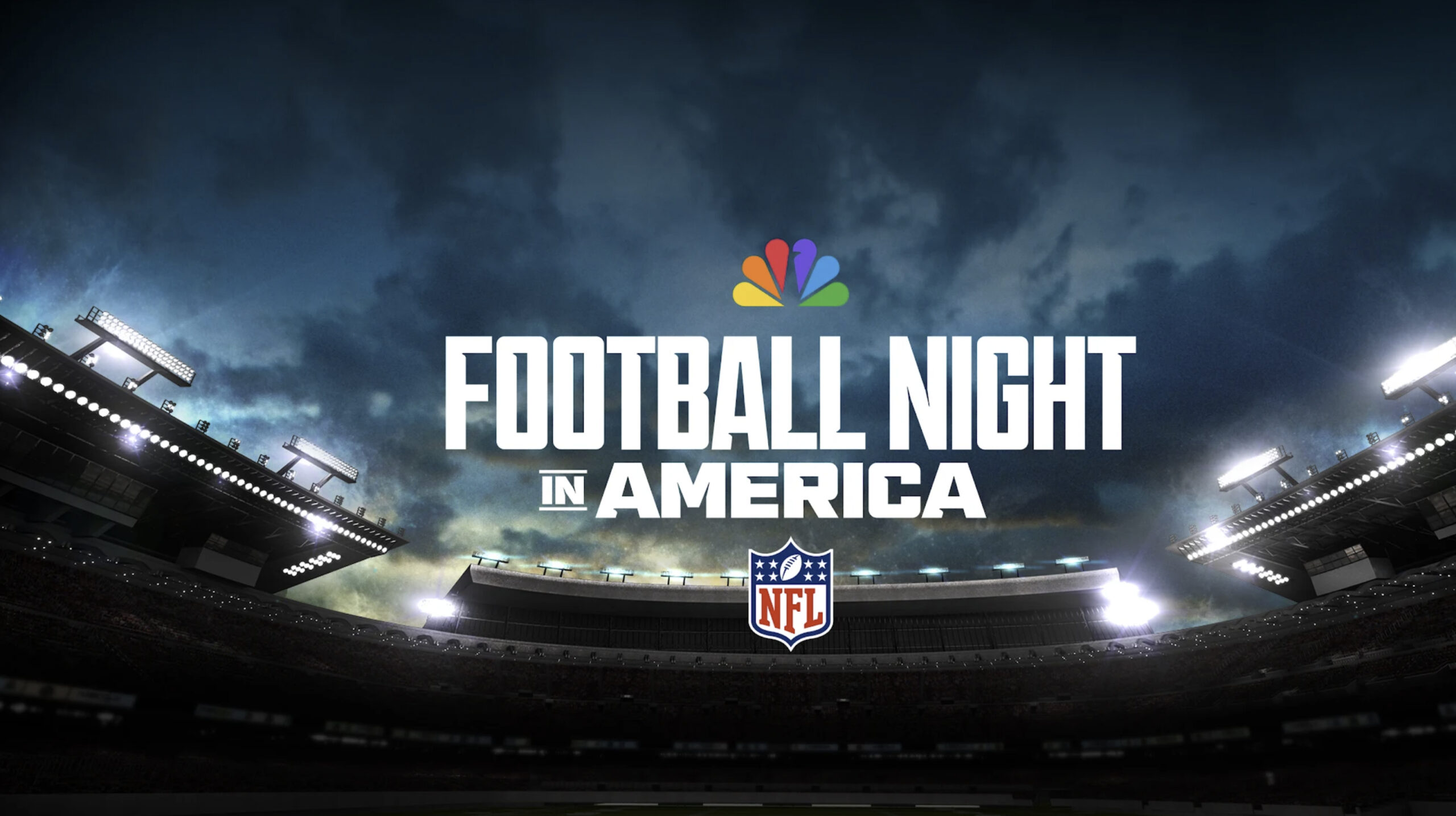

Super Bowl LVI marked the debut of a new look for NBC’s football coverage that has since rolled out to more of its coverage.
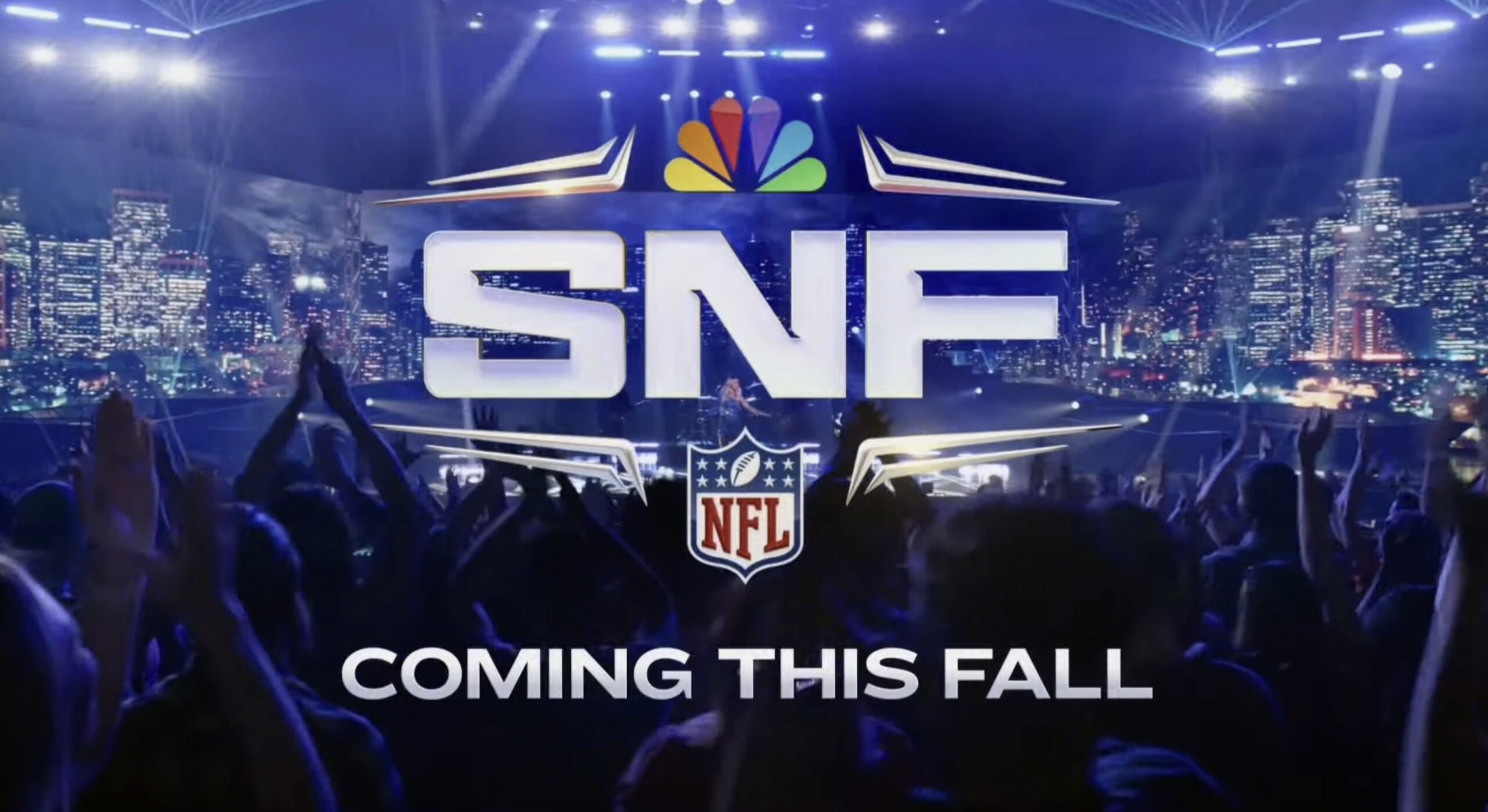

The notches are also echoed in the four sets of double strokes placed above the initials “FNIA” or “SNF” and help frame out the design while also leaving space for the NBC peacock icon above and NFL logo below.
These elements bring in some of the metallic elements found in both the old look and new one and could also be interpreted as either forming a horizontal football-like shape or creating the suggestion of a vertical one in the middle.
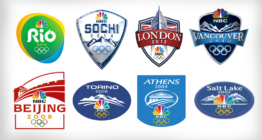
Overall, however, the new FNIA and SNF logos appear to be moving toward a much more simplified look. The FNIA one in particular drops the highly metallic look with morphed serif typography that is similar to designs used for NBC’s Olympics logos from 2010 to 2014.
NBC started shifting design directions starting with Rio de Janeiro in 2016, favoring flatter, more geometric designs.
The new “Sunday Night Football” logo is also a significant departure from what was being used, becoming much cleaner.
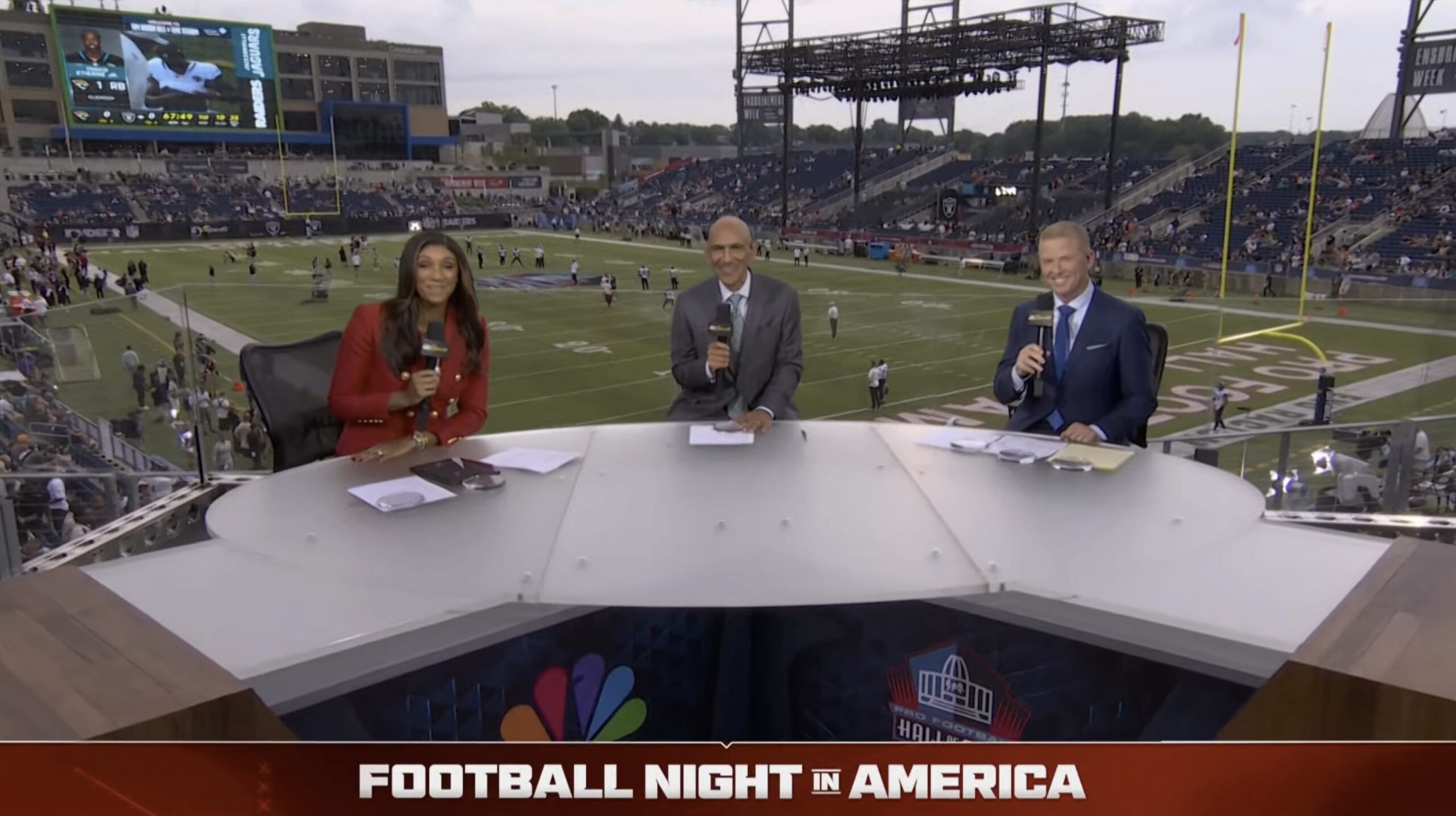

The notched look continues with a full-width branding banner that can be inserted across the bottom of the screen. It has a small notch in the center that suggests a downward pointing arrow, drawing the eye to the center of the logotype below, which typically switches to completely wide typography.
This banner is similar to the ones NBC often uses during special news coverage.
Subscribe to NCS for the latest news, project case studies and product announcements in broadcast technology, creative design and engineering delivered to your inbox.





tags
football night in america, nbc peacock, nbc sports, NFL, sunday night football
categories
Branding, Broadcast Design, Broadcast Industry News, Heroes, Sports Broadcasting & Production