Weekly insights on the technology, production and business decisions shaping media and broadcast. Free to access. Independent coverage. Unsubscribe anytime.
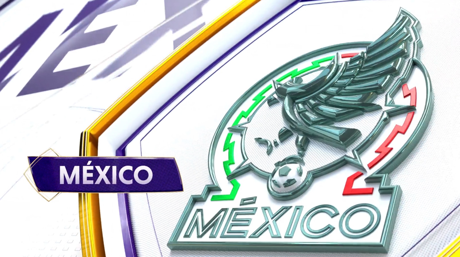
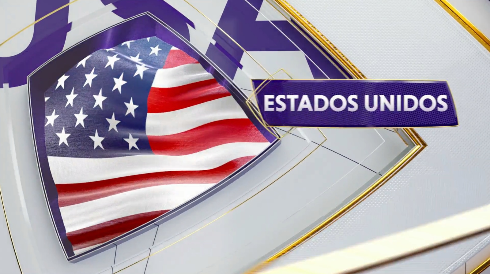
Embracing the vibrant celebration that is the FIFA World Cup, Telemundo’s on-air design for the event aims to capture the energy of soccer.
“It’s a sport, it’s a pastime, it’s an activity, it’s a lifestyle, it’s an obsession,” said Eric Say of Gameday Creative, the team behind Telemundo’s design. “The one adjective that was a through line and really became the core identity for the package is celebration… It’s not a somber ceremony. This is going to be an event. ”
“When Telemundo does a broadcast, they want to capture the energy of these games. Celebration felt right across the board… But how do you communicate celebration with graphics?”
“So some of that we did in an incredibly literal way,” said Say. “There’s some confetti in the package… but some of it is with the movement style and the motion logic and the color schemes.”
Armed with extensive research into past soccer coverage and a history of working on major sporting events, the team at Gameday Creative approached the concept of celebration across all parts of the package, resulting in the largest independent project the company has tackled to date: nine months in the making.
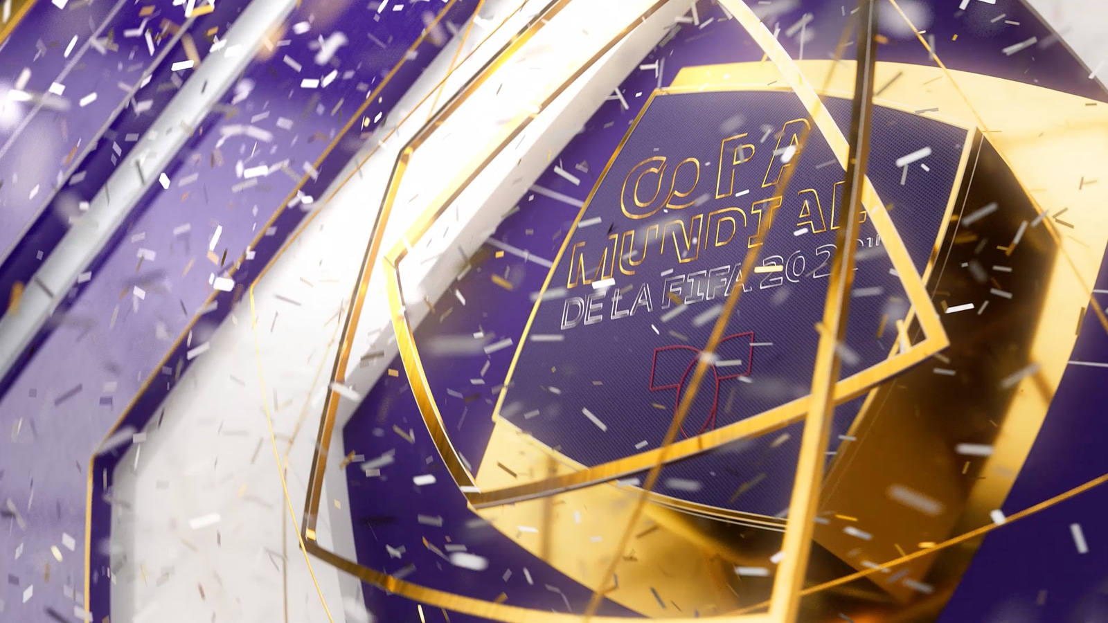
From literal confetti effects in the opening title sequence to the bold purple and gold palette, the package is built to feel uplifting and prestigious.

“The movement always comes in with high energy. There are explosive moments. It’s reactive. Sort of like when a ball goes into the goal, the whole stadium erupts, everyone stands to their feet,” said Say. “This is their biggest property and they wanted it to look and feel prestigious.”
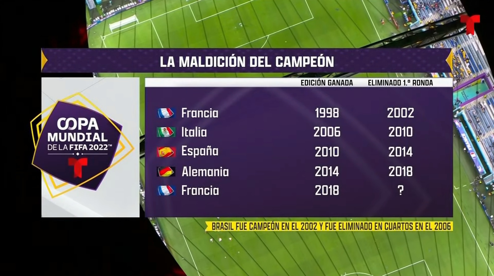
Along with conveying celebration, the package needed to clearly communicate information beyond the FIFA-provided scoring graphics.
The overall insert system and many of the graphics featured during the World Cup will become the standard insert look for Telemundo Deportes moving forward, carrying on the vibrancy of the World Cup to other coverage.
The package was created in Cinema 4D with Redshift for rendering and implemented into Chyron by Telemundo’s in-house team.
Asymmetry front and center
“The logo that was the root of this package is asymmetrically balanced. So it is balanced but it’s not perfectly symmetrical and it has kind of these rounded forms,” noted Say. “We really liked coming up with these asymmetrical compositions and the more we leaned into that – this sort of oblong diamond – the echoes around the logo and those gold rings in it, the more we found our compositions got more dynamic and more interesting.”
“We really leaned into the asymmetry on our designs. And I think the graphics that turned out the best to me are the ones that are strictly speaking asymmetrical but feel very balanced.”
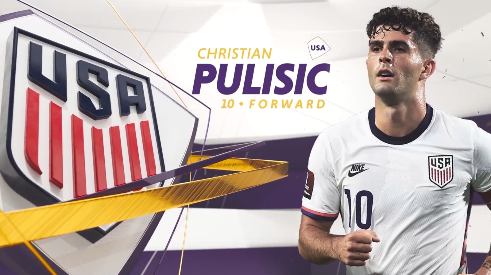
“Our hero font – Niveau Grotesk from HVD Fonts – has some really nice nuances that tie back to the logo. Some of their capital letters have these little flags that have the same shape and contour as the Telemundo World Cup mark. We thought that was a nice connection,” said Say.
Texture-wise, the package applies a variety of treatments to the Telemundo “T” which give a nod to the host country of Qatar.
Integrated sponsorships
Along with being a world sporting event, the World Cup is also one of the largest advertising events a broadcaster can carry outside of a Super Bowl or Olympics.
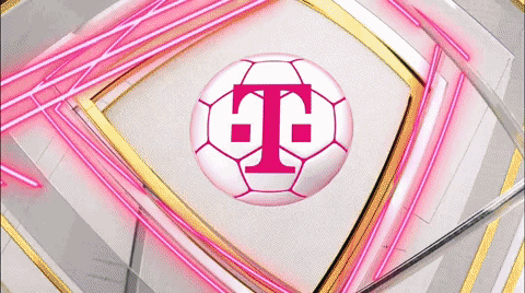
With this in mind, the team at Gameday Creative worked beyond traditional billboards to fully integrate sponsorships such as Xfinity and T-Mobile into the broadcast.
“Since we built the graphics package and know the graphics package, we can find an intersection between the sponsor’s identity and their visual look and their style and the graphics package,” said Say.
“I think you get some pretty seamless and clever tie-ins that make the sponsor look a little bit like it has a little more natural integration. It doesn’t feel forced, it’s a little more seamless and it’s also, there’s a little bit of serendipity there, surprise and delight.”
“It creates fun little graphic moments that I think give the sponsors a little more value for the integration and also make the sponsor graphics just look better so the broadcast overall looks better.”
The Gameday Creative team was led by Eric Say and Scott Flato with Robert Pardo, Jaime Peñalosa, Diego Pirogovsky, and Carlos Miranda at Telemundo.