Updated NBC promo format leans heavily on branding update

Subscribe to NCS for the latest news, project case studies and product announcements in broadcast technology, creative design and engineering delivered to your inbox.
As NBC continues what it previously said would be a gradual roll-out of its new logo and branding, more and more uses of the new look are popping up in network promos for its primetime programming.
Although the new logo started appearing in promos in late December 2022, it is now appearing in full force on almost every network-level promo that runs for its programming as of early January 2023 (so far news and sports productions haven’t made the switch).
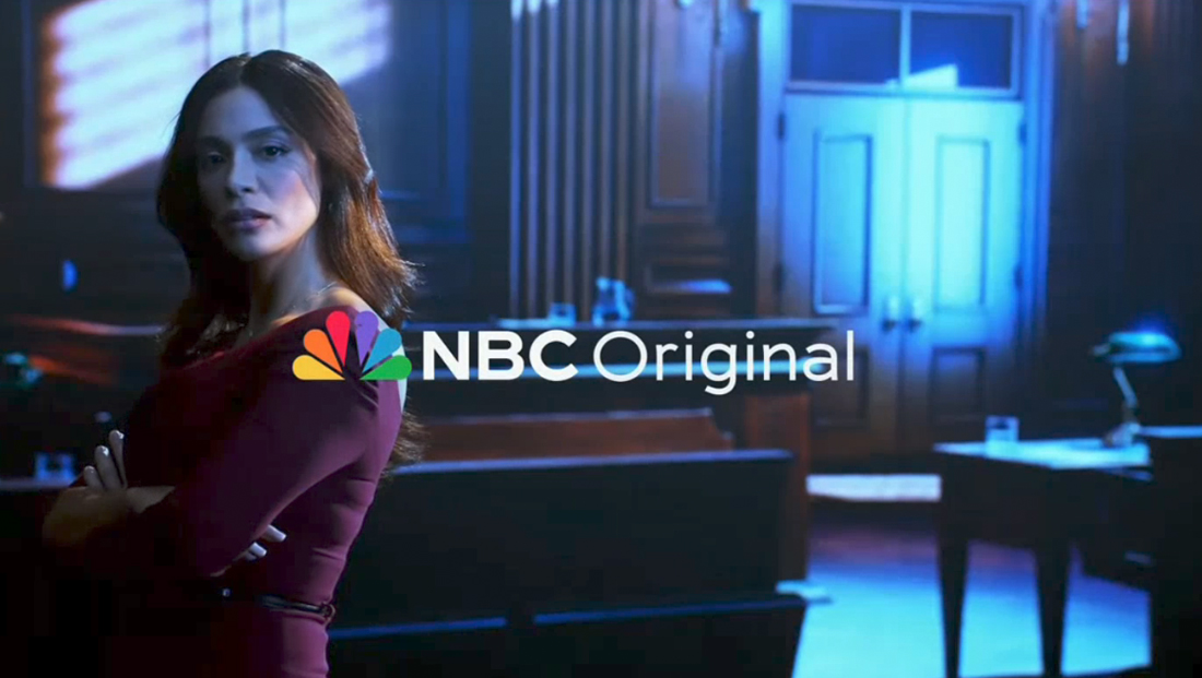
The promos now start with a brief shot, typically episodic, with the new logo along with the label “Original” shown on screen.
This is notably similar to how CBS has been calling its network programming “originals” since 2020 — a phrase this is commonly used by streamers to label content available exclusively on its platform.
One thing that is different, however, is that NBC is not using a brief cut of branded animation at the beginning of most promos like CBS does.
In nearly all CBS network promos, there’s a very brief animation using the “deconstructed eye” look with the words “CBS Original” in the font TT Norms along with eye logo.
NBC has opted to start most promos with a show-specific shot or look but still labeling it as an original on-screen, with that word appearing in a lighter version of the bespoke NBC Tinker font.
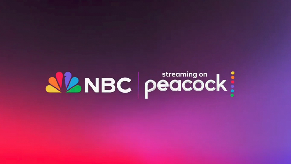
The network does, however, devote a tiny bit of the very end of each promo to a screen that includes the new logo in its horizontal lockup (which is also being used as the bug on most feeds) alongside a beveled Peacock logo with the “streaming on” label.


Behind these elements is a background created using bursts of colors, an approach that is prominent throughout the new look. Some instances are more vibrant, while others are darker backgrounds with less bold color splashes around the borders.
The choice typically matches either the show’s own logo or title card or the subject matter of the show, such as darker versions used from crime and legal dramas “Law & Order.”
This is similar to CBS’s approach both in the sense that it remains consistent on most promos and also that its coloring can be shifted based on what program is being advertised.
NBC is in the middle of rolling out an updated peacock design that includes updated and consistent spacing across all sizes, mediums and platforms as well as updated colors and a tweaked “beak” in the iconic design.
Sources tell NewscastStudio that the updated design will eventually extend network-wide.
An animation sequence that appeared in a show tweet, meanwhile, has been confirmed as the base design for the new vanity card that will appear in front of most network programming.
Known internally as the “curtain raiser,” the animation previously read “NBC presents” and included a straightforward NBC chimes sequence.
Because of production schedules, that sequence still appears regularly on NBC as of early January 2023 because it is “baked in” to edited episodes rather than inserted by network master control, according to sources.
Those same sources say that as shows begin airing that were produced more recently, the new vanity card will begin appearing more and more.
Subscribe to NCS for the latest news, project case studies and product announcements in broadcast technology, creative design and engineering delivered to your inbox.


tags
Bugs, NBC, nbc peacock, promos, TV Promos
categories
Branding, Broadcast Design, Broadcast Industry News, Featured, News Promos and Sports Promos