KSTP continues its flourishes with 75th anniversary logo iteration

Subscribe to NCS for the latest news, project case studies and product announcements in broadcast technology, creative design and engineering delivered to your inbox.
KSTP in Minneapolis–St. Paul, Minnesota, is marking its 75th anniversary with branding that, like many other milestone looks, uses its existing logo design.
The logo is sometimes referred to as the “groovy 5” and is recognizable for its swash-like top bar and large, circular accent in the lower left of the numeral.

In the 1990s, the station moved the ABC logo out from inside the “5,” though the suggestion of its circular footprint remained in the form of that exaggerated flourish on the end of the hook of the “5.”
Over the years, U.S. networks have become increasingly picky over how their logo is used in conjunction with location station designs in order to maintain integrity of its logos as standalone elements, though there are often some holdouts.
The KSTP logo has been through multiple color palettes as well, including a time when it was gold against a blue background.

In 2004, the station switched to a red polygon background with an angle that matched that in the “5.” The station’s “Eyewitness News” wordmark could be placed below the red box in an italic typeface that also matched that angle.
The “5” has been redrawn and tweaked over the years, but has remained roughly the same since the 1990s.

There was also a period when the station attempted to draw on the swash-like elements by enclosing the “5” in two curved accents, including one that originates from behind the ABC logo.
KSTP’s logo was most recently updated to an app-like square box with rounded corners and new ABC logo introduced in 2021.
In KSTP’s case, it is a bit less than half of the height of the overall design.
At least one iteration of ABC brand guidelines suggest that affiliated stations make the ABC logo at least 60% the height of the overall logo unless the logo is circular. If the red box is ignored and only the shape of the number 5 is used as a reference, the ABC globe does appear to be approximately 60% of the height.

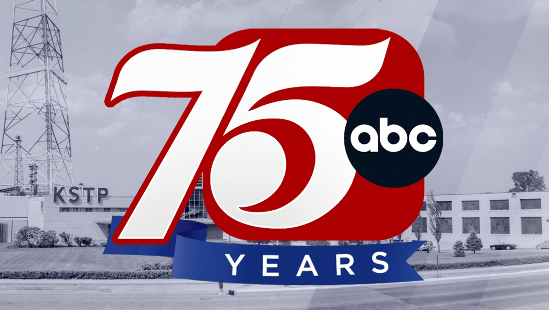
To mark the 75th anniversary of its April 27, 1948, sign-on date, the station released a logo that adds a “7” to the left of the logo, jutting outside of the red box.
The “7” has a strong diagonal line that matches the angle suggested by the “5” and its top stroke is essentially a flipped version of the one found at the top of the “5.”
In addition, the diagonal stroke also gets slightly wider as it journeys down toward the baseline, another nod to varying thicknesses in the “5.”
The height of the “7”, meanwhile, which becomes outlined in red outside the box, is higher than the “5,” with the baseline of the “7” roughly aligning with the bottom of the red box rather than the numeral within, while the top is roughly the same height when comparing the white numbers.
Meanwhile, the ABC logo remains in its place and a blue ribbon accent that starts behind the “7” and flows out under the box includes the word “years.”
The station continues to brand as “5 Eyewitness News,” typically placing the wordmark to the right of the logo in a wide sans serif.
The anniversary logo is being used on digital and over-the-air platforms, including frequently showing up where the normal logo would appear.
The station also created a five-part look at its anniversary and history, which is available on its website.
Subscribe to NCS for the latest news, project case studies and product announcements in broadcast technology, creative design and engineering delivered to your inbox.


tags
Anniversary Logos, hubbard broadcasting, kstp, logo design, minneapolis, St. Paul
categories
Branding, Broadcast Design, Broadcast Industry News, Heroes, Local News