
‘Nightly’ doubles down on ‘N’s, unique blend of 3D, flat design in new look
Weekly insights on the technology, production and business decisions shaping media and broadcast. Free to access. Independent coverage. Unsubscribe anytime.
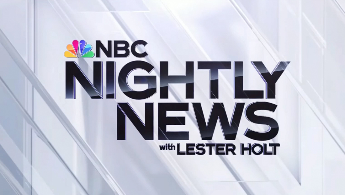
“NBC Nightly News” debuted its new logo and graphics package on June 19, 2023 — a look that marks not only the first significant overhaul to the broadcast’s look since 2016 but also a design that’s not quite like anything else out there on U.S. network evening newscasts.
Logo design
The centerpiece of the new broadcast design package is a completely redesigned logotype. The previous iteration was based on a design originally created during Tom Brokaw’s days going back to 1999.
The new logo switches to NBC Tinker, the bespoke font inspired by Sweet Sans that NBC has been using as part of its logo since 2013 and that was part of a network-wide rebranding in 2022 that included an updated version of the font.
![]()
In addition to the lockup with the full show title spelled out along with anchor Lester Holt’s name, “Nightly” now also relies on an “NN” icon.
This approach attempts to connect both “N”s into a single glyph by removing the far right vertical stroke of the first one and the far left oen from its mate and then placing the matching diagonals side-by-side with a narrow space between them.
The resulting look arguably could be read as both a double and single “N,” though the design still technically works either way thanks to the triple alliteration in the broadcast’s title — as an abbreviation for “Nightly News” or simply “NBC,” “Nightly” or “News” (or, really, any two-word combination of the three words).
![]()

While the double-“N” design rings as a nod toward a smartphone or streaming app icon, it has notably not been used as, for example, the broadcast’s avatar on major social media networks, a choice that largely renders it nearly unreadable in these smaller formats.
A nod to the combined diagonals of the “NN” icon is also found in the show’s full logotype, with the first “N,” in “Nightly,” using it in the lower right corner and the one in “News” using in the upper left. If one were to drop the leftover vertical in each design and put the remaining “V”-shaped elements side-by-side, this would essentially create the abbreviated look.
In addition, the broadcast has notably updated the “NBC” and peacock icon part of its overall logotype to match the redrawn logo introduced in late 2022 and early 2023. The “NBC News” logo has also been revised to use Tinker instead of the Futura-inspired typography that has been used for years.
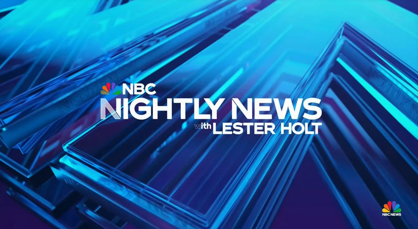
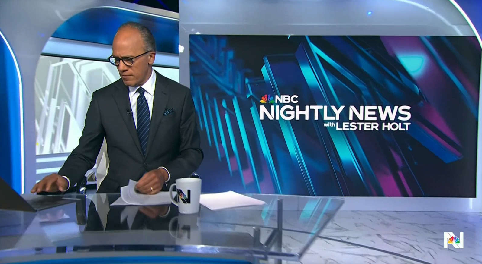
3D background
Jumping off of the “N” theme, “Nightly’s” design uses several variations of a glassy background element behind various parts of the new look.
This features what appears to be multiple layers of the double-“N” icon rendered as slabs with multi-tiered beveled edges and stacked on top of each other. In some variations, surfaces have faint versions of the show logo emblazoned on them.
The dominant shade of the design remains blue, though there are hints of violet that find their way in.
Other variations include a look that imagines the “N”s as a repeating element that sort of snakes their way through the 3D space, often with a bit more violet added in.
This approach can be found in fullscreen video wall elements, loops behind boxed layouts and in the squeezeback backgrounds during branded commercial breaks.
In both of these variants, the repeating nature of the “N” icon tends to emphasize the arrow-like notches that the letters naturally form, which ends up looking a bit like the lower tips of the peacock feathers or the “notch” in the NBC peacock that represents the creature’s head.

Another variation of the background element is a white variation that is also used in the open. This design tends to use a more straight-on viewport.
Continue reading to see the new open and headline teases…

tags
logo design, NBC, NBC News, NBC Nightly News, nbc peacock, NBC Tinker, Studio 1A Rockefeller Center
categories
Branding, Broadcast Business News, Broadcast Design, Graphics, Heroes, Network Newscast, Networks