
A look at the evolution of ‘Nightly’ branding, graphics up until 2023
Weekly insights on the technology, production and business decisions shaping media and broadcast. Free to access. Independent coverage. Unsubscribe anytime.
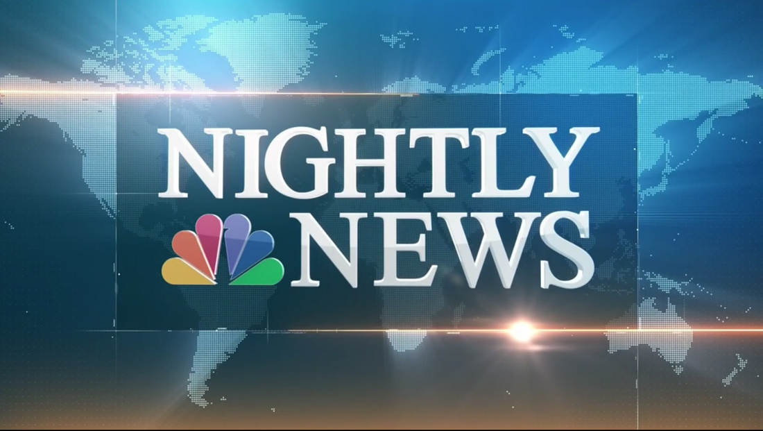
With “NBC Nightly News” set to debut what’s being billed as a “rebranding” June 19, 2023, here’s a look at how we got to the newscast’s current, rather mismatched look.
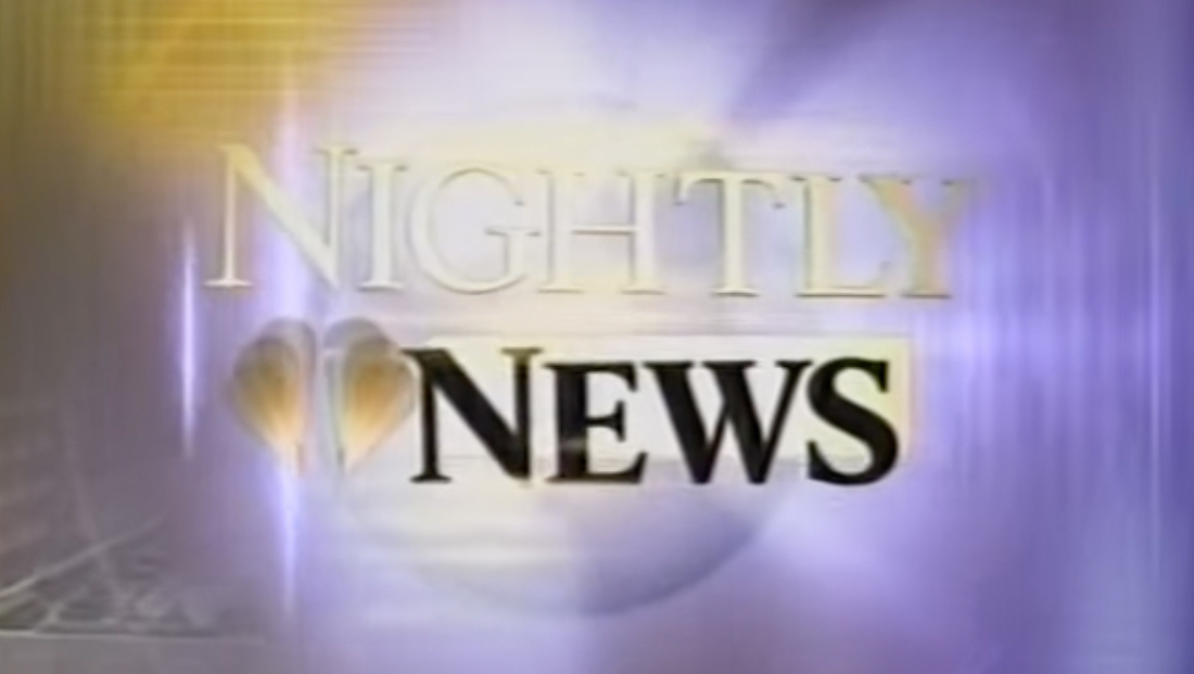
In many ways, the current design actually goes back to the Tom Brokaw days, which ended in 2004. In 1999, the broadcast moved from the former Studio 3A footprint to what was then known as 3C, introducing a smaller set and new logo.
That logo, which, at the time, was accompanied by a violet-blue and gold color palette, effectively introduced the current logotype foundation that “Nightly” has used since.
The design used a serif at the time for both the main logotype and anchor name.
That broadcast has since removed the boxed elements and shifted to a more traditional color scheme.
The broadcast went through a myriad of accompanying graphical looks since 1999, including the 2015 look seen above that, among other things, has world map accents and animated hashmarks.

In 2016, “Nightly” kept the same logotype but received an updated design in its open, lower thirds, OTSs and other graphics.
This look was hallmarked by a 3D rendition of the world that zoomed into the island of Manhattan and, ultimately, 30 Rockefeller Plaza, the headquarters of NBC News. This design featured the State of Liberty, an element used prominently in past “Nightly” looks as well as the exterior view of the building that was used going back to Brokaw’s time at the anchor desk.
This new open completely removed the boxes around the logotype and also saw the anchor name and word “with” change to the sans serif font Effra.
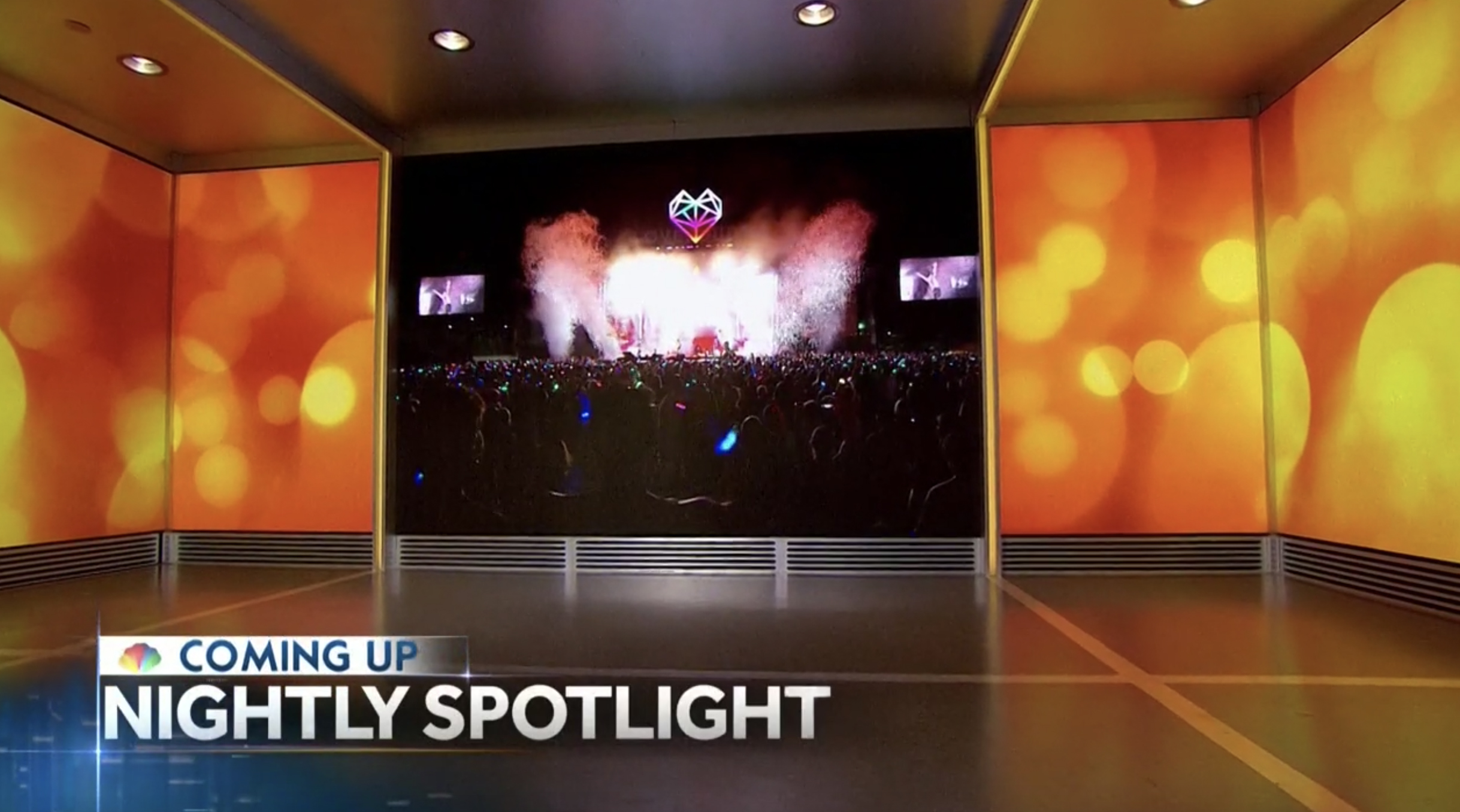
“Nightly” would eventually cut the open down significantly, but two things from this redesign have remained consistent: The tease headline and “coming up” graphics and lower third inserts.
This redesign significantly simplified the lower third design, breaking away from the traditional approach of using separate boxes or gradient backgrounds for each tier.
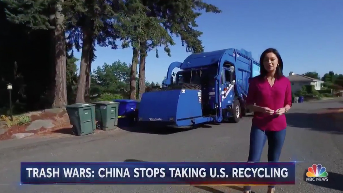
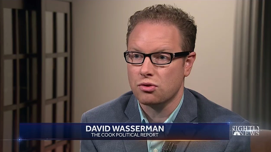
Instead, the banners were mostly now a mostly simple blue rectangle with red, violet and gold accents with subtle light bursts in the corners.
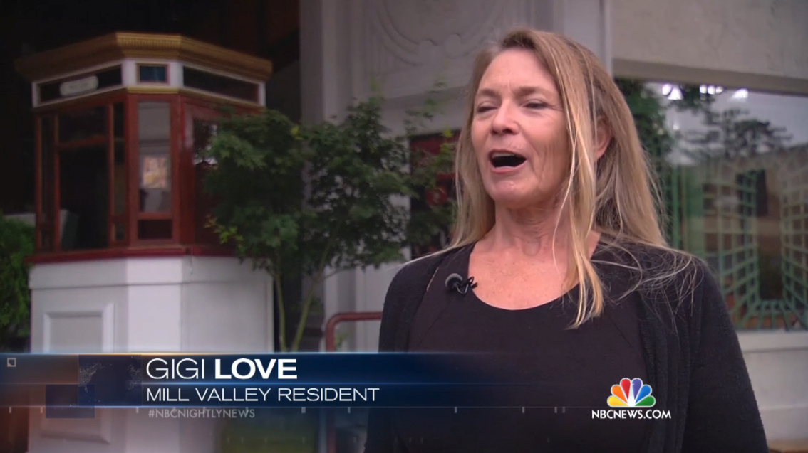
These lower thirds remained on-screen during most packages and voiceovers, typically only disappearing during anchor intros and teases. When someone appearing on screen needed identified, the same background was used, just with an elegantly centered two-line approach.
In addition to the standard lower thirds, the broadcast also had separate lower-third style graphics that were used for tease headlines at the top of the show as well as bright before most breaks. Effra was also used in the insert graphics as well as on-set video wall text.
These graphics, along with fullscreen wipes used at the time, featured an updated take on the animated hashmarks found in the pre-2016 look. These could also be arranged in a way that created the appearance of a 3D space that looked a bit like an evening cityscape. The small hashmark elements are also visible, on close inspection, in the animated open.
Fast forward to November 2020, when “Nightly” began broadcasting from its studio again after being mostly produced remotely from Lester Holt’s home due to the COVID-19 pandemic.
At this time, it switched to a dotted, world map motif on its video wall graphics but kept the same lower thirds, tease graphics and open.
Meanwhile, a new open was introduced later that month that incorporated elements from both the video wall designs and insert look — a dotted world map background and series of linear elements that formed a frame for the logo to sit in.
The open was notably a lighter shade of blue than elsewhere, and also added a circular element at the very beginning as well as a heavy 3D effect to the show logo that also was inconsistent with the rest of the show’s look. Overall, the animated felt slightly unrefined and rushed.
The dotted map motif, however, wasn’t added to the insert look.
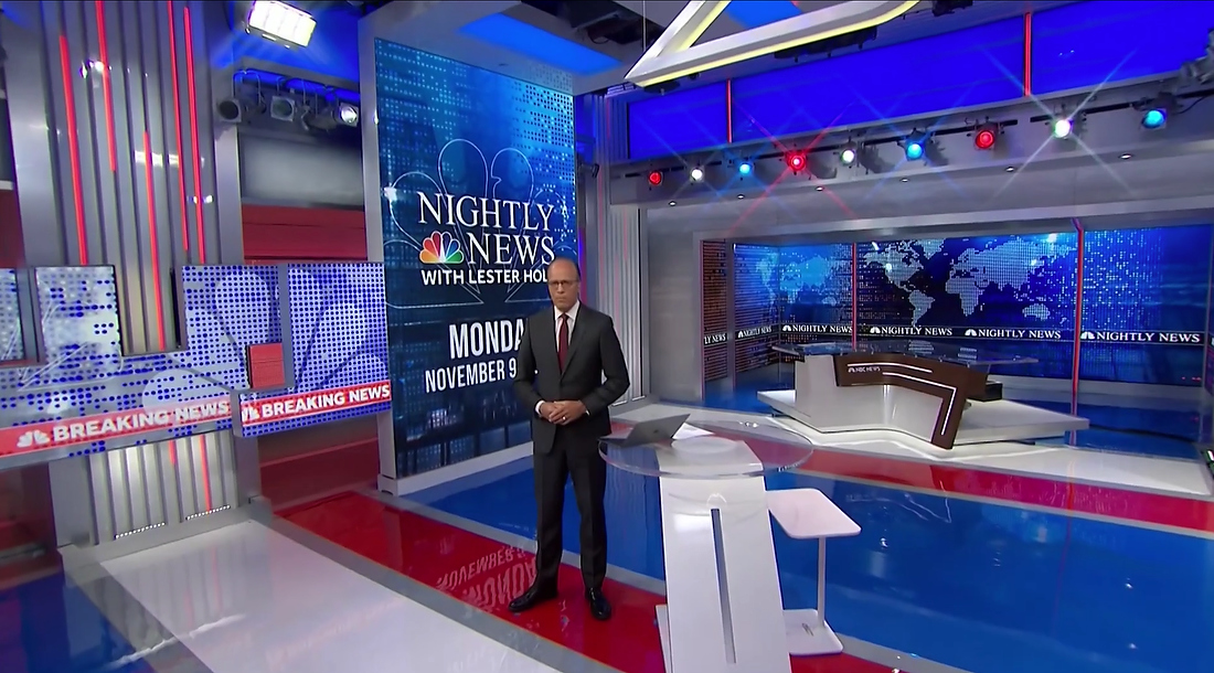
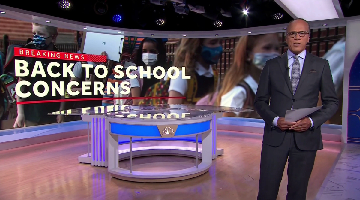
In September 2021, “Nightly” moved production to Studio 1A and updated its on-set video wall graphics to an approach that combined a flatter design with imagery and text being the centerpiece.
Most texture was removed from video walls in favor of solid backgrounds or ones with large, oversized outlined typography.

Topical video wall graphics focused more on the imagery itself, particularly when used on the 40-foot curved video wall used at the top and end of each broadcast.
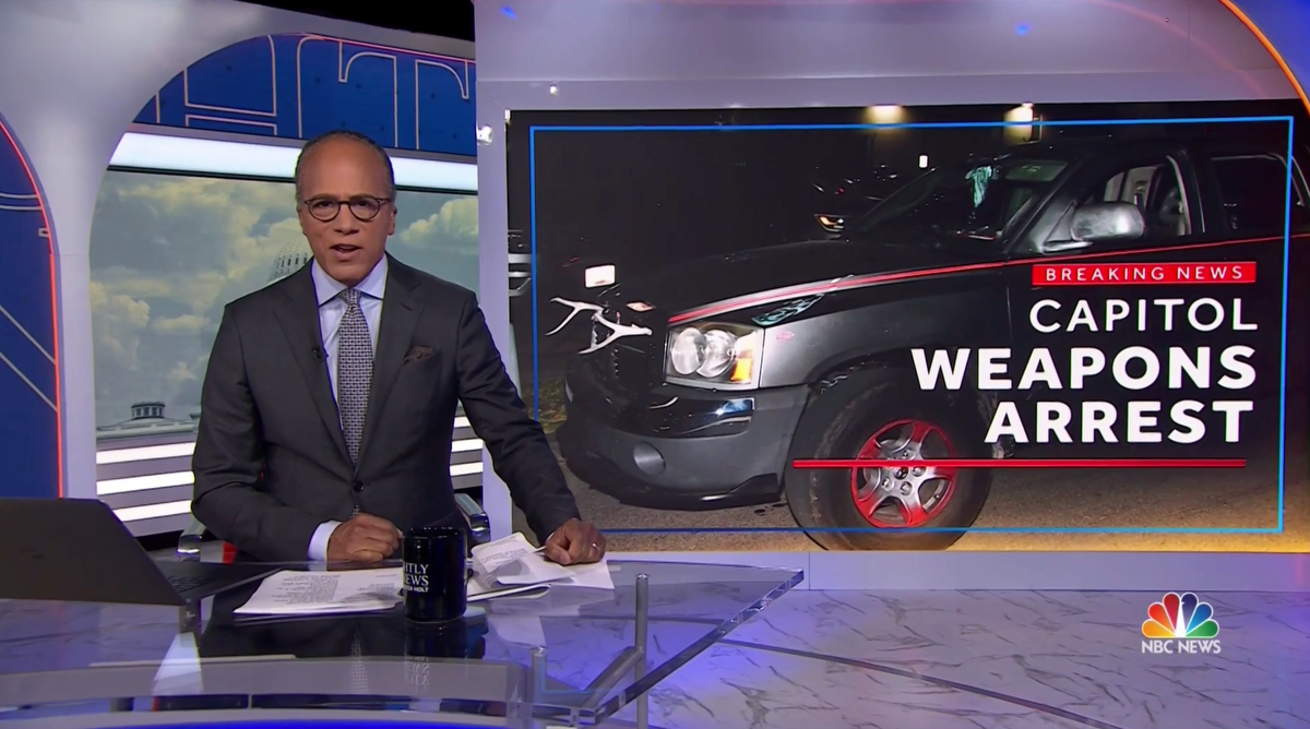
For other anchor intros and outros, the video wall graphics remained largely photography-centric with a sold blue outline and overlaid text. LED header and pillar elements added to the space earlier in 2021 for “Today” displayed the large, oversized typography elements.
This update, however, did not include any changes to the lower third and banners.
A particularly odd part of this change was that the broadcast did switch to fullscreen animated “coming up” transitions that then added a blue outline meant to match the video wall graphics over tease video ahead of commercial breaks.
However, this border was added on top of the existing tease banners — creating the rather odd composition above.
At the time, NBC sources told NewscastStudio that the network was planning to redesign the inserts and banners to match the flatter look of the video walls, but that apparently never materialized.
In a sense, by this point, the design, which essentially represents where the broadcast was as of early June 2023, was using elements from three different looks — the 2016 redesign, the 2020 dotted look and the 2021 video wall and tease design.
NBC sources also told NewscastStudio that behind-the-scenes indecision and squabbling lead to the odd mixed look and inability to commit to a unified design until this point.
Correction: An earlier version of this article misstated the studio “NBC Nightly News” used in 1999. It was Studio 3A. 3A has since been renovated into a different footprint for use by MSNBC.
tags
NBC, NBC News, NBC Nightly News, Studio 1A Rockefeller Center
categories
Branding, Broadcast Business News, Broadcast Design, Broadcast Industry News, Featured, Graphics, Network Newscast