
CNBC updates logo, overhauls graphics package — including its famous ticker
Weekly insights on the technology, production and business decisions shaping media and broadcast. Free to access. Independent coverage. Unsubscribe anytime.
NBCUniversal’s CNBC financial news network has unveiled a logo update as well as a major overhaul to its graphics package, including its iconic blue and white ticker element.
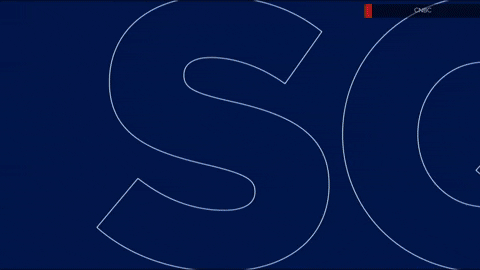
The network’s logo, which previously featured the NBC peacock above the letters “CNBC” in a wide, squat sans serif, has been updated to use both the redrawn peacock icon and NBC Tinker font. Both of these elements have been slowly updating across multiple NBCU properties that sport the bird or typography since the new concept was first introduced for the television network itself in the fall of 2022.
The changes mean that the network name extends beyond the left and right feathers of the peacock above, instead of sticking closer to the width of the icon in the old version.
The old CNBC logo with old version of the peacock and wider, shorter logotype.
Incidentally, MSNBC previously used a similar typographic treatment as CNBC logotype when it arranged its letters in an L-shape arrangement.
While CNBC continues to stack the logotype and peacock in most lockups, the two elements can also be placed side-by-side in some applications, such as in the network’s website header, though it swaps to the stacked version when the user scrolls down. CNBC has also stopped the practice of outlining the peacock in white in most cases, another change that is spreading across NBCU.
This, however, has the effect of certain feathers fading into the blue background behind the website header background, an issue that’s been noted on other applications of the new icon.
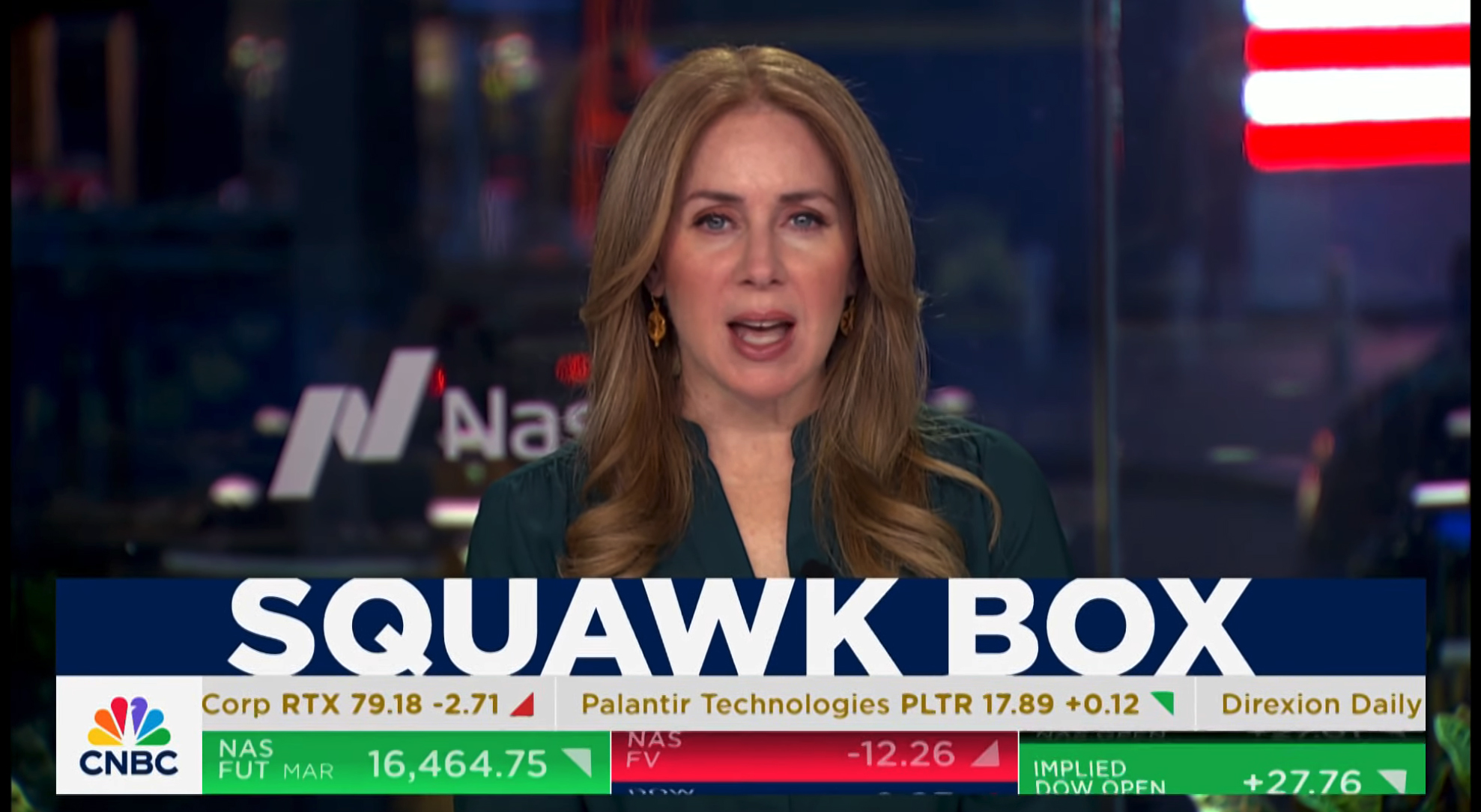
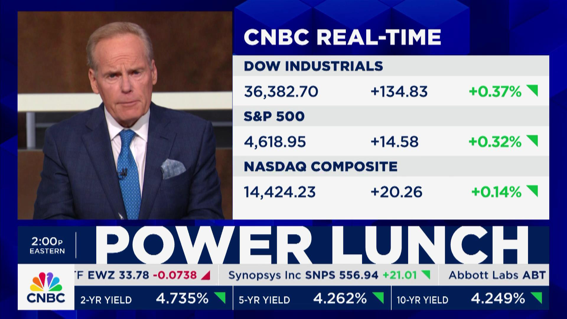
In addition to the new logo, CNBC also used the opportunity to roll-out a new on-air graphics package, including updating its famous blue and white ticker.

The ticker itself most notably lost its shadow effects.
Another big change is the shift away from the darker, glassy and glowing elements in favor of a flatter, more rectangular look with clean lines and brighter accents.
Gone are the beveled edges, light flares, gradient-filled on-screen text and glassy 3D elements in backgrounds and opens.
CNBC calls the approach, which was developed with Troika, a “a clean, minimal overall aesthetic that delivers simplicity to the viewer so they can engage comfortably 24/7.”
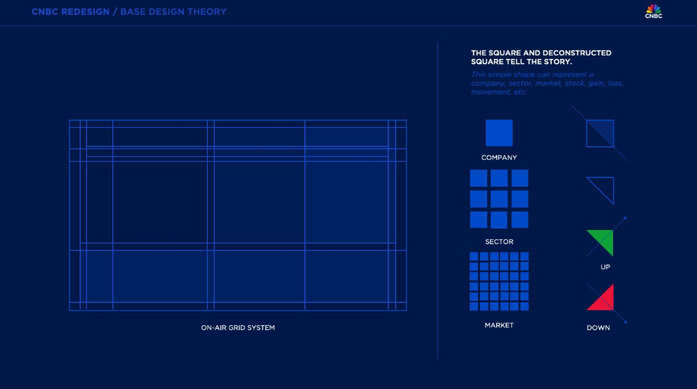
The network spent nearly two years developing the new design, which is based off an on-air grid system and the concept of a square shape serving as the base of the new design language.
“All actionable information and language can be seamlessly communicated through this core design element,” the network notes.
In a design theory graphic shared with NewscastStudio, the idea of a company can be illustrated by a single square, with a three-by-three grid standing for a sector. A much larger cluster of squares can then represent the concept of the market as a whole.
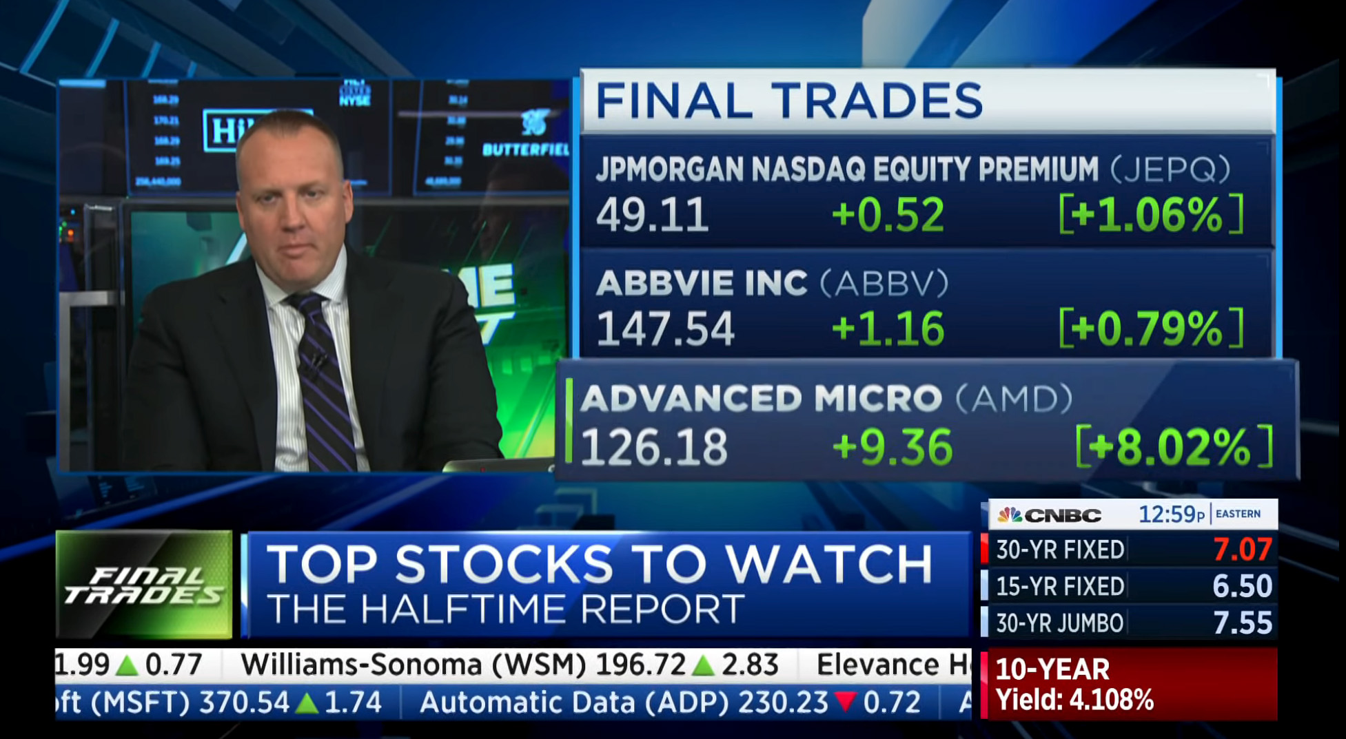
The use of this square-based concept starts with the network bug being positioned inside a square box in the lower left of the screen — a new location. The space to the right of this is typically reserved for the ticker, which remains a two-tier setup.
Exact configurations can vary based on daypart and current market conditions, but the top row of the ticker continues to focus on company or fund names, ticker symbols and current trading prices.
Instead of the more literal “up” and “down” arrows in green and red, respectively, CNBC has switched to a different take inspired by that square base.
By slicing the square in half much like you might cut a sandwich if you’re feeling a bit fancy, the network has created two indicators that correspond with ups and downs.
The green “up” arrow now points north east as opposed to true north, while the red “down” one is pointing south east instead of directly south. The meaning is still fairly clear, especially with the help of the colors.
Meanwhile, the lower, blue tier of the ticker, now known as the “bottom line” has been switched to show major market indices, commodities and bonds, including similar color-coding. Outside of market hours, these can change to reflect futures and implied data.
The square foundation is also used in fullscreens, including animated backgrounds and stingers for breaking news and market rallies.
The green “Market Rally” stinger that’s popped up around the debut of the new graphics features a eager bull formed from squares — though its body and figure still curve thanks to the undulating surface the 3D boxes sit on, even as he appears to triumphantly buck his head.
In this example of the old CNBC graphics package, the ticker is noticably smaller. The CNBC logo in the white box on the right was used as a bug, with the market information below it known as the ‘bug stack.’ This information has largely been moved to the ‘bottom line,’ the new name for the blue band in the ticker.
The entire ticker can now be wider than it was before in most layouts, expanding from being about 75% of the screen width to somewhere just shy of 100%.
The blue bar in the ticker had been used previously to separate out Nasdaq stocks and other information such as weather, but it appears the network felt it was more important to devote this real estate to at-a-glance market summaries, which often was displayed in a box the network called the “bug stack” — an element that ate up a lot of real estate.
“Combining both ticker elements into one was part of the overall redesign plan which included refreshing the lower third banner. This was done partly to make the banner information more clear and accessible,” Robert Poulton, vice president and global creative director told NewscastStudio.
“We’ve kept the iconic CNBC ticker element and created a permanent home for several items that could sometimes be found in different locations within the lower third. The overall package with redesigned charts, data boards and other elements will allow us to showcase our content, talent, guests and the insight they provide,” added Poulton.
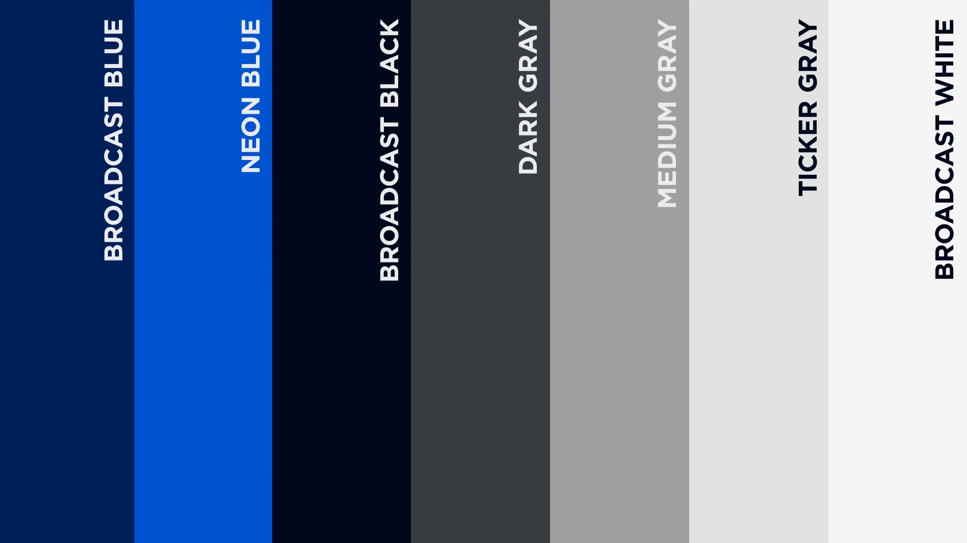
The new graphics use a curated selection of blues, blacks and grays along with white and the red and green market indicators.
Market info is definitely more out of the way here, though removing actual stock quotes from the blue bar obviously reduces the number of quotes that can be on-screen at any given time, something the network may be content to live with now that stock quotes a few swipes or clicks away for even lay people.
Above the tickers and bug, the network can now insert a nearly full-width lower third spotlighting the topic at hand. Previously the bug stack would often limit how much text could be shown on-screen.
The far left, in the space above the bug box, there’s space for the current time as well as segment labels or franchise names.

Show or other branding can also be flashed on-screen in the primary banner space with a blue background and white text with the show name scaled to be slightly more than the height of the white box itself to help delineate it from a topical banner.
One thing that didn’t change with the new CNBC graphics is the use of Gotham as its primary typeface. With the exception of the logo, this font is used in almost every on-screen element, from lower third banners, tickers, charts and video wall graphics. It’s not also applied, in full-width, to much of the ticker text, meaning that the ticker is easier to read but also can’t display as much information at once.
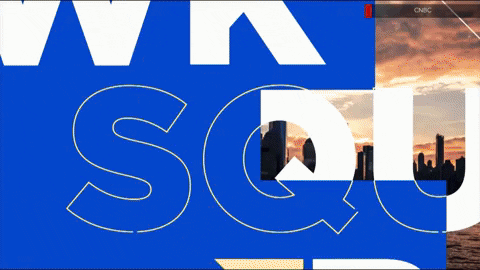
Dropping the more glassy, darker look means the network now uses a bright approach that uses a blend of imagery, oversized outlined typography along with simple geometric accents, including use triangles, microtext, blocks of solid color and peacock elements in elements such as opens.
While each show still uses its own unique open, the title screen at the end of each one follows a similar layout: The CNBC logo in a white box on one side and the show title in white text inside a deep blue box to the right, with the except of “Last Call,” which uses a white version of the logo and show name placed inside of medium-thick outlines, similar to how it looked at debut.
In addition to the on-air changes, CNBC also worked closely with Vizrt to migrate over to its systems across the entire network, fueling everything from lower thirds to real-time market data to on-set video walls.
A new custom user interface allows producers to create and drive graphics from their workstations. This includes being able to use a mix of both data-driven and producer-created looks as well as share the content across other NBCU properties.
CNBC was able to tailor their ecosystem with Viz Engine 5, developing plugins and control interfaces for graphics playout.
Project Credits
Client: CNBC
SVP, Marketing: Tom Clendenin
VP, Global Creative Director: Robert Poulton
Associate Creative Director: John Rehm
Sr. Director, Design & Brand Standards: Julie George
SVP, Business News: Dan Colarusso
VP, Business News & Programming: Craig Bengtson
SVP Technical Operations: Steve Fastook
SVP Design & Production NBCUniversal News Group: Marc Greenstein
VP, Production & Studio Operations: Andy Barsh
Agency: Troika

tags
CNBC, logo design, nbc peacock, NBC Tinker, NBCUniversal, Robert Poulton, Troika, Vizrt, Vizrt Viz Engine
categories
Branding, Broadcast Design, Broadcast Industry News, Cable News, Graphics, Heroes