
‘CBS Mornings’ gets graphic updates inspired by rays in sun icon
Subscribe to NCS for the latest news, project case studies and product announcements in broadcast technology, creative design and engineering delivered to your inbox.
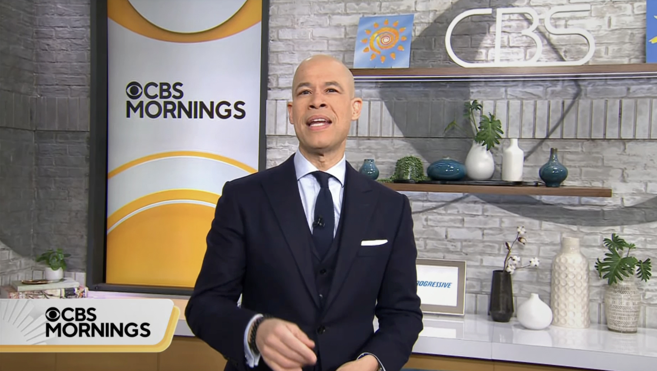
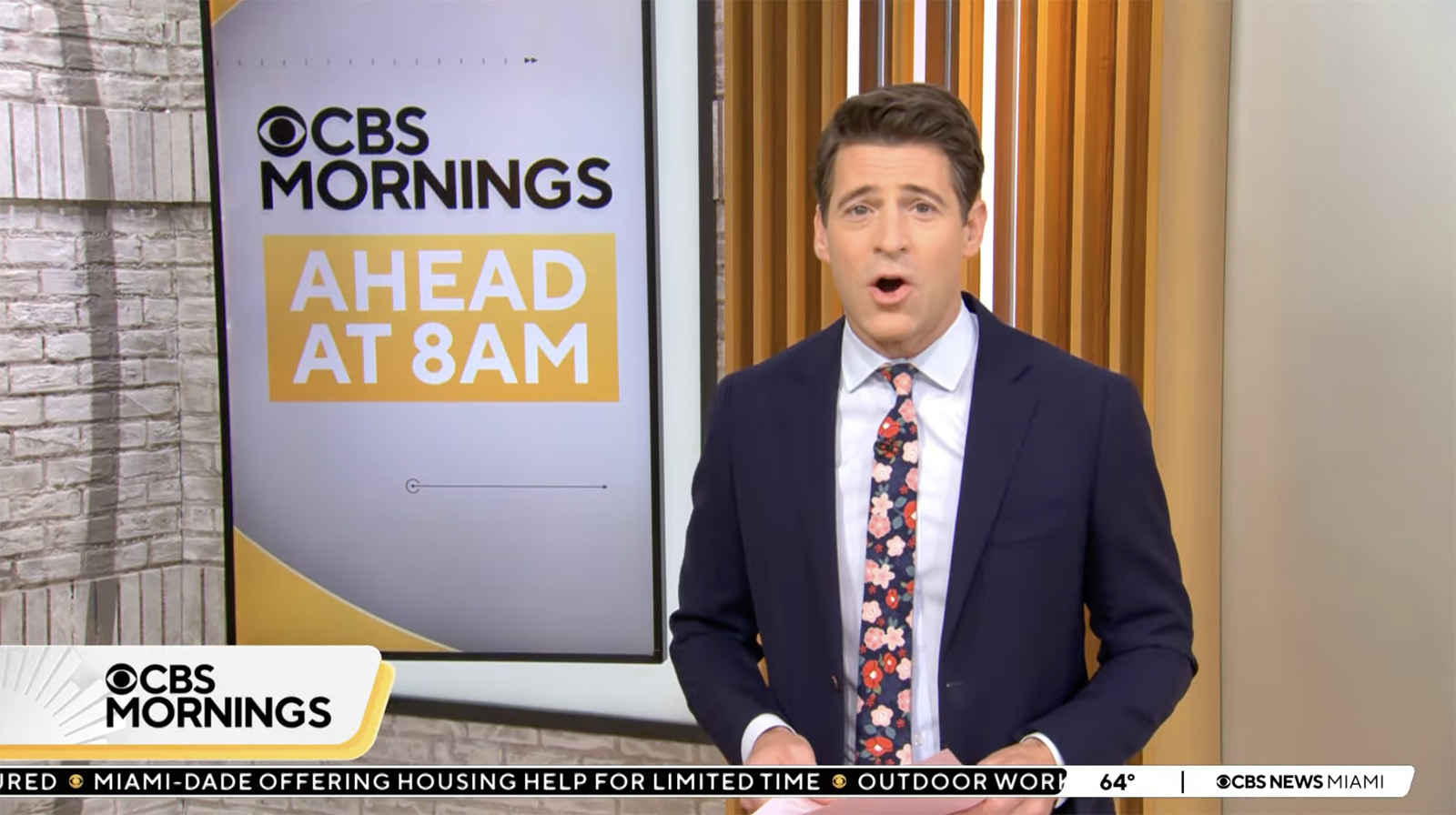
“CBS Mornings” debuted updated insert graphics Feb. 5, 2024, that center around redesigned lower third banners with a shape inspired by its sun emblem logo.
The new look uses a horizontal bar with a distinct corner that forms a fin-like shape.
![]()
The shape appears to be roughly inspired by the sun logo used in opens and other elements. That design, meanwhile, is an updated and redrawn version of the longtime “CBS News Sunday Morning” sun icon.
The weekday version of the sun debuted in 2021 when the network revamped its morning show from “CBS This Morning” to simply “CBS Mornings.” The move was meant to align the weekday editions with the popular and iconic Sunday morning version, even using a theme song with familiar fanfare inspired by the Sunday version.
On weekdays, the sun looks slightly cleaner and features smoothed-out tips of its rays, which have have a suggestion of the fin-ike shape that is similar to that found in the lower thirds.
In most instances, the lower third and show bug both feature a white background in the distinct shape with a second iteration of the shape, in a different color, offset behind it, forming a sort of border around the bottom and right side of the design.

When full lower thirds aren’t being used, just the show logo is shown peeking out, in a tab-like feel, in the lower left of the screen. This area also features a portion of the sun element shown in a light color and accented with a gray outer glow-like effect.
Lower third banners can grow wider as needed for lower thirds, but the show logo remains in the lower left in most cases; it just becomes part of the banner box and gains a vertical line that serves a visual separate between the logo and neighboring text.
This large, distinct logo area feels similar to the logo placement on “CBS Evening News,” the CBS News Streaming Network and CBS-owned stations’ looks, though those designs all use a simple rectangle.
By default, the color used in the new banners a orange-yellow hue, similar to the shades that have been featured in several of the show’s previously graphics packages (though with a bluer detour in 2019), including its most recent design that debuted with the rebranding in 2021.
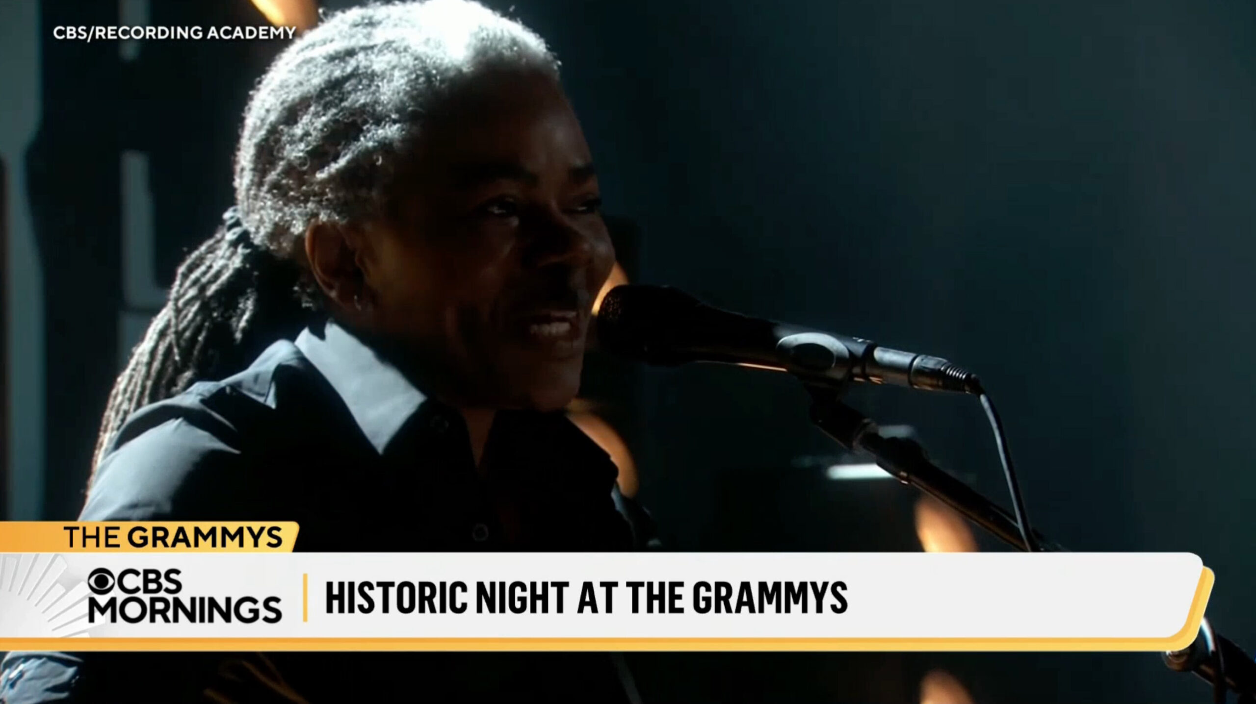
Inserts can also gain a third, flag-like tier that uses a similar shape as the large bar below, though this one is typically a solid color. This color, however, can change based on the topic at hand.
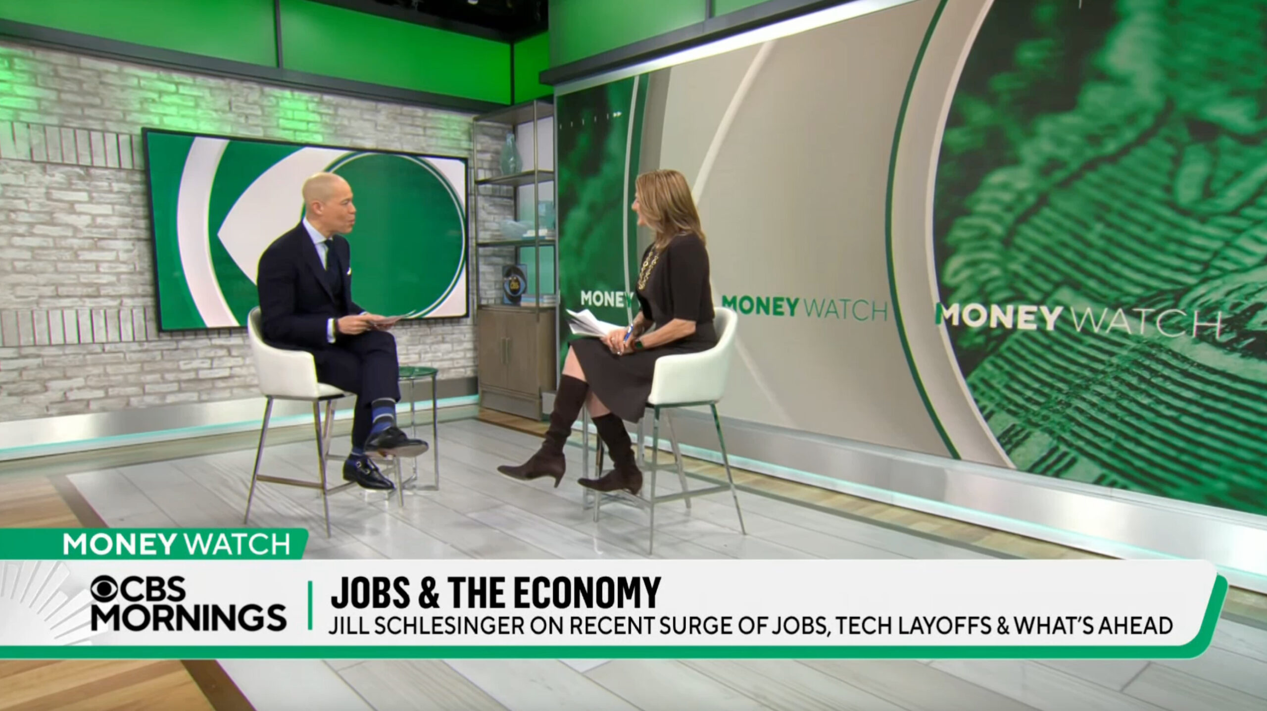
On the first day out, a light violet was used for “The Uplift,” green for “Money Watch” and a purple to magenta gradient for Super Bowl LVIII preview coverage. The top tier was shifted red with the shadow colored blue for election coverage, creating a red, white and blue color scheme. Producers can also change the color of the vertical divider line.
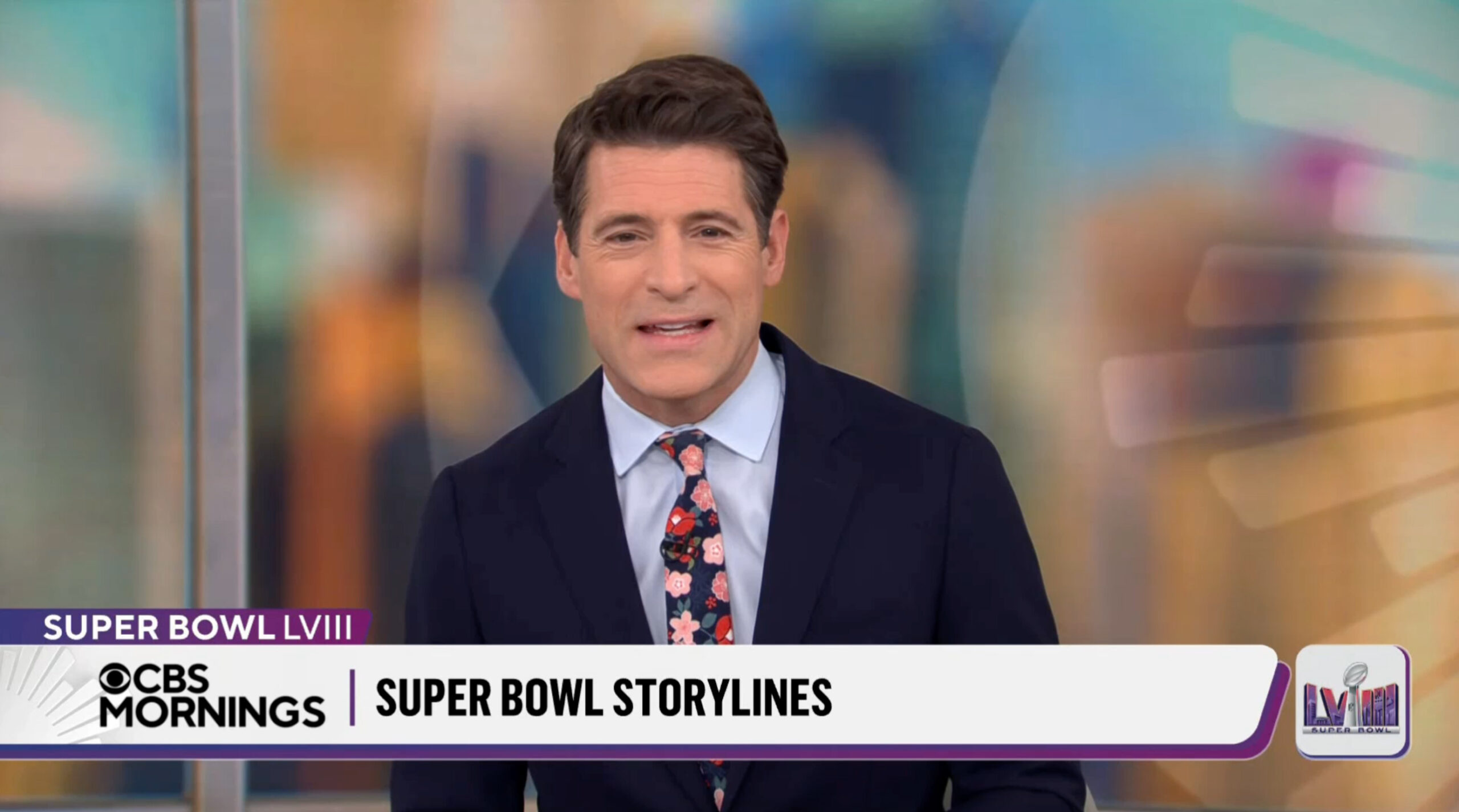
The show also has the option to add an app-like square icon to the lower right side of the screen, which it did during Super Bowl coverage.
This design attempted to replicate the offset-colored background element, but only a small amount of color was visible, making the scale feel off.
The square shape also clashed with the angled ends of the bar to the left when at least one better option might have been to have a white bar extending from the right of the screen with a matching angle when it hit the primary bar.
Animations used in the graphics allow the show to transition between bug-only or fuller-width banners thanks to bars tht “grow” and “shrink” as needed. Colored elements can shift quickly thanks to a fade effect.

CBS uses a condensed sans serif that appears to be Flama Condensed Bold (the same as in its election “America Decides” design) for the primary tier of text, while TT Norms, the networkwide font of choice, is used elsewhere.
WFOR is one of a few stations currently using the new ticker. Aircheck via FATV Play on YouTube.
In addition to the new design, there is also a new ticker that stations can insert at the local level. This features a white text on black bar for most of the screen width with a white element in the lower right for time and temp. Both elements feature a subtle curved that matches the one in the banners.
Some stations, including CBS-owned WBBM in Chicago, where NewscastStudio acquires its airchecks, were not inserting the ticker as of Feb. 5’s broadcast, though it’s not clear if this was an oversight or the station is simply opting out.
CBS does not appear to be providing its stations with a placeholder container for the ticker content and current time and temperature (or it’s offering a separate feed for those who aren’t using it).
A longtime practice of many network morning broadcasts has been to include the background and other graphics elements for tickers baked in to the national feed. Local stations are then provided with the appropriate coordinates, sizes and other specifications for outputting their own, locally generated content, over it with the intent of creating a cohesive look that appears to be all generated at a single source.
Not all stations have the correct equipment to output tickers exactly as the network requires, so in some cases a station might opt out of the ticker or cover it up with its own design.
If CBS is requiring stations to output the entire ticker bar at the local level, this would likely require the network to provide all of its stations with the necessary graphics files, fonts, and anything else needed to generate the required look.
It’s also worth noting that, by using the angled look, the show is eschewing the more rectangular look being used as part of the network’s “deconstructed eye” look, though these elements are still found in the show opens, stingers, video wall graphics and other elements.
The new lower third inserts still manage to hold fairly true to network design, thanks mainly in part to their flat look, but they are still decidedly different from looks seen elsewhere on the network, including almost completely ignoring the prominent used of concentric rings.
There were perhaps some opportunities to use some elements from the network’s overall branding, such as the beveled edges, outlines and micro elements such as hashmarks and circles (again, these continue to appear elsewhere in the show).

The show’s squeezeback look used during select breaks with national weather conditions on the left side was also redesigned.
The new design replaces a look introduced in 2021 when the show changed names and studios.
The old ‘CBS Mornings’ insert graphics.
This design had a white and black banner with colored accents on the left and perched above. This approach allowed the network to left space for the smaller CBS bug used during most network programming on the far left while an equal space on the right balanced things out.
The look did, however, feel a bit like it was meant to be a transitional look to accommodate both 16:9 and 4:3 viewers, though CBS, like most networks, had long since abandoned that practice (and, in reality, the spacing doesn’t quite match up).
With the change, “CBS Morning News” was also retitled as “CBS News Mornings” and debut the same graphics package.
Subscribe to NCS for the latest news, project case studies and product announcements in broadcast technology, creative design and engineering delivered to your inbox.

tags
CBS, CBS Mornings, CBS News, insert graphics, lower thirds, tickers
categories
Branding, Broadcast Design, Broadcast Industry News, Graphics, Heroes, Network Morning Shows, Networks