
ABC News debuts updated special report slate, open
Weekly insights on the technology, production and business decisions shaping media and broadcast. Free to access. Independent coverage. Unsubscribe anytime.
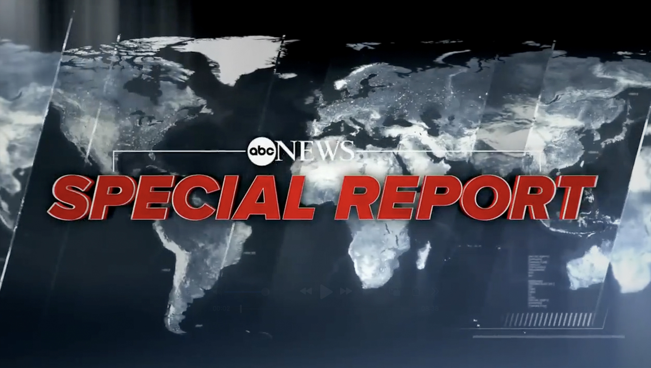
ABC News has quietly rolled out a new special report slate, open and lower third banner design.
The new look strays from the flatter look that the network had been using going back to 2020.
The world map background, which had been a more subtle element previously, has been bumped up to a bigger role in steely blue and white with the lights of major metropolitan areas dotting the surface.
This new look more closely matches looks used on both the “ABC World News Tonight” open and default video wall background behind anchor David Muir, though there are subtle differences.
Also included are angled glass elements. The glassy look is found, without angles, in some “WNT” elements and also shows up in ABC News Live looks.
The network opted for a bold red and italic version of Proxima for the words “Special Report” rendered with a 3D effect and sporting a thin outline, which creates a sleek look — and the italics play nicely with the angled elements.
Above this element is the ABC News logo along with a thin white bracket element. The look is also accented with microtext and angled hashmark-like elements, which are also found in other looks on the network.
During the Jan. 7, 2025, coverage of the late President Jimmy Carter’s casket being moved across the country, ABC replaced its normal special report music with a more somber cut, while also adding an additional fullscreen graphic after the default special report open featuring Carter imagery. Later, however, the network provided an update on the California wildfires with an open that used the same music as its previous open.

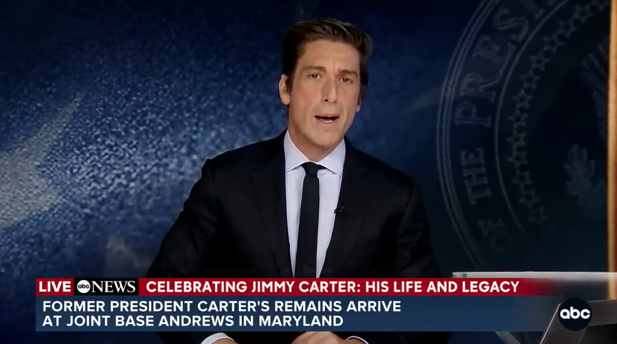
ABC News also introduced redesigned lower third banners for its special report. The updated look removes the diagonal hashmark accents as well as the “Special Report” bug that previously appeared in the lower left of the screen.
The graphic is now red, dark blue and black with white text.
Along the top is the word “Live” against red followed by the ABC News logo in black box. The rest of this tier is also red and features a topical banner that identifies the story being covered.
Below this the network has space for two lines of text, with the font updated to be slightly smaller but bolder.
Removing the “Special Report” branding box to the left frees up significant screen real estate for more text in the banner itself, though it also breaks from the traditional notion of having something on-screen that identifies the content clearly as a special report. There’s certainly no hard and fast rule that says that’s a must, and it’s likely that most viewers, if they were to tune in in the middle of a report with this banner on screen, would understand what’s going on.
Another update to the lower third is that the colored backgrounds now fade out on the right side of the screen near the network bug.
Overall, the new layout appears to take design cues from both ABC News Live and the “Good Morning America” banners along with a goal of adding a bit more breathing room for the text and improving legibility throughout.

tags
ABC, ABC News, david muir, Proxima
categories
Broadcast Design, Heroes, Network Special Reports